

Context
A local hiking tradition, brought online.
Southern Urals Thousanders is a noncommercial portal for hikers exploring the region’s peaks above 1,000 metres. It combines a summit catalog and map with the ability to record ascents and follow other participants’ progress.
The idea existed in handwritten records and spreadsheets long before the website launched in 2016. Collecting summits gives familiar mountains a new purpose, encouraging hikers to look beyond popular routes and discover more of their region.
The portal had been built around its practical features and did not yet have a developed visual identity. As the founder looked to grow the project, it needed a recognizable expression of its own.
The Challenge
Give a functional project a shared identity.
The audience was already interested in hiking. The identity needed to speak to people looking for new experiences close to home, with summit collecting providing a sense of progress and friendly competition.
The website was the main point of contact, but the identity also needed to extend to social media, patches, stickers, clothing, and outdoor accessories. These applications could help participants express their connection to the project as a community developed around it.
The challenge: create a distinctive, adaptable identity rooted in the Southern Urals and the experience of exploring its mountains.
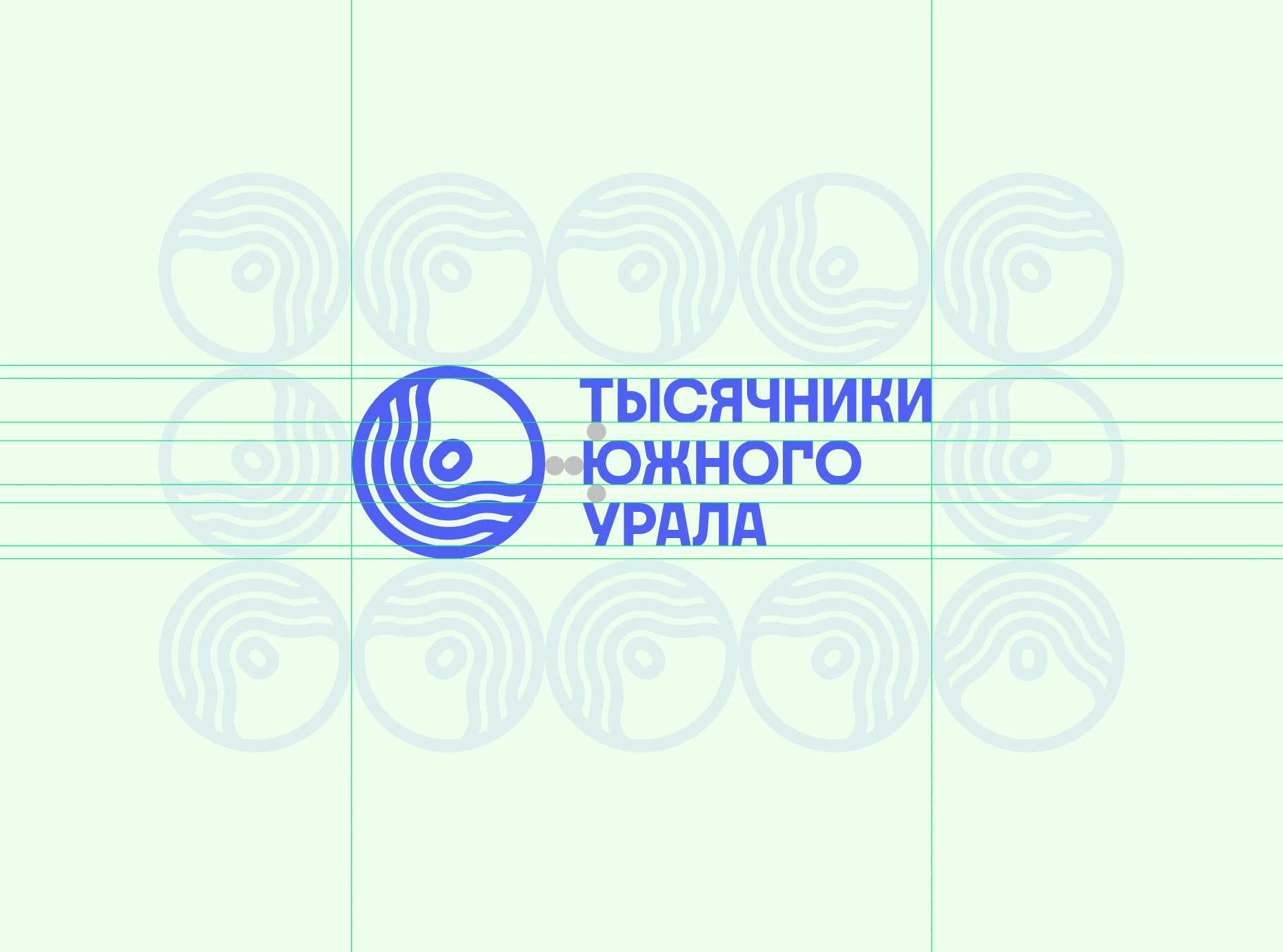
The topographic symbol and the project name are brought into one compact composition.
Approach
Start with the terrain—and the reason people return to it.
I analyzed the project and dozens of related portals and outdoor projects, looking at how they presented places, activities, and communities.
The direction grew from two connected subjects: the mountains themselves and the hikers who move through them. Topographic mapping provided a visual language that belonged to the project’s purpose and could extend beyond a single logo.
Three principles guided the work:
— Ground the identity in a real place
Build the concept from the Southern Urals, giving the mark a specific connection to the region.
— Connect the landscape with its explorers
Reflect both the terrain and the people whose journeys give the project meaning.
— Make the logo a starting point
Develop forms, colors, and typography that could carry the identity across the portal and physical materials.
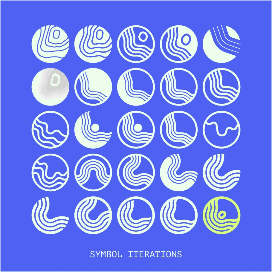
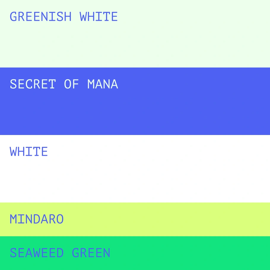
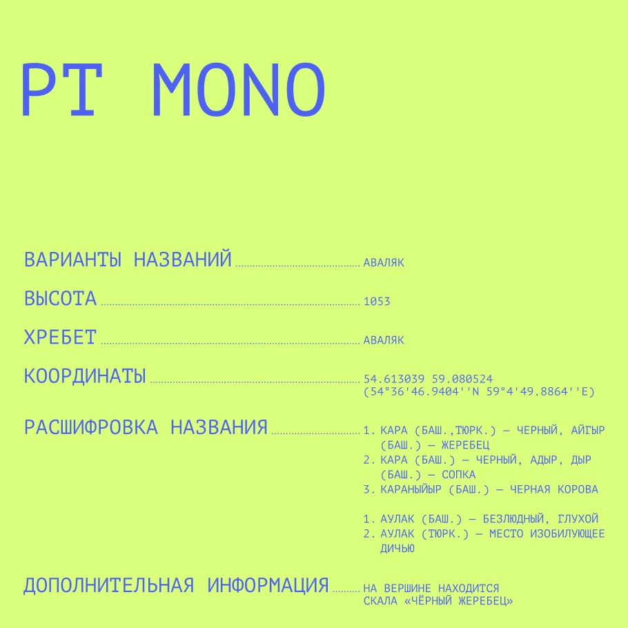
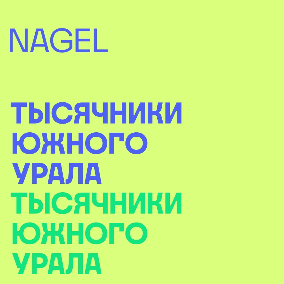
Symbol explorations, a bright palette, and the PT Mono and Nagel typefaces.
Solution
A topographic mark with a human presence.
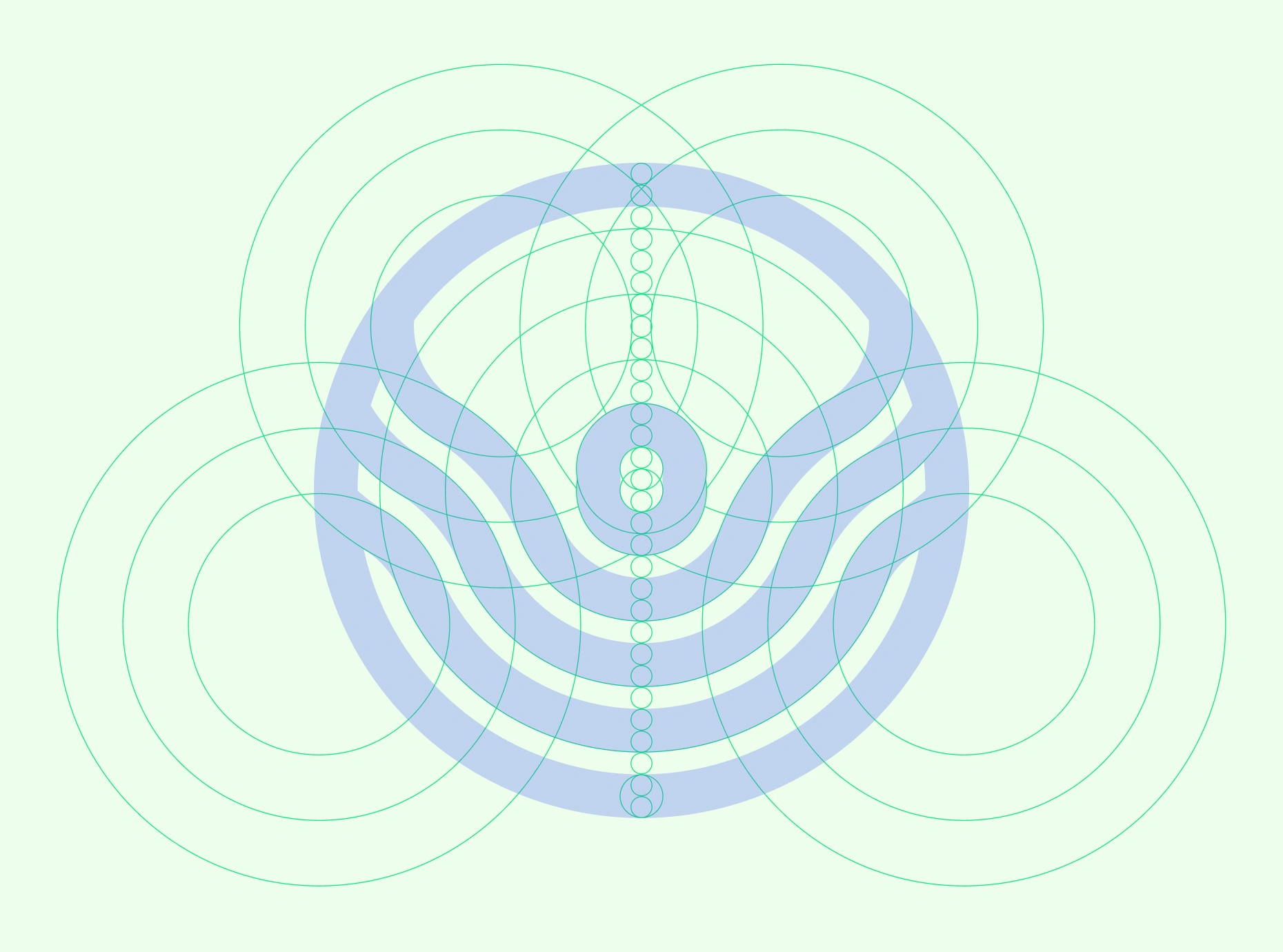
The logo draws on the topographic map of a Southern Urals mountain. Its contour lines become a compact, rounded emblem that connects the identity with elevation, mapping, and the landscape.
The form can also be read as a hiker, bringing the person and the mountain into the same symbol. This second reading connects the project’s catalog of places with the experience of visiting them.
The symbol sits alongside a bold, stacked rendering of the name. It can also work independently where space is limited or the full name is unnecessary.
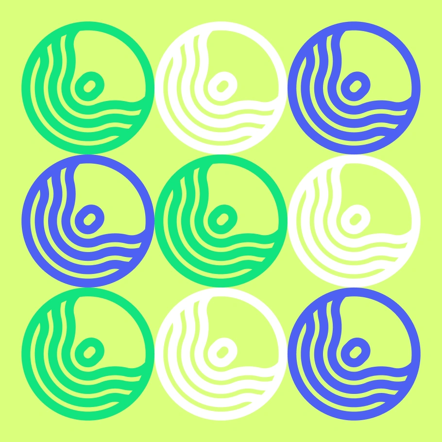
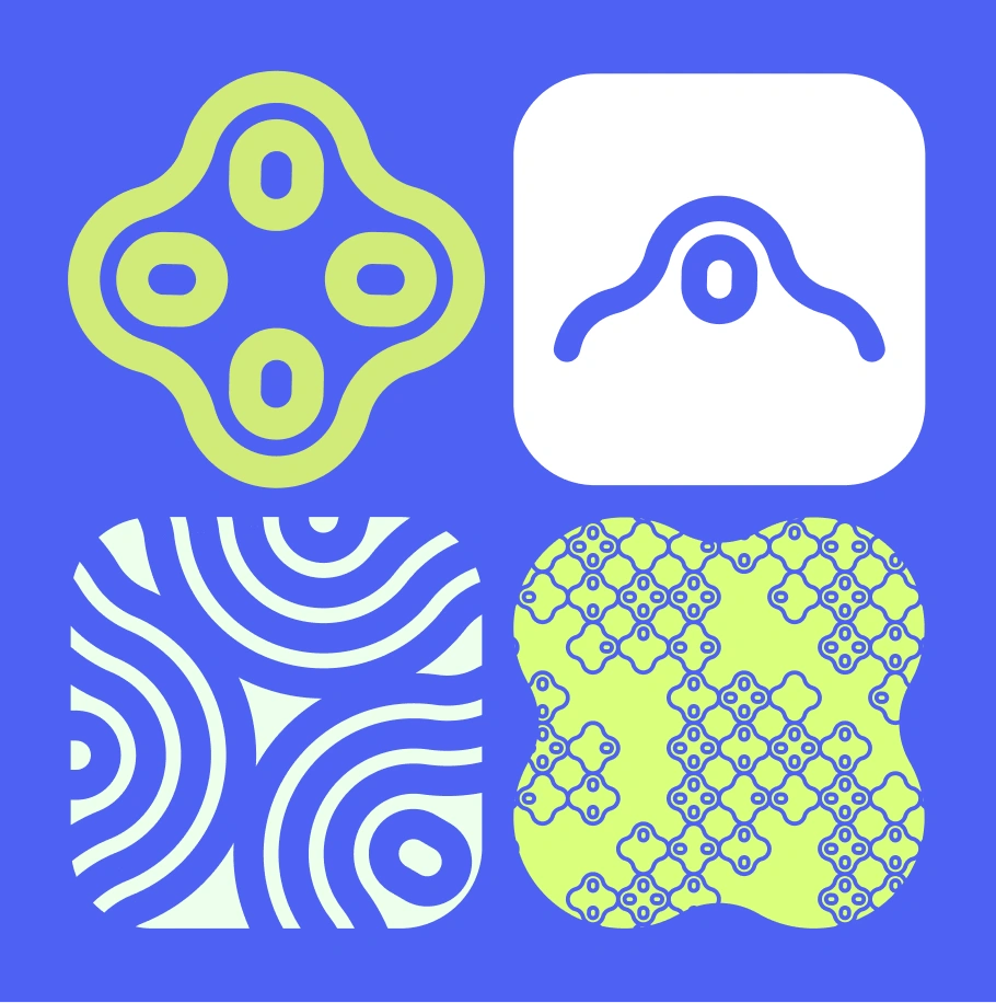
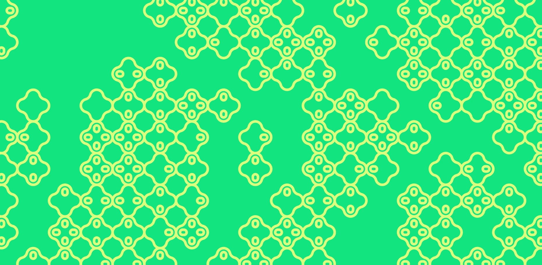
The logo expands into repeated marks, contour-derived elements, and patterns.
Beyond the main composition, the logo becomes a source of graphic elements. Its contour lines can be enlarged, cropped, repeated, and rearranged into patterns. These variations retain the character of the mark while allowing different materials to have their own rhythm.

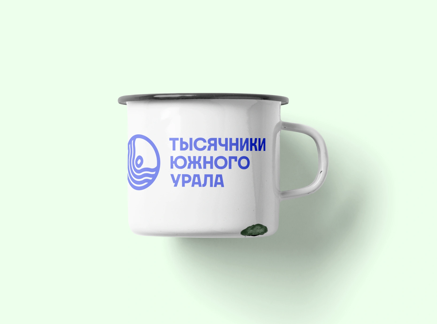
Application studies connect the identity with familiar hiking objects.
Blue, bright lime, and green give the identity an energetic palette, balanced by pale backgrounds, white, and near-black. The combinations support both quieter informational layouts and more expressive applications.
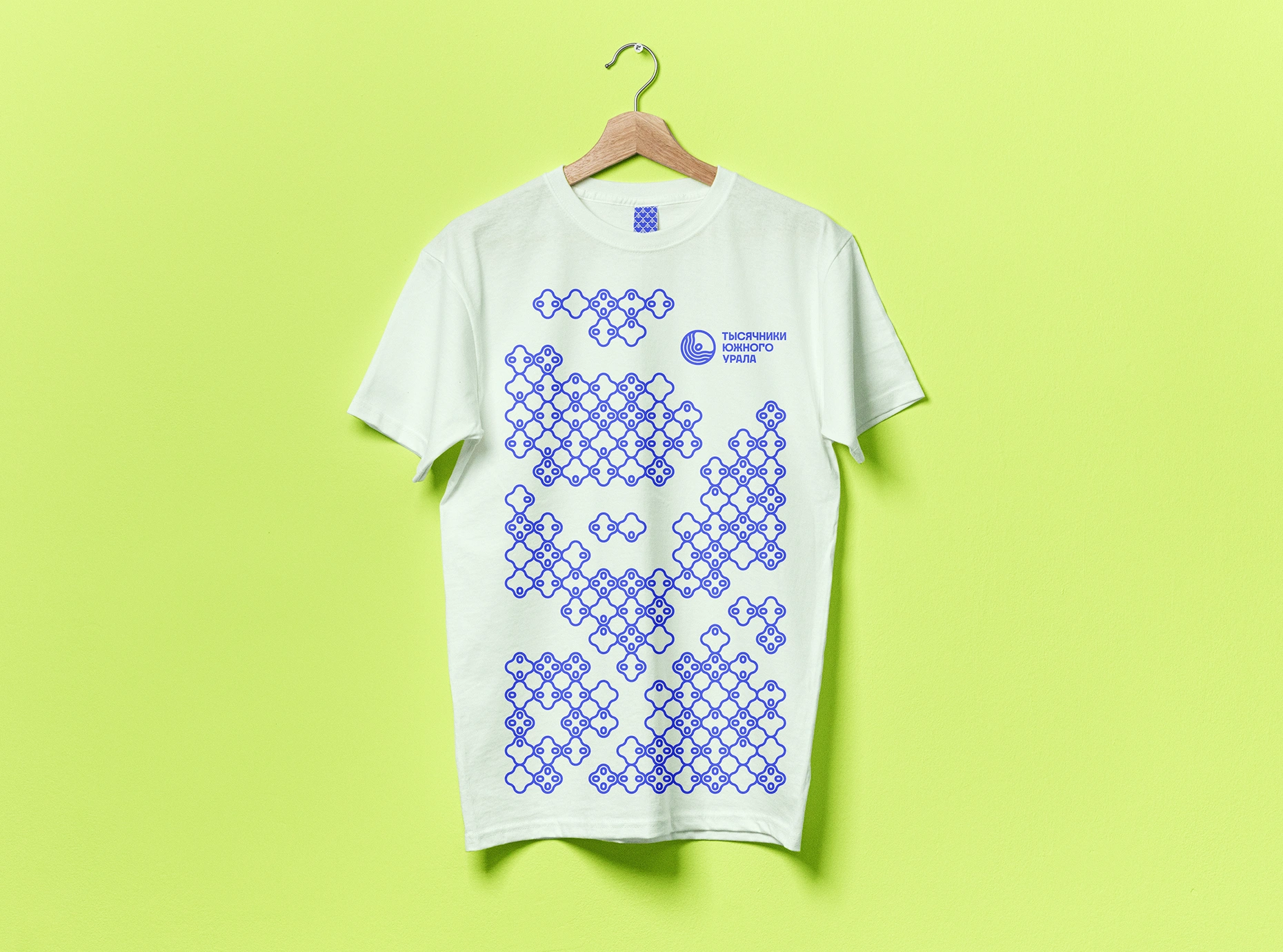
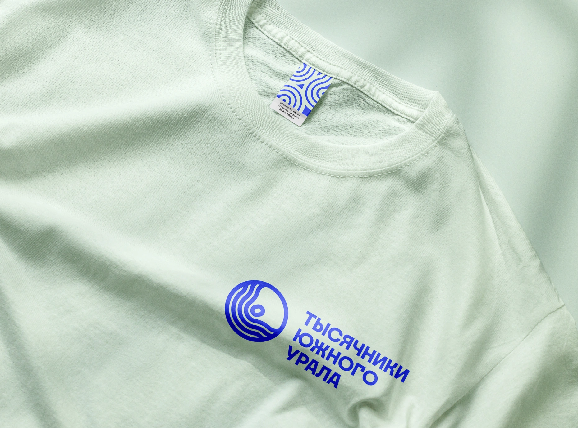
The same identity moves between an all-over graphic and a small identifying detail.
Nagel gives the name and headings a distinctive typographic character. PT Mono provides a structured counterpart for information such as summit heights, coordinates, and other peak data, connecting the visual identity with the portal’s practical content.
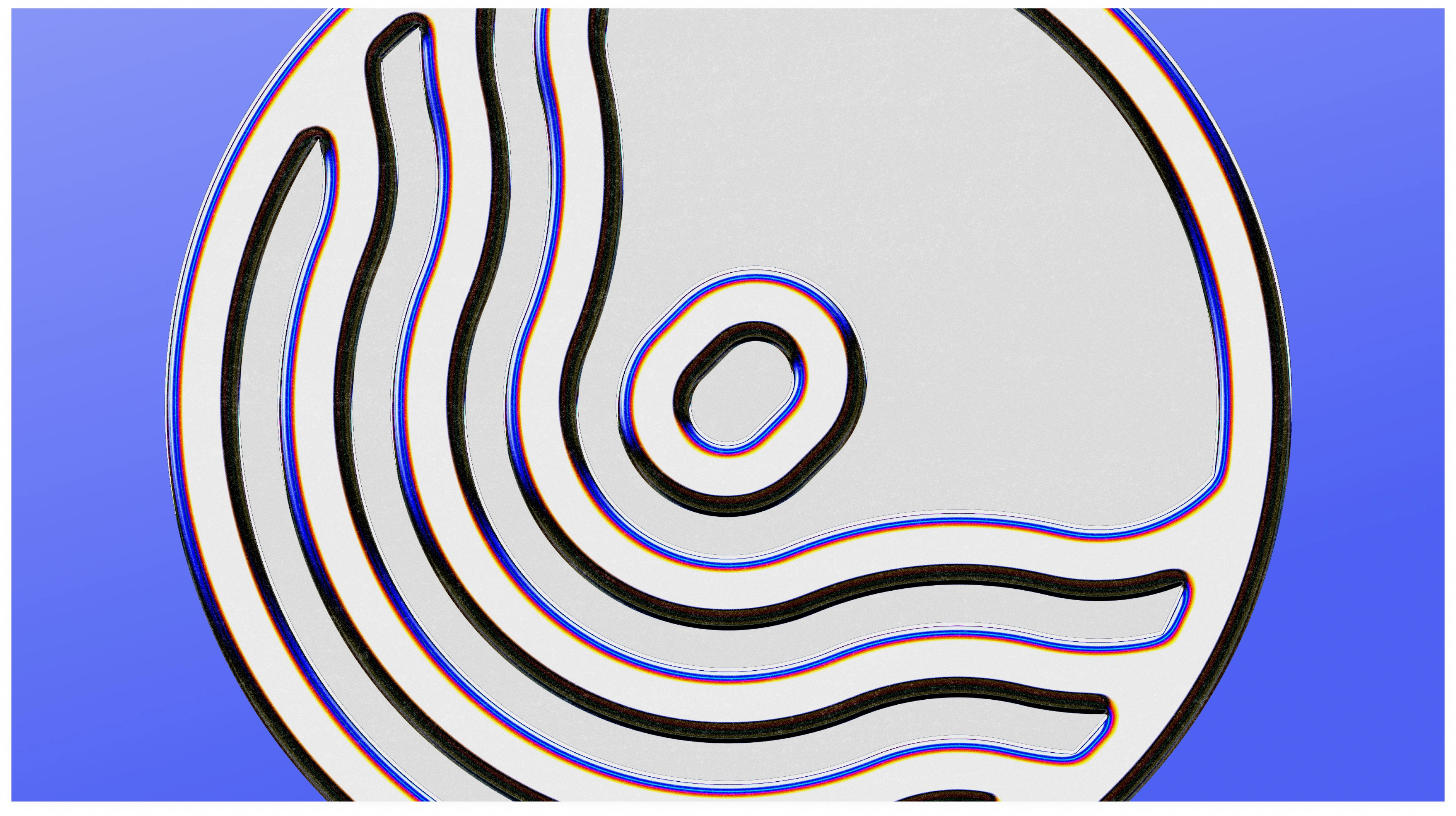
A closer look at the contour-based emblem.
Application studies across T-shirts, bucket hats, bottles, mugs, and stickers demonstrate how the same elements can adapt to different surfaces. Some use a small identifying mark; others turn the contours into an oversized graphic or an all-over pattern.
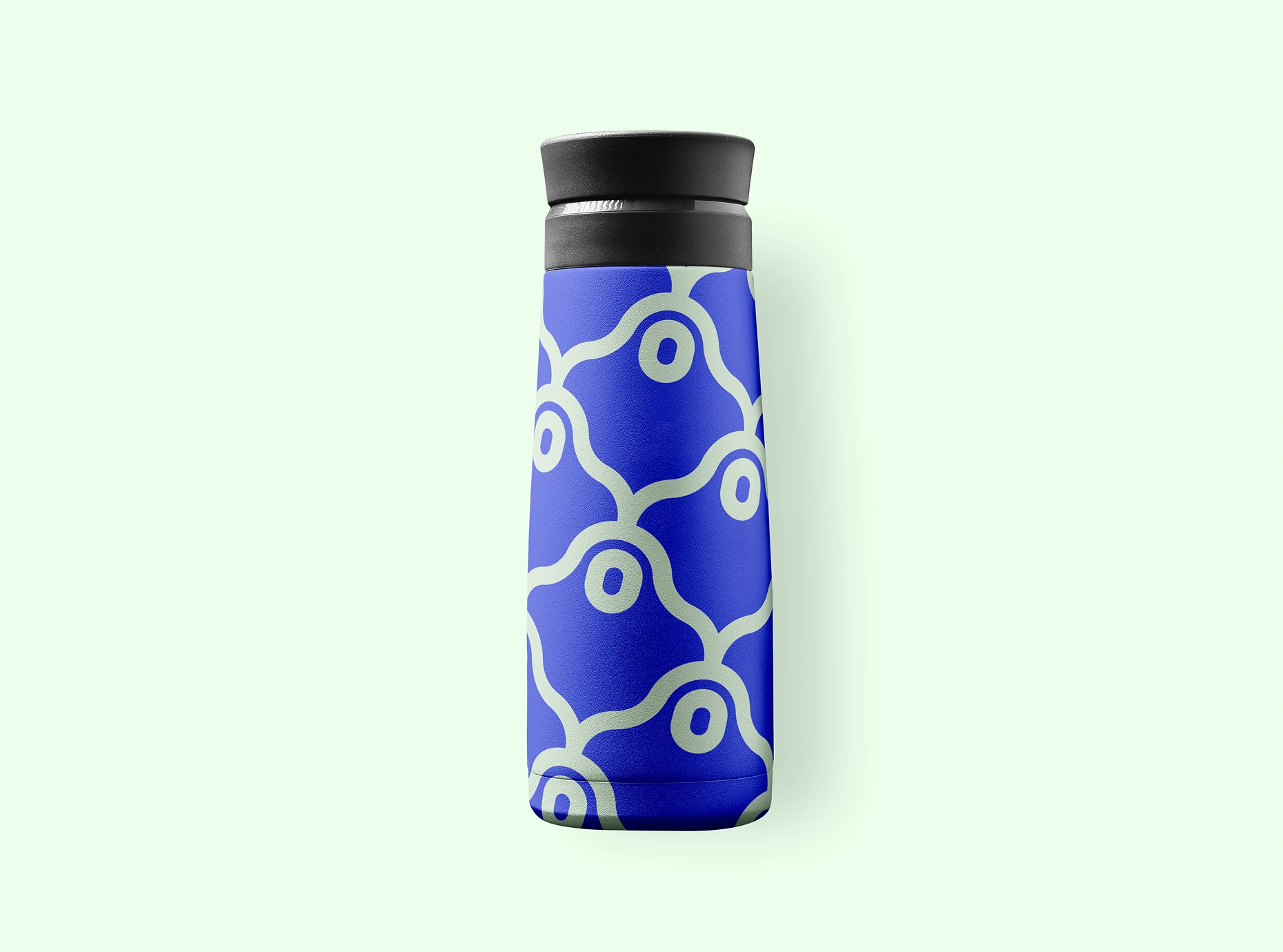
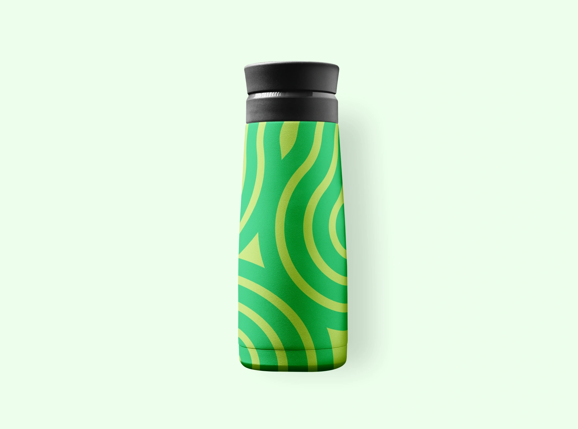
Two treatments of the contour language on insulated bottles.
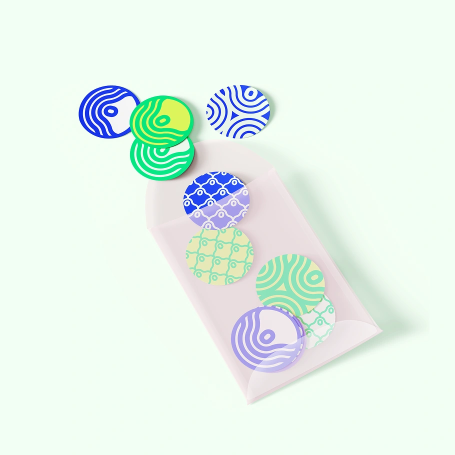
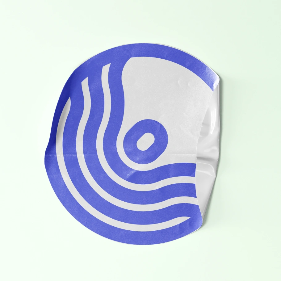
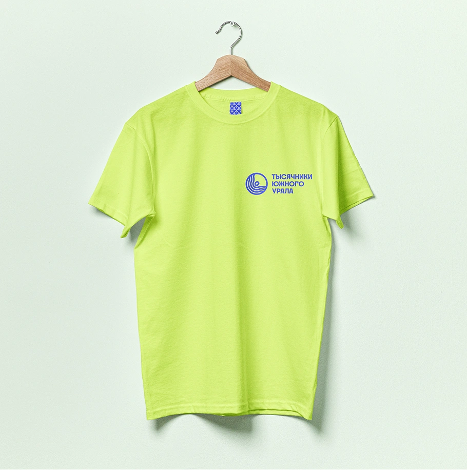
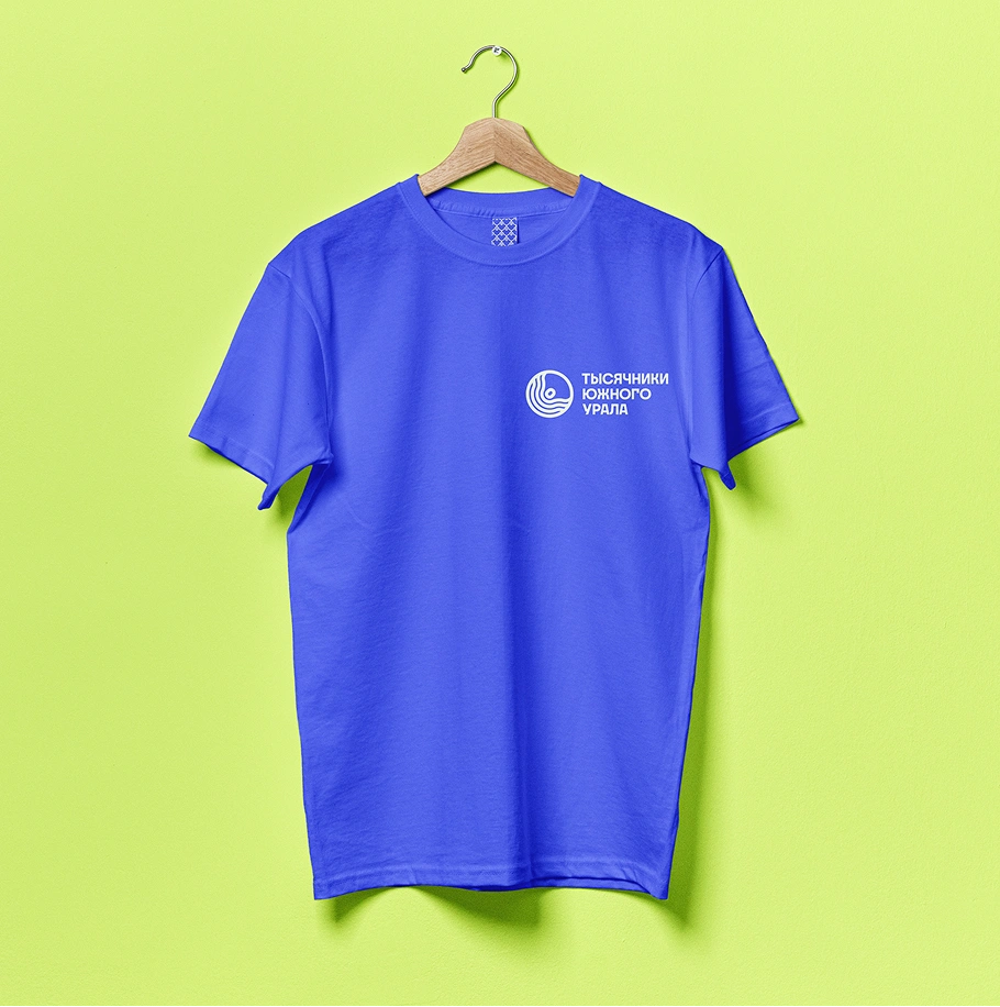
Stickers, a patch, and T-shirts explore ways to express a shared connection to the project.
Result
A recognizable foundation for a growing hiking project.
Southern Urals Thousanders gained a logo and basic visual identity grounded in its own subject: the relationship between mountain landscapes and the people exploring them.
The mark, palette, typography, and patterns provide a consistent starting point for digital communication and future physical applications. Together, they give the project a way to express a shared connection beyond the act of recording an ascent.
The result is an identity that brings terrain, exploration, and participation into one visual language.