
Context
Built on reliability, not big promises.
VIARTEK was entering a crowded market with a straightforward ambition: supply quality metal-cutting tools, provide practical technical support, and make customers’ work easier.
The team wanted to establish its identity early rather than revisit it as the business grew. With engineers and procurement specialists making considered purchasing decisions, the brand needed to communicate technical competence and dependability—not simply look new.
The Challenge
Technical without the clichés. Ambitious without overpromising.
VIARTEK wanted an identity that felt sharp and technologically progressive, but rejected familiar industrial shorthand such as gears.
The founders’ interest in space and futuristic imagery added another tension: the brand could look forward, but still needed to feel credible to people working with real tools, specifications, and production constraints.
The challenge: balance ambition with restraint—and create something distinctive enough to recognize, yet practical enough for everyday business.
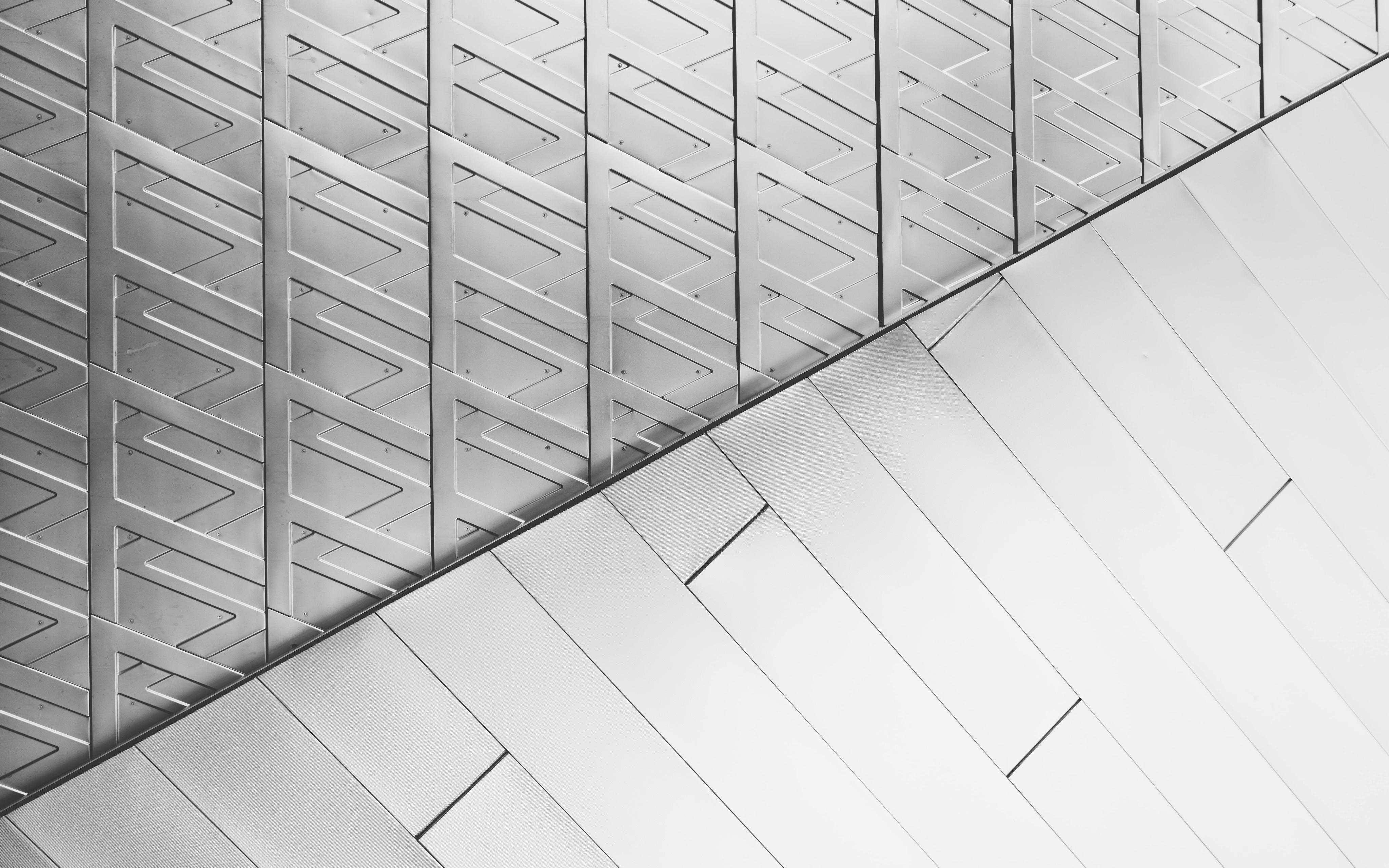

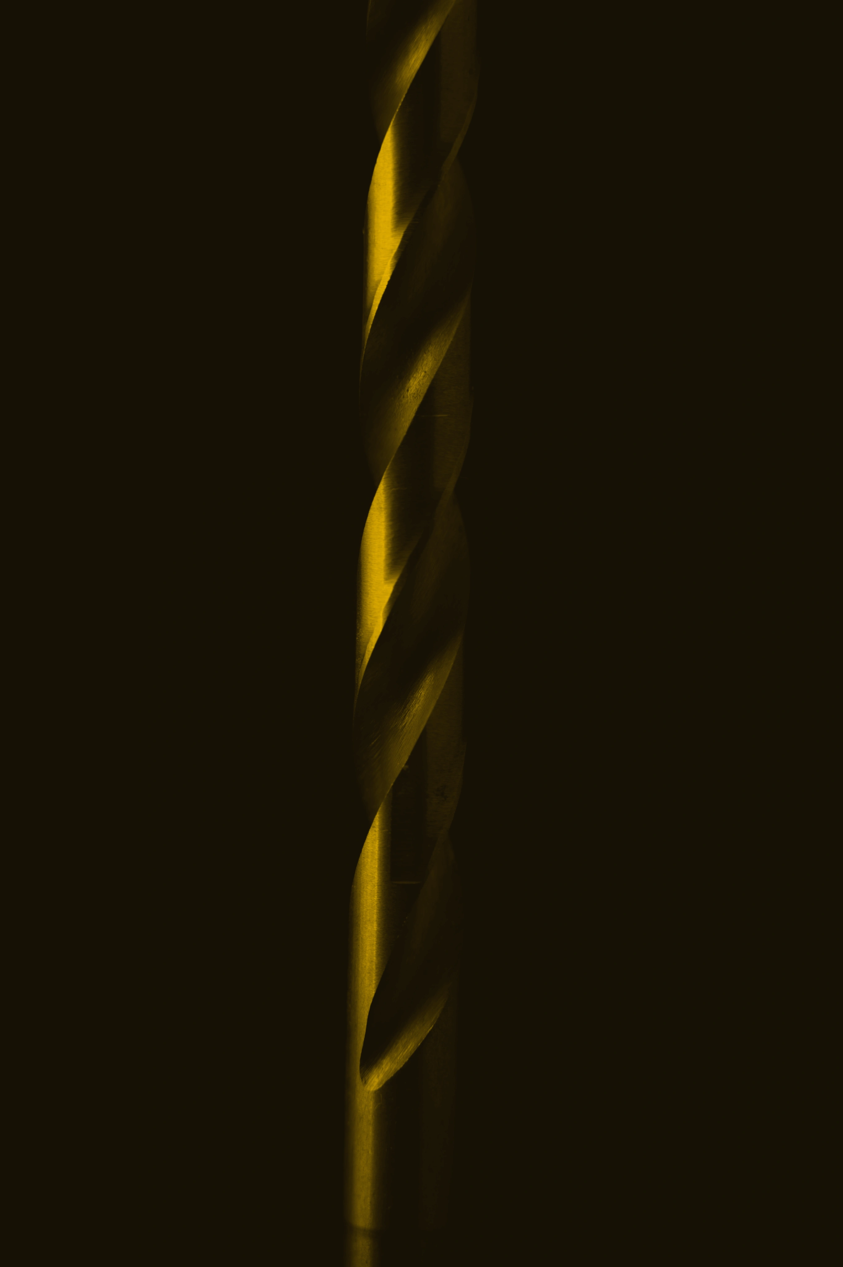
Reflective surfaces bring a more expressive, technological dimension to the identity.
Approach
Understand the category. Find a different expression.
I reviewed seven client-nominated competitors alongside roughly 80 Russian and international logos, then explored multiple visual directions and developed two concepts for presentation.
Three principles guided the work:
— Express precision, not machinery
Use sharp geometry and controlled construction to suggest technical capability without illustrating a tool or relying on a gear symbol.
— Balance confidence with restraint
Give the identity a clear visual presence while keeping it aligned with the company’s calm, dependable character.
— Think beyond the logo
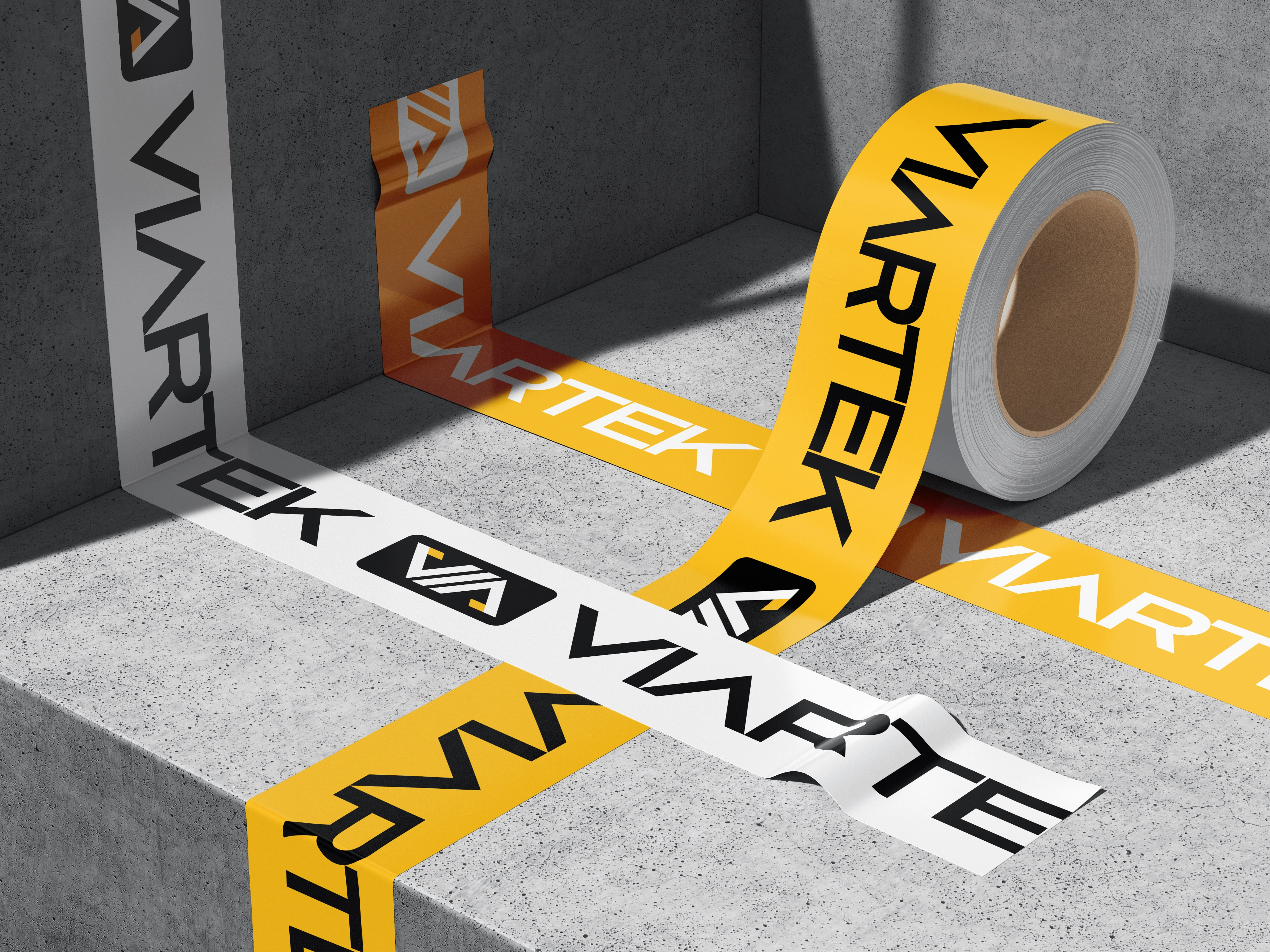
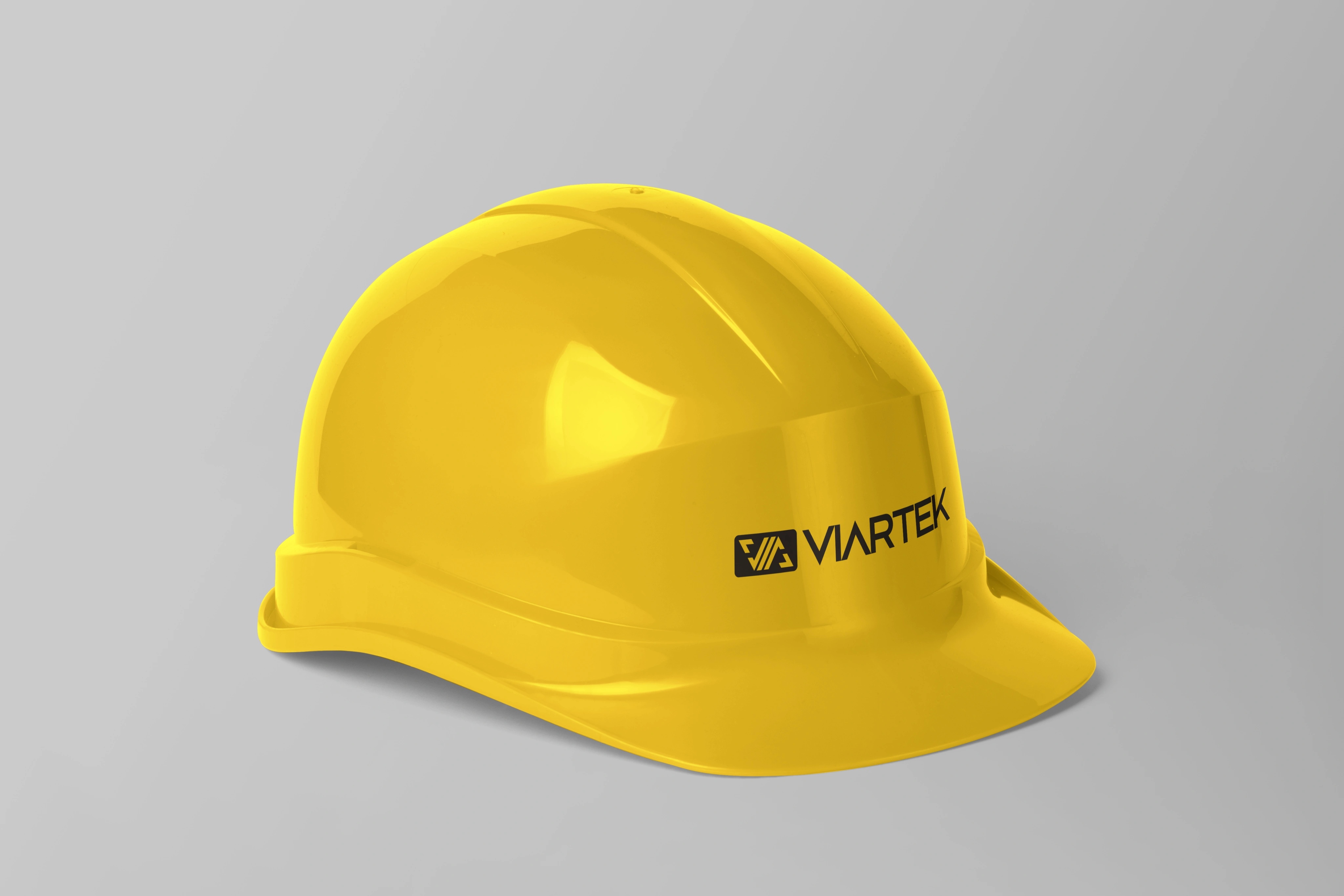
Build a visual language that could carry into business documents, catalogs, packaging, and the existing website.
Solution
A sharp core. A broader visual language.
The final identity pairs an angular wordmark with a compact geometric symbol. Repeated diagonal strokes and opposing corner forms create a sense of direction and precision, while the shared geometry connects the two without making them dependent on each other.
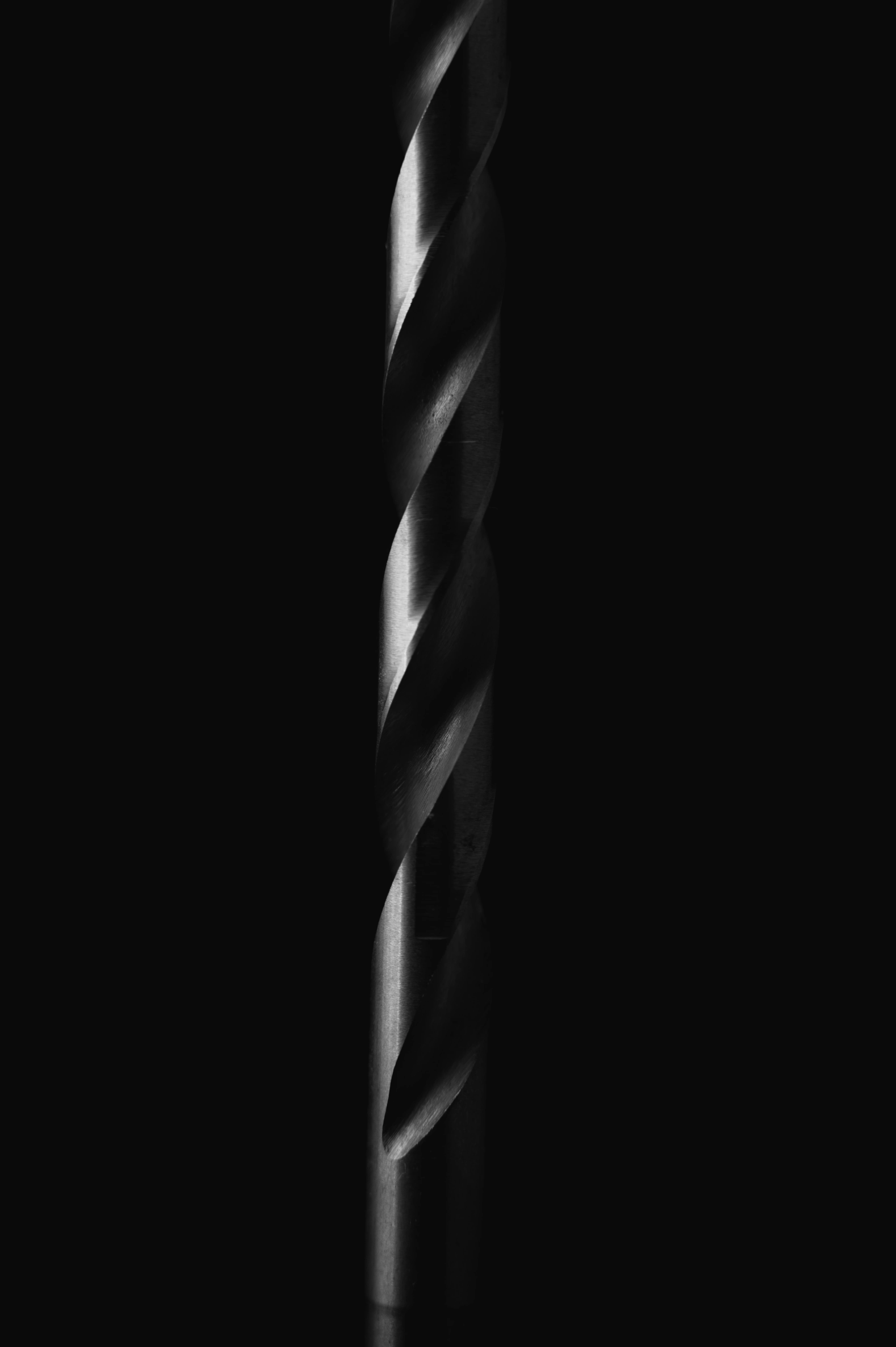
A yellow accent cuts through a restrained palette of near-black, white, and metallic grays. It adds energy and visibility while keeping the overall expression grounded.
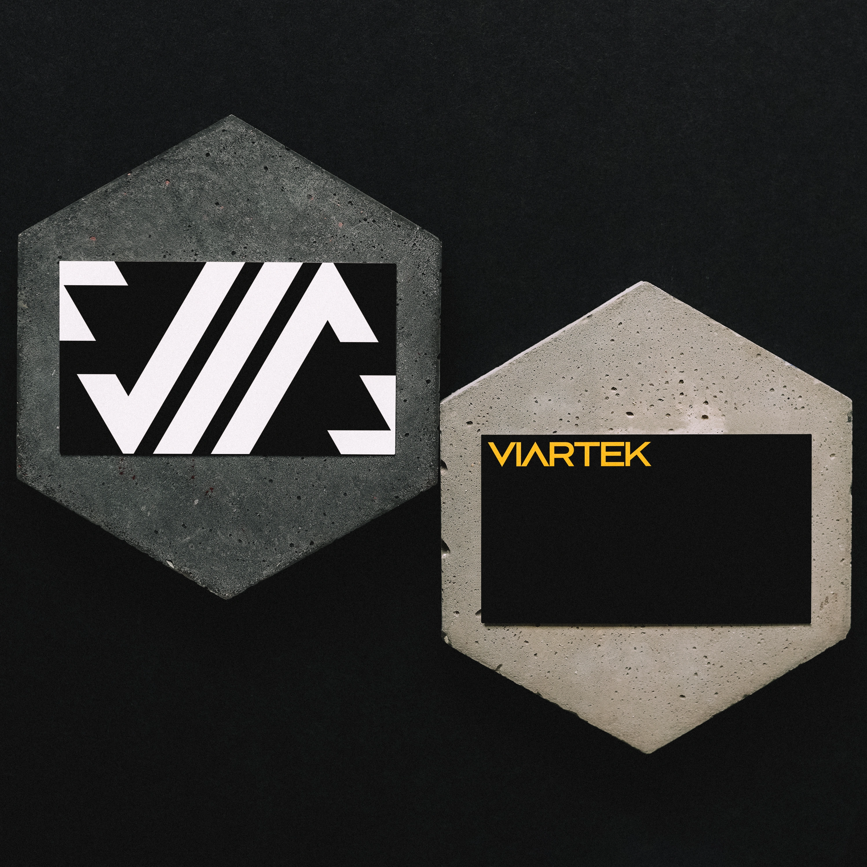
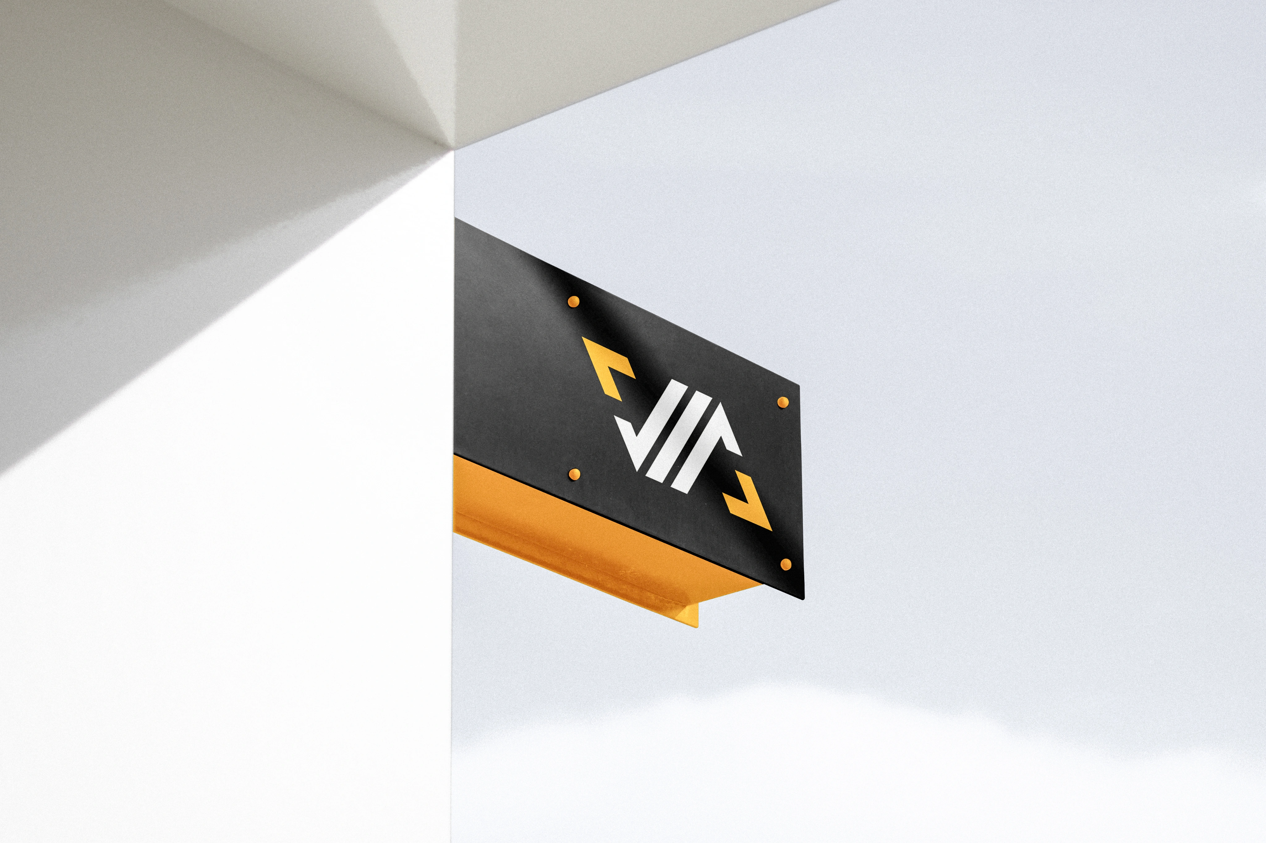
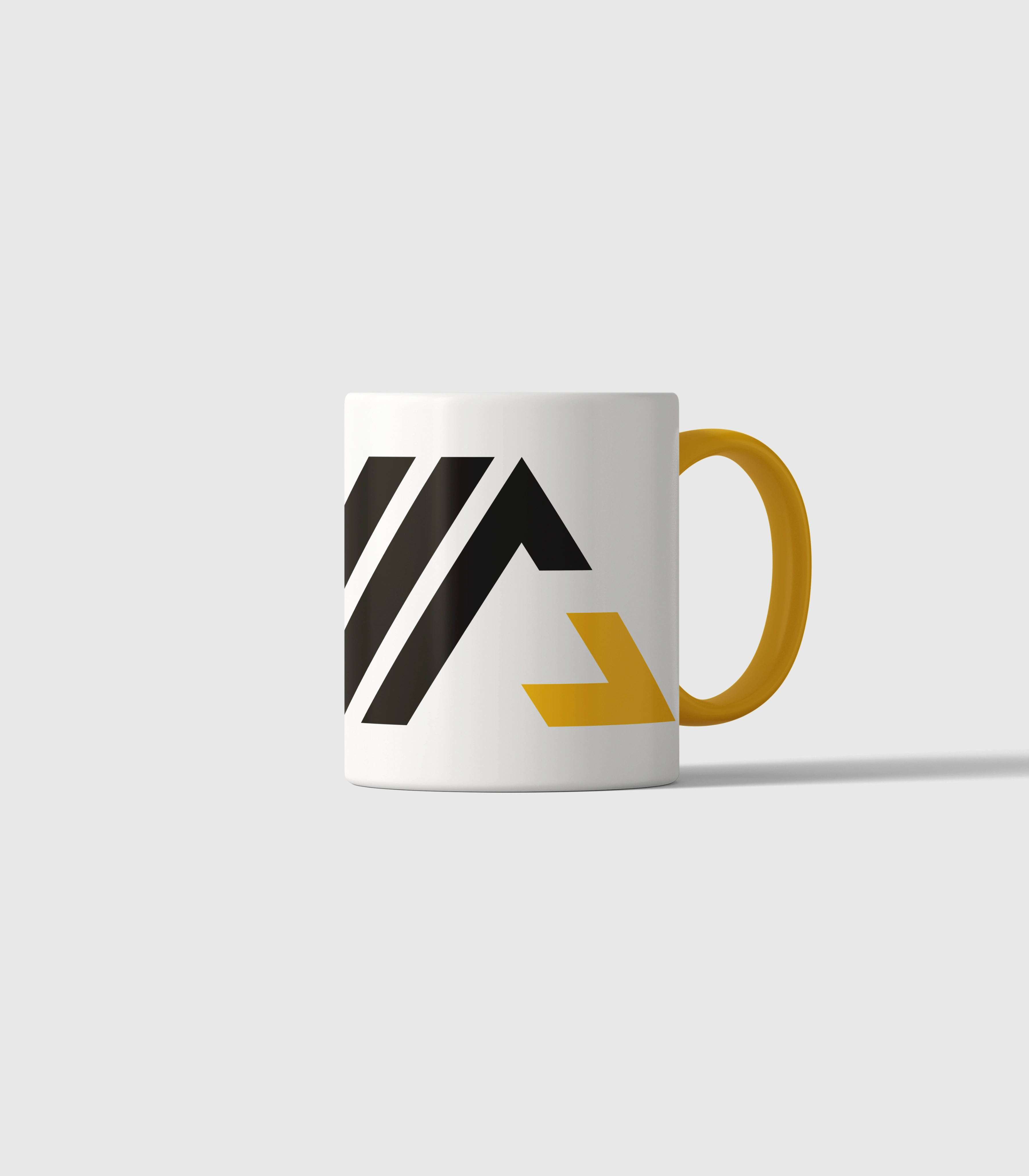
The symbol also becomes the foundation for a wider graphic language: its shapes can form repeating patterns, oversized crops, and standalone accents, allowing the identity to remain recognizable beyond the full logo.
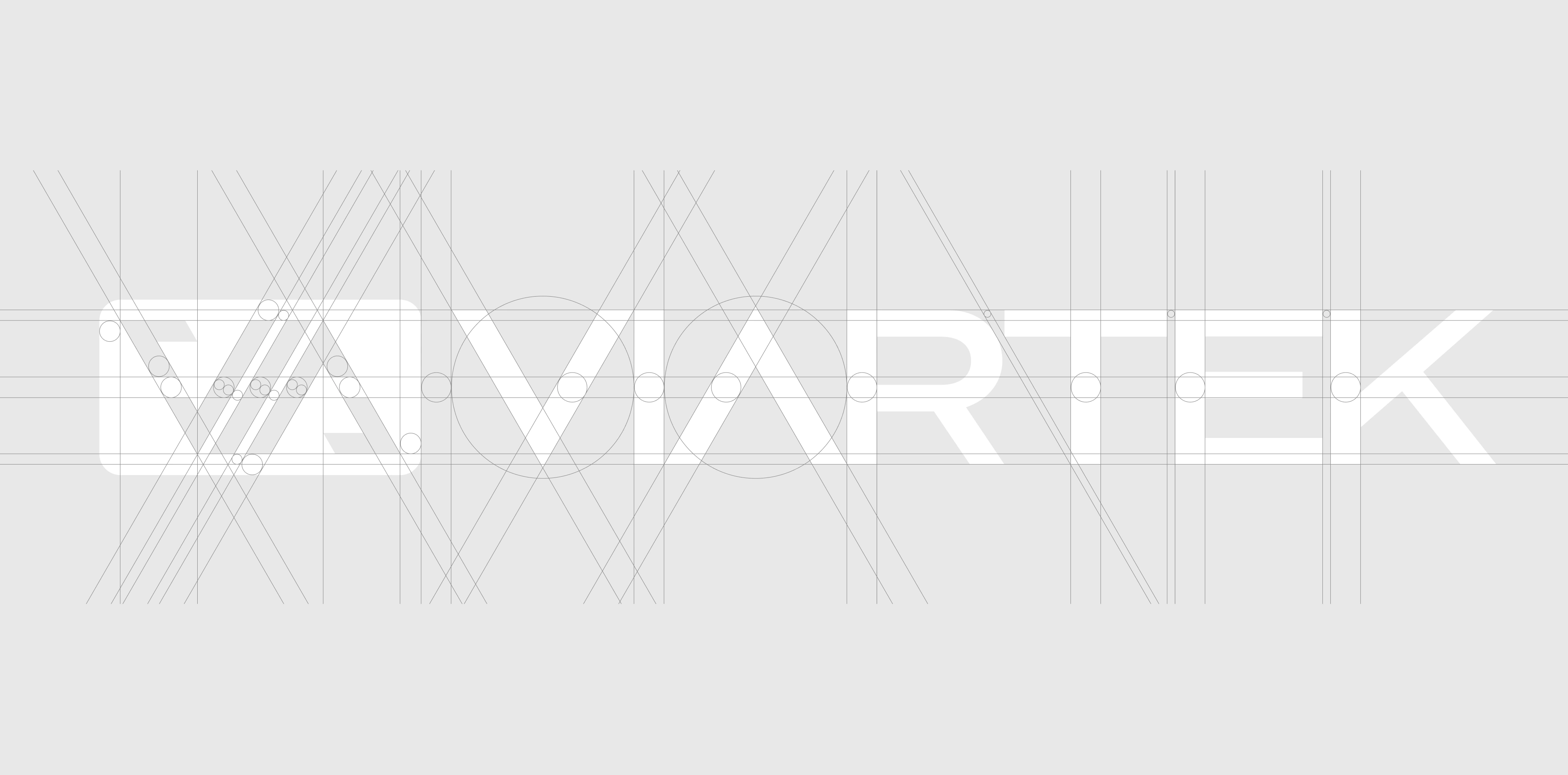
Shared angles connect the symbol and wordmark.


White
Silvery Mist
Iron
Nickel
Knight Rider
Citrus Splash
Fragments of the mark become a graphic language of their own.
Result
From an initial direction to a coherent identity.
VIARTEK began with a name, a rough visual direction, and a clear sense of how it wanted to work with customers.
The project translated those starting points into a defined logo, color palette, typographic direction, and supporting graphic language—a foundation for consistent communication across digital and physical applications.
The result gives the young business a recognizable presence without making claims its identity alone cannot prove.