

Context
A packaging request became the starting point for a brand.
Sen Juu is a laundry detergent brand from Kyrgyzstan, created by an entrepreneur developing his own washing powder.
The client initially approached me for packaging design. As we discussed the project, it became clear that the work needed to start earlier: the product had a working name, Ona Plus, but no logo or visual identity to guide a consistent range of packaging.
Research also revealed repeated use of Ona and Ona Plus. We moved to Sen Juu and developed a visual foundation that could support the detergent and future household-care products.
The Challenge
Make a new household brand recognizable and approachable.
The packaging needed to attract attention in a crowded category while giving customers a clear introduction to an unfamiliar product.
The client wanted a bright, honest, and friendly character. Family care was an important part of the brief, with a gentle reference to children while remaining relevant to a broad household audience.
The identity also needed to adapt to different pack sizes and formats, keeping the brand recognizable as the product range developed.
The challenge: create a distinctive brand and packaging system that combined strong shelf presence with a warm, approachable character.


From the wordmark’s construction to its finished stacked form.
Approach
Understand the category before defining the expression.
I analyzed the product and dozens of household-care brands sold through retailers across Central Asia. This helped establish the visual context in which the packaging would appear and identify opportunities for a recognizable direction.
The research informed the naming decision and a moodboard agreed with the client. From there, I developed the logo, symbol, colors, typography, and packaging applications.
Three principles guided the work:
— Make the name prominent
Give Sen Juu a clear visual presence that could remain consistent across different packaging formats.
— Express friendliness through form
Use rounded shapes and an approachable character to reflect the family-oriented brief.
— Build consistency into the range
Establish a small set of recognizable elements that could adapt to different sizes and future products.
Solution
A bold wordmark with a friendly elephant at its heart.
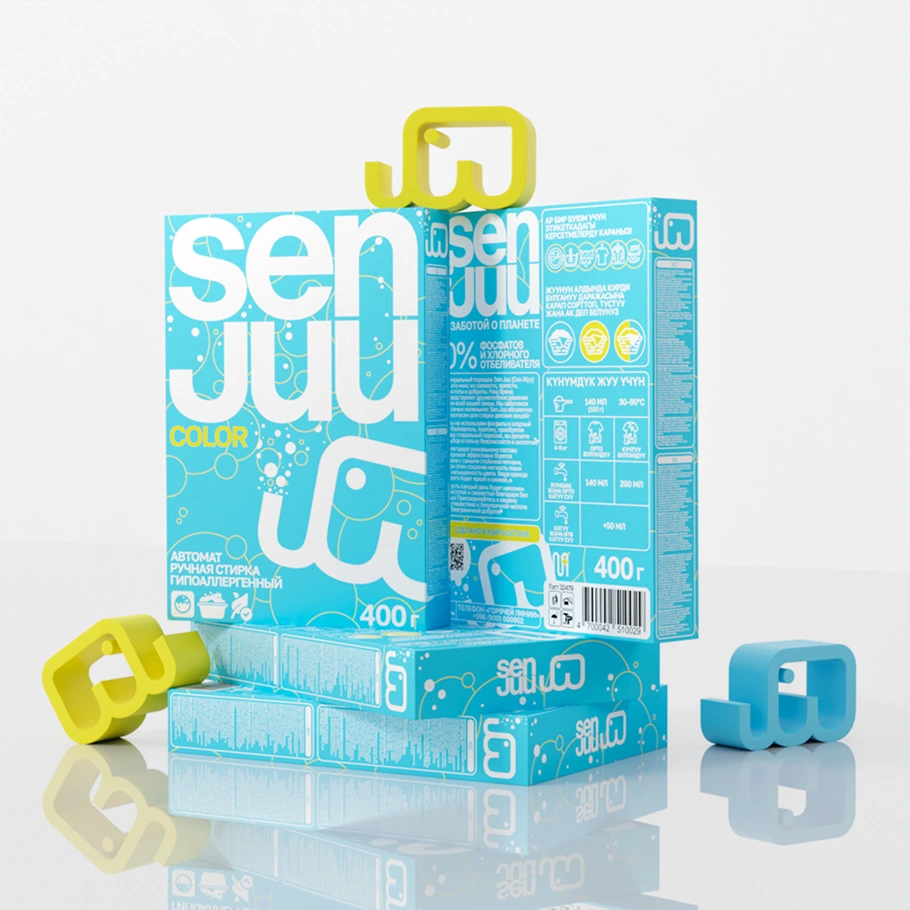
The logo uses a stacked, lowercase wordmark. Its large, rounded letterforms give the name a direct presence on the packaging and establish the softer character of the identity.
Alongside it, I developed a simple elephant symbol whose shape also resembles the letters “JUU.” This connects the character to the name, giving the brand an identifiable graphic that can work independently of the full wordmark.
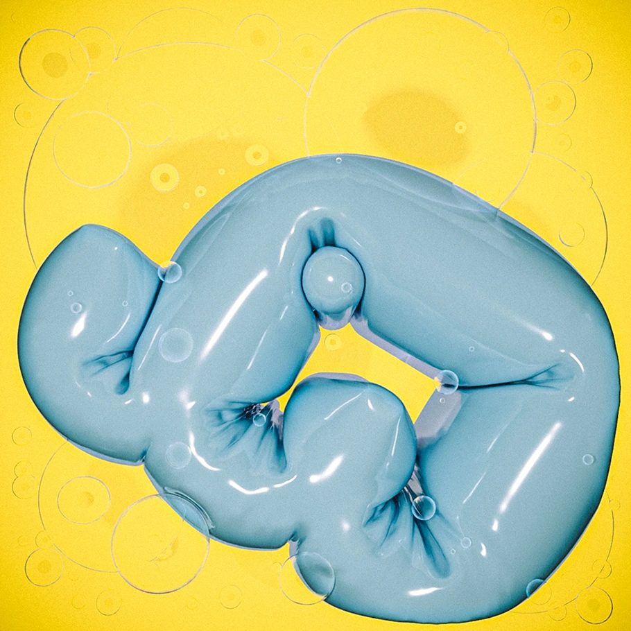
The elephant appears as an outline, an enlarged packaging element, and in playful three-dimensional interpretations. These treatments provide different levels of expression while retaining the same underlying form.
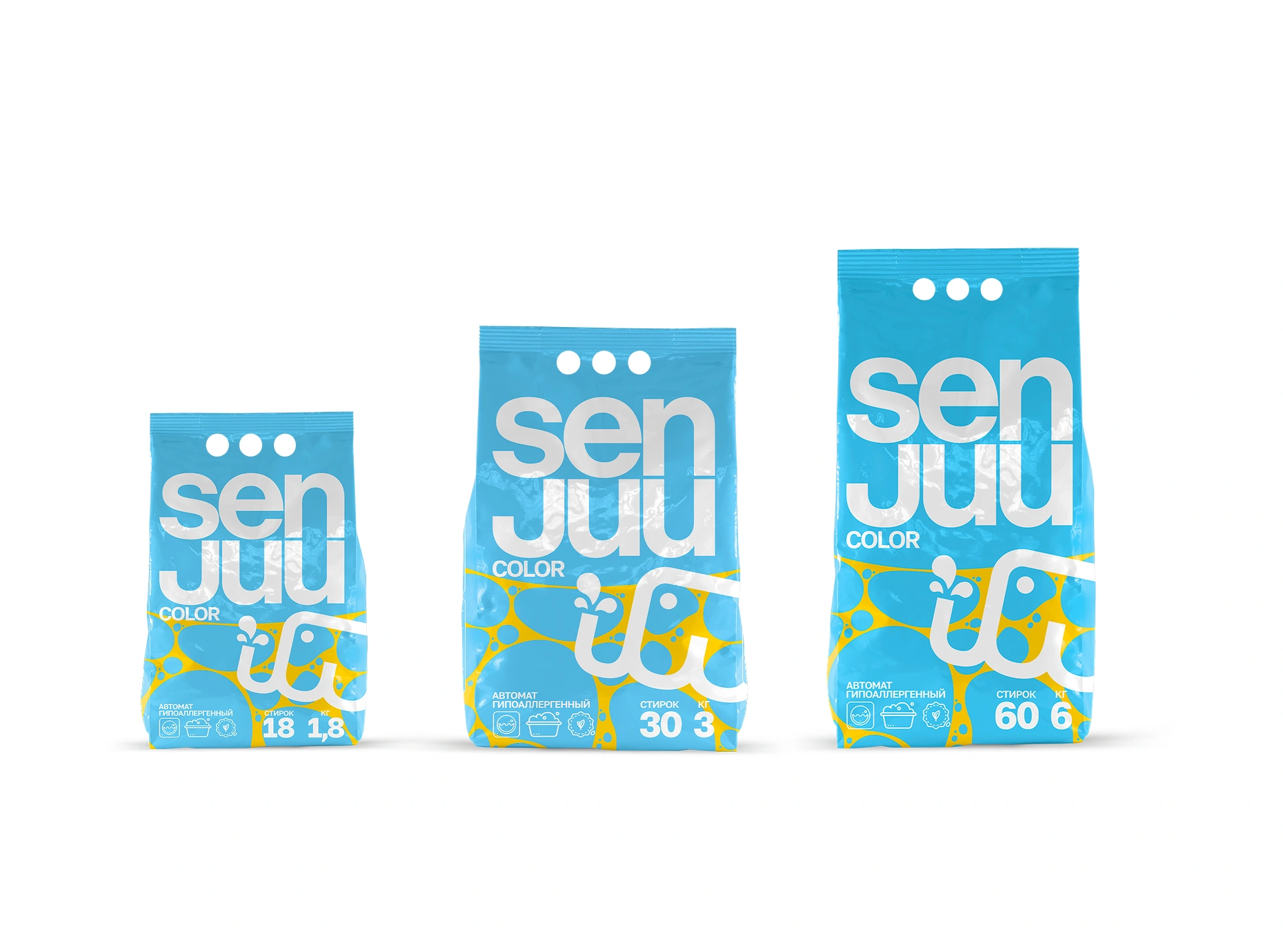
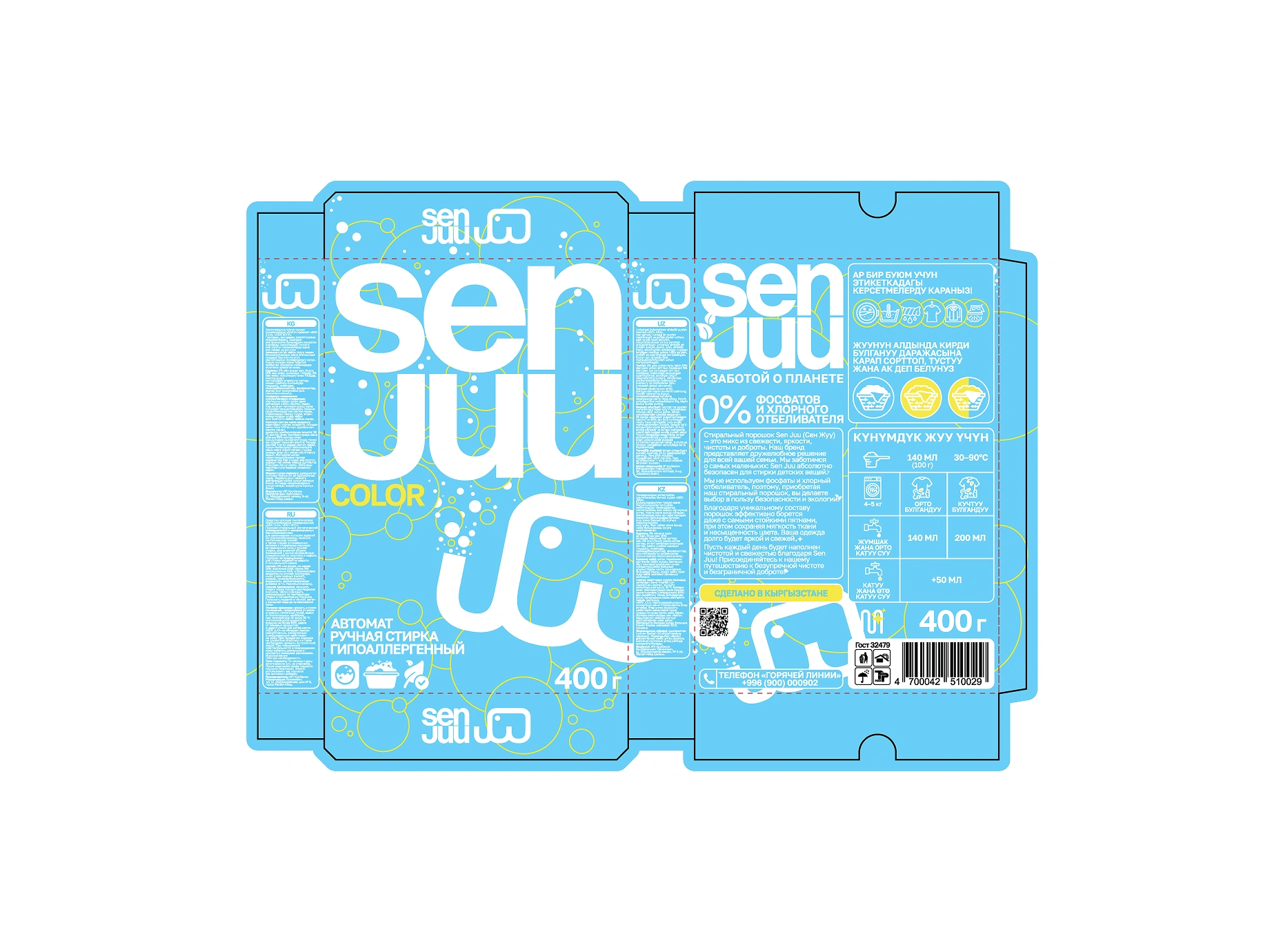
The identity adapts to flexible bags and a complete carton layout.
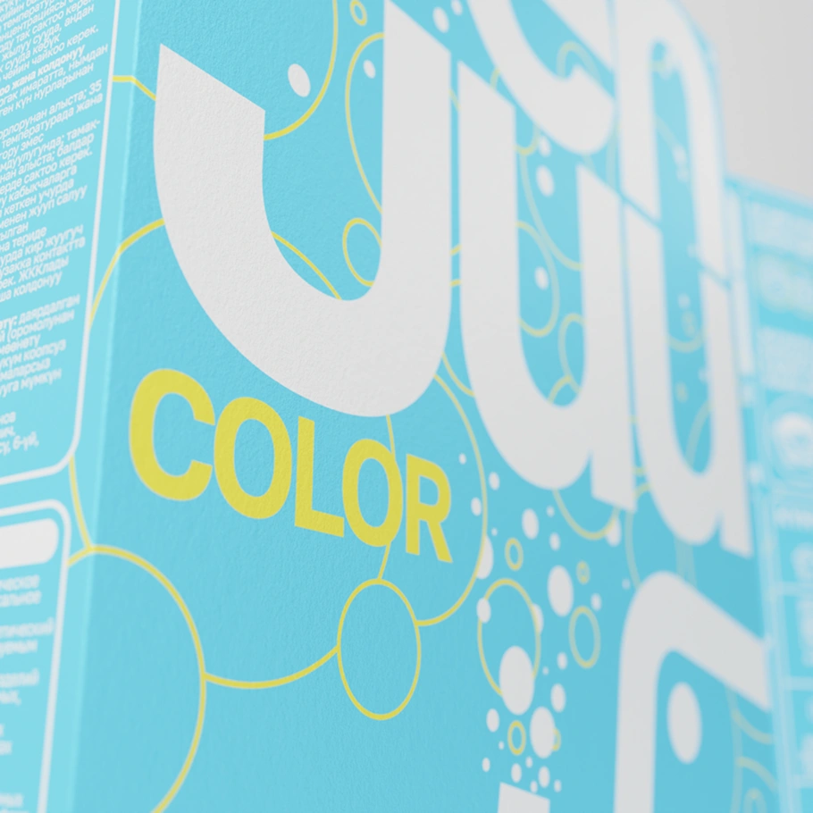
A palette of blue, white, and yellow brings the identity together. Blue provides the main field across the range, white carries the prominent lettering, and yellow introduces contrasting accents. Bubble-like circles extend the visual language through the backgrounds and supporting graphics.
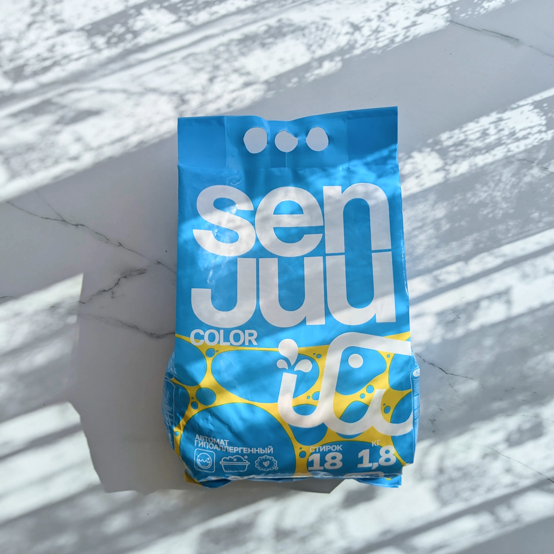
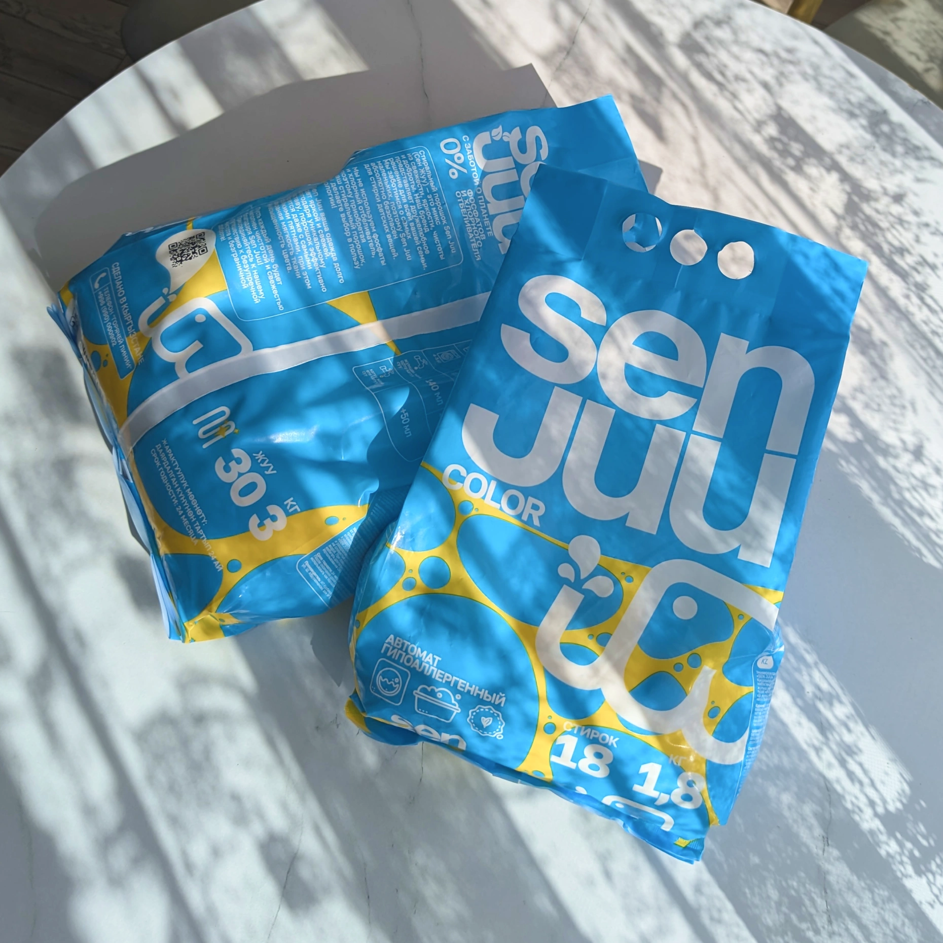
The finished packs photographed in natural light.
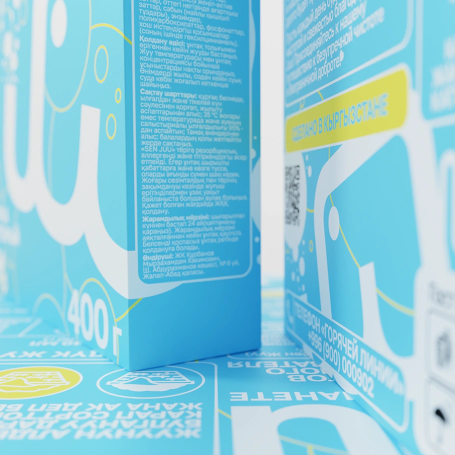
On the packaging, the oversized name establishes the first level of recognition. Product details, pack weight, and usage information sit within a consistent hierarchy around it, while the elephant and circular elements connect the different faces of each pack.
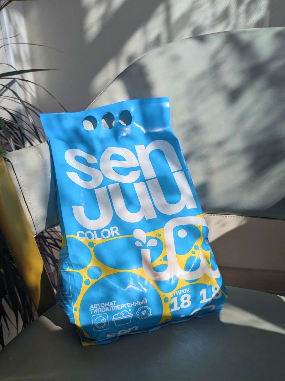
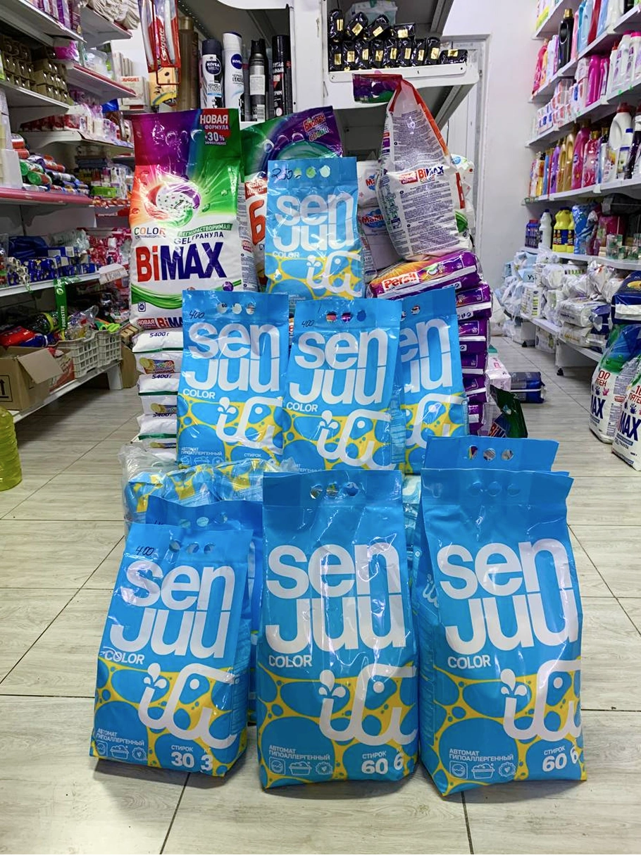
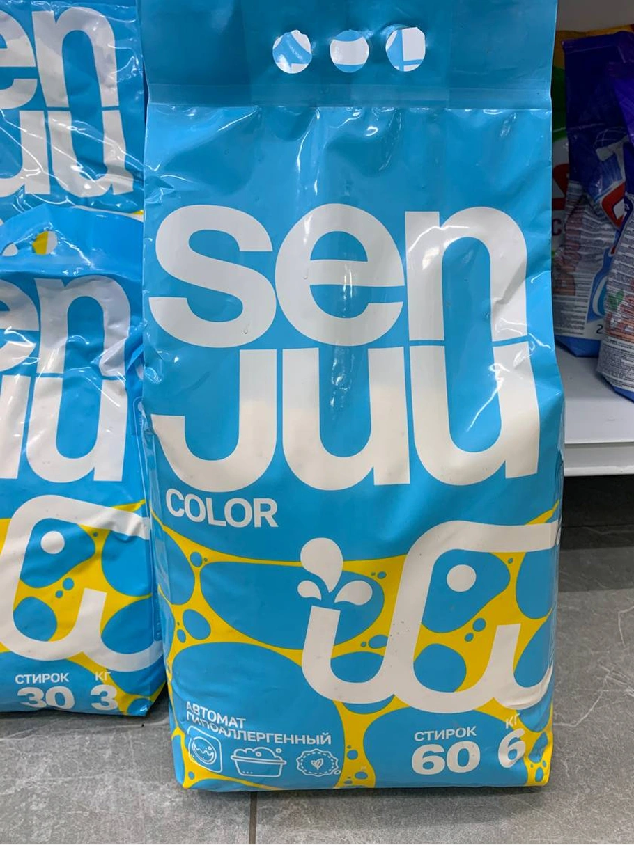
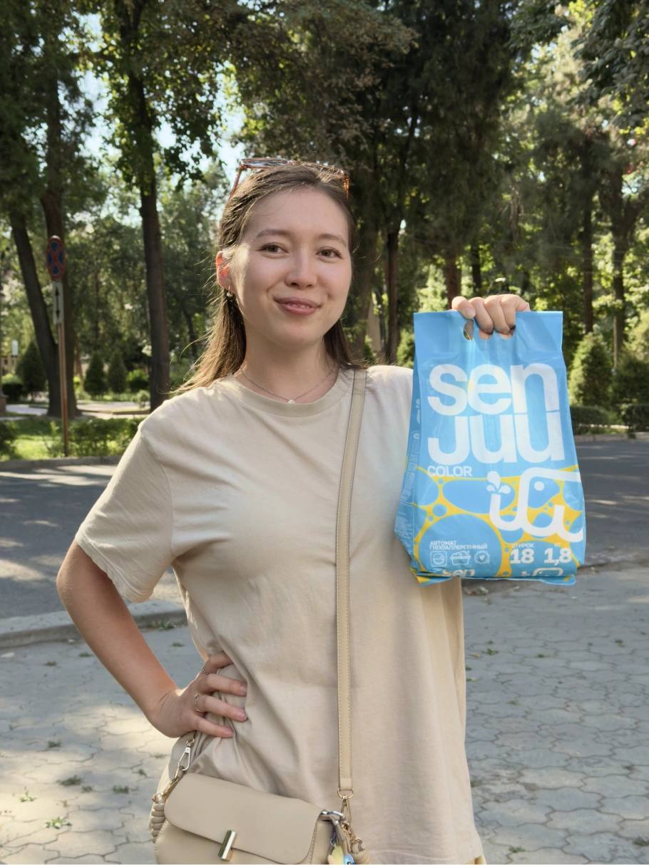
Some photos are provided by the client.
I developed designs for cartons and flexible bags in several sizes. The layout adapts to their changing proportions while preserving the same visual anchors: the wordmark, elephant, blue background, and yellow accents.
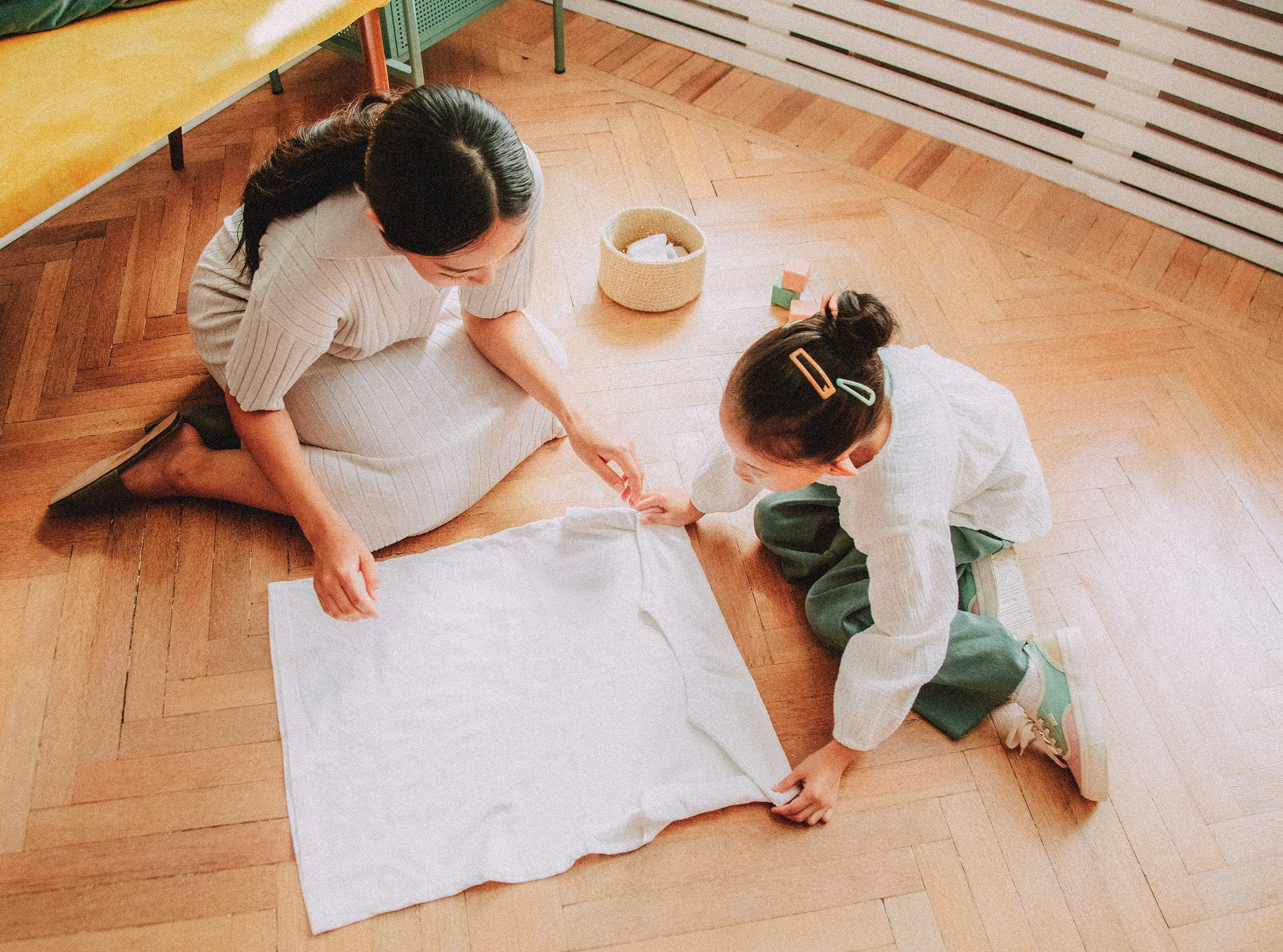
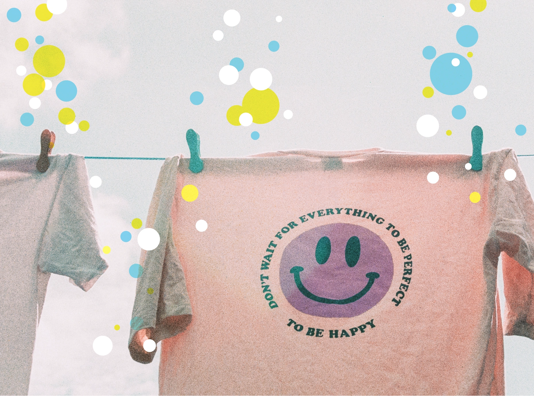
Photography references explore family routines, clothing, and a friendly visual character.
The photographic direction adds an everyday context through laundry, clothing, and family life, extending the brand’s approachable character beyond the packaging itself.
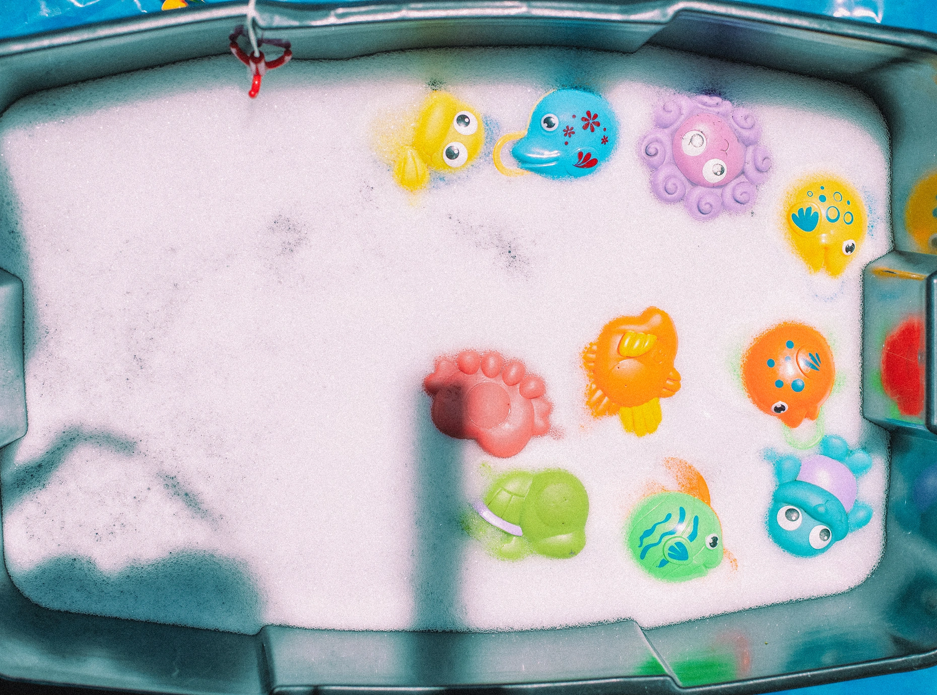
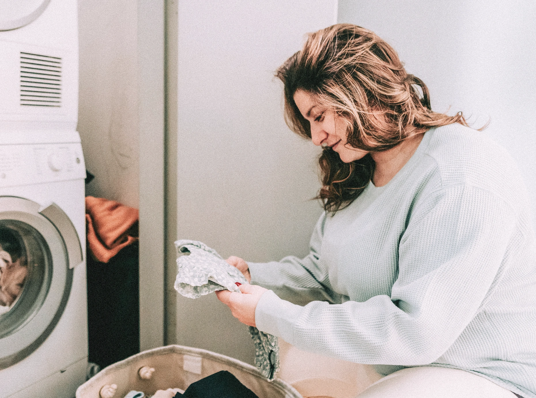
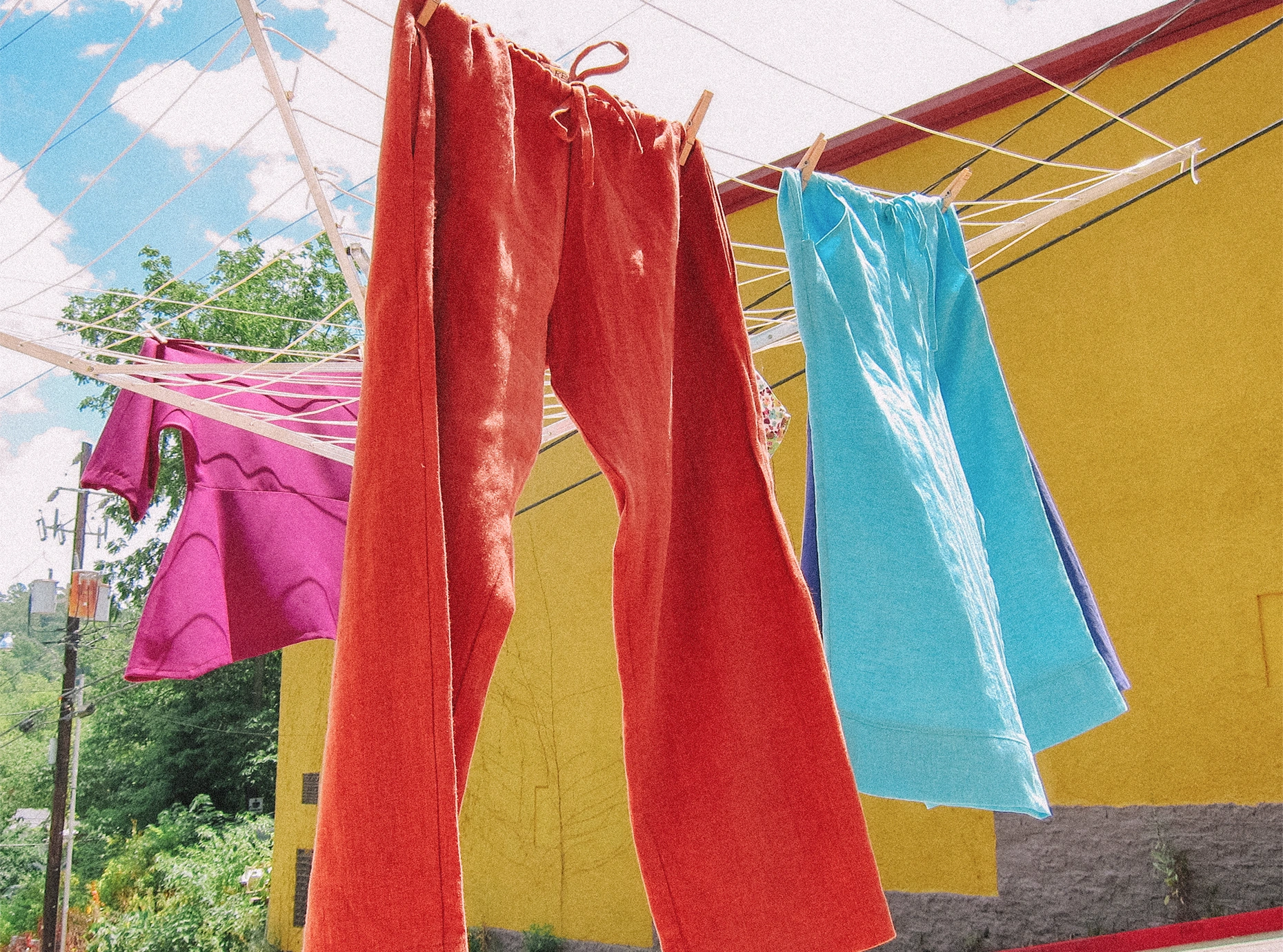

Color and familiar laundry details extend the photographic direction.
Result
A consistent foundation, carried through to the finished packs.
Sen Juu gained a name, logo, basic visual identity, and packaging designs that work together as a recognizable family.
The system gives the client a foundation for presenting the detergent across different formats and extending the range. Photographs of the produced packs show the identity carried into physical products and retail settings.
The result is a bright, approachable household-care brand with a consistent presence across its packaging.