
Context
A familiar product needed a recognizable brand.
Sanjar is a food producer from Jalal-Abad, Kyrgyzstan, building its brand around dumplings, with plans to introduce puff pastry and other products.
The client wanted to offer the convenience of a quick meal with the comforting feeling of something prepared at home. That warmth was central to how the brand should present itself.
The existing packaging was simple and outdated, and there was no developed visual identity to connect future materials. The project needed a recognizable foundation that could support both the current product and a broader range.
The Challenge
Make convenience feel warm and personal.
Sanjar was entering a competitive regional market. Its identity needed to give the name a clear presence on packaging and communicate a friendly character at first glance.
The design also needed room to grow. Dumplings were the starting point, but the brand’s planned range called for an identity that could extend naturally to other foods.
Packaging was the main application, supported by opportunities for communication and branded materials beyond the product itself.
The challenge: create an approachable food identity that combined strong recognition with the warmth of a home-cooked meal.
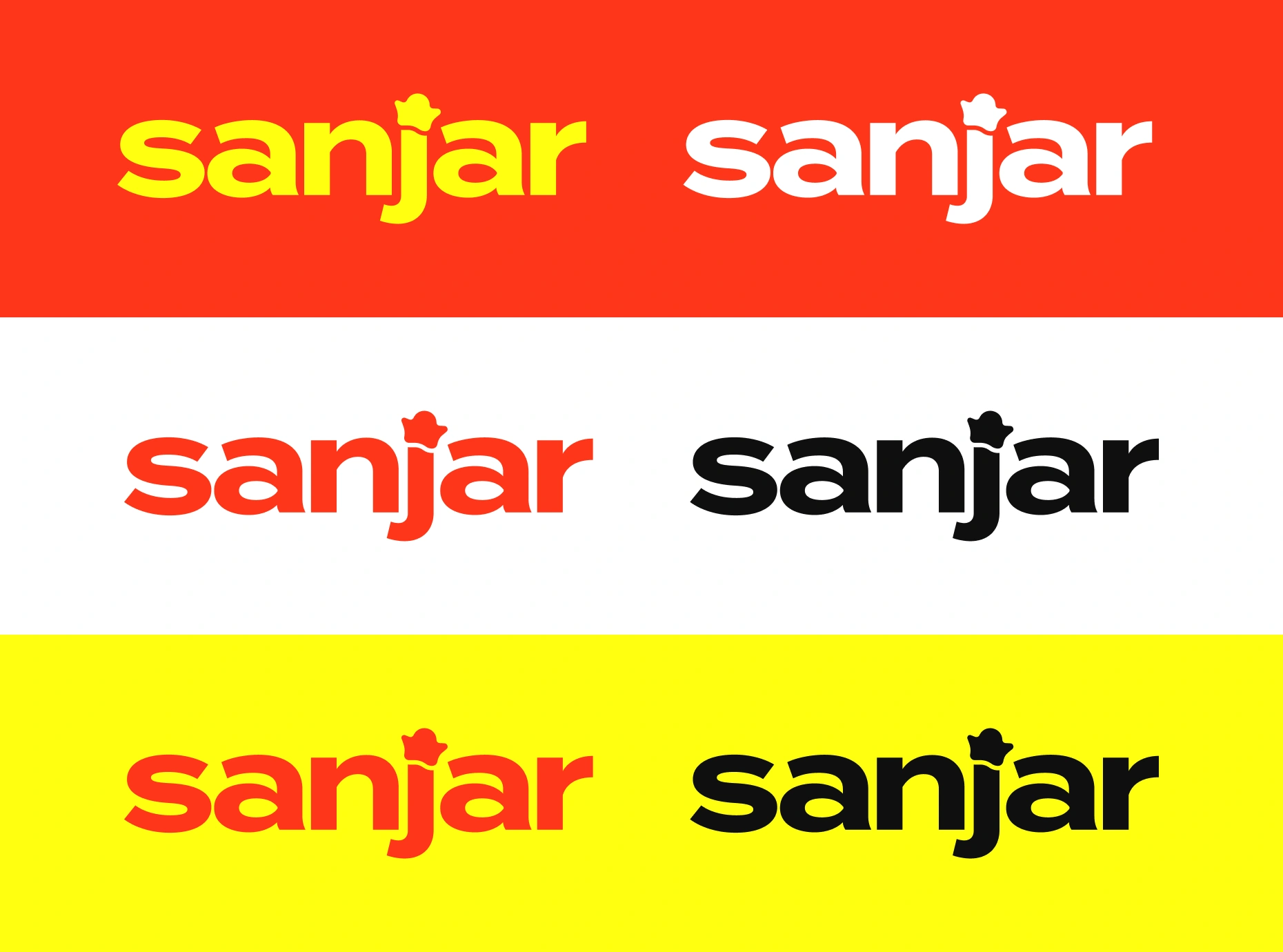
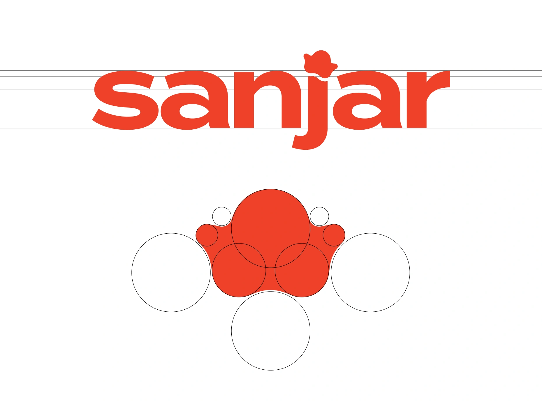
The wordmark’s color variants and the construction of its rounded symbol.
Approach
Translate the brand’s character into a few expressive elements.
I analyzed the project and dozens of comparable brands across Central Asia, looking at how they used names, symbols, color, and packaging to communicate their products.
The research informed a moodboard and the development of the core identity: a wordmark, symbol, basic palette, and supporting typography. Dumpling packaging provided the main setting in which these elements came together.
Three principles guided the work:
— Make friendliness visible
Use approachable forms and a playful character to express the warmth described in the brief.
— Keep the name recognizable
Give Sanjar a distinctive wordmark that could work prominently on packaging and independently on other materials.
— Leave room for the range to develop
Build a visual language connected to food and care that could support future product categories.
Solution
A friendly character with more than one reading.
The logo uses a bold, lowercase wordmark with rounded forms and an expressive descending “j.” A small symbol replaces its dot, connecting the name directly with the wider identity.
That symbol is deliberately open to interpretation. It can suggest a dumpling, a chef’s hat, a star, or simply a friendly character. These associations connect it with cooking and enjoyment while giving it a character of its own.
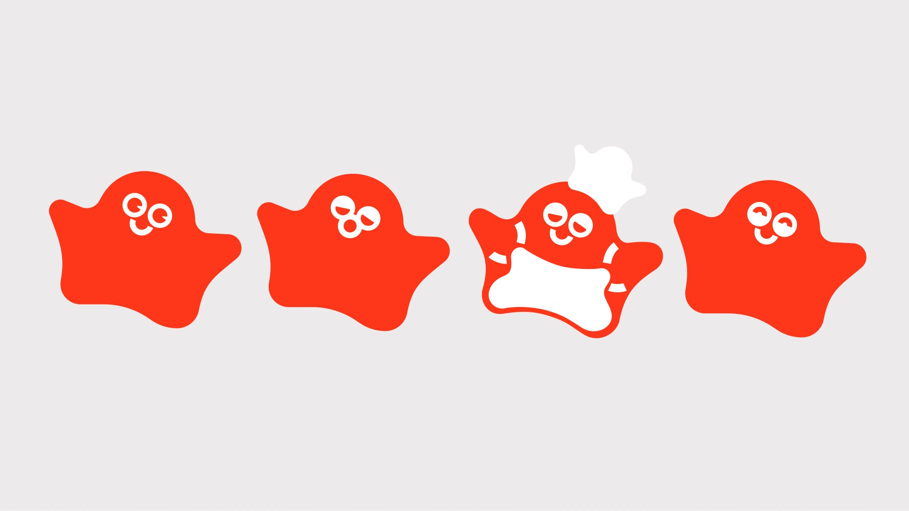
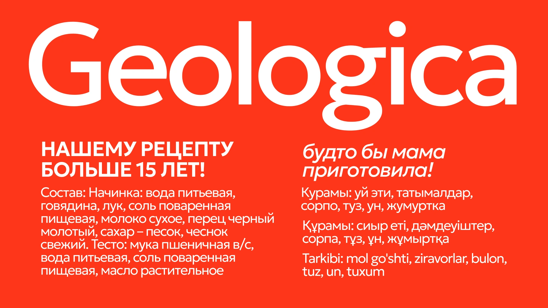
A friendly character and Geologica typography give the identity its voice.
With different facial expressions and arrangements, the symbol becomes a flexible graphic element. It can appear alone, form a repeating pattern, or interact with typography in more playful compositions.
Bright red and yellow establish the main color direction, supported by white and neutral tones. The combinations give the identity an energetic presence, while the rounded forms keep its character approachable.
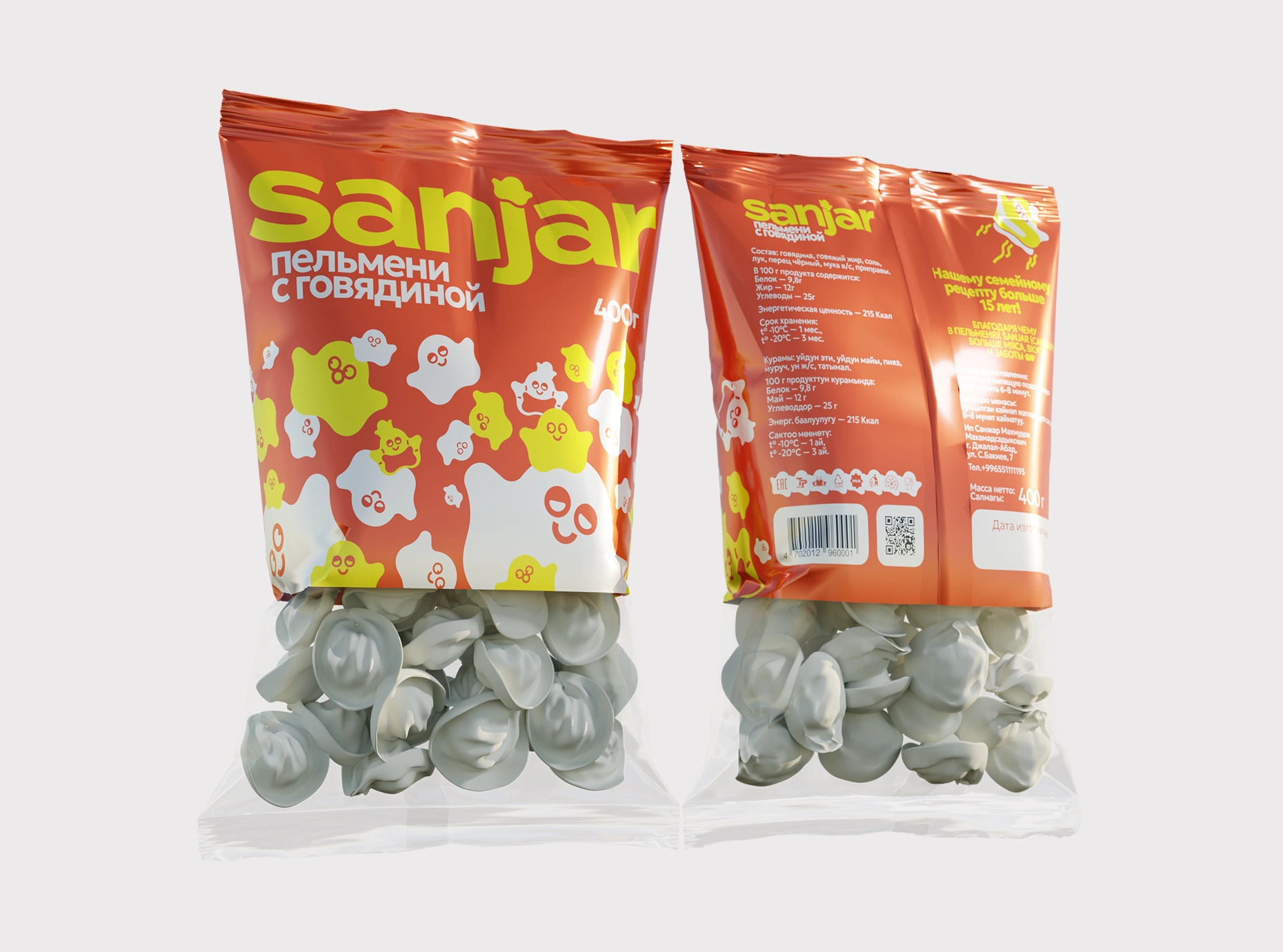
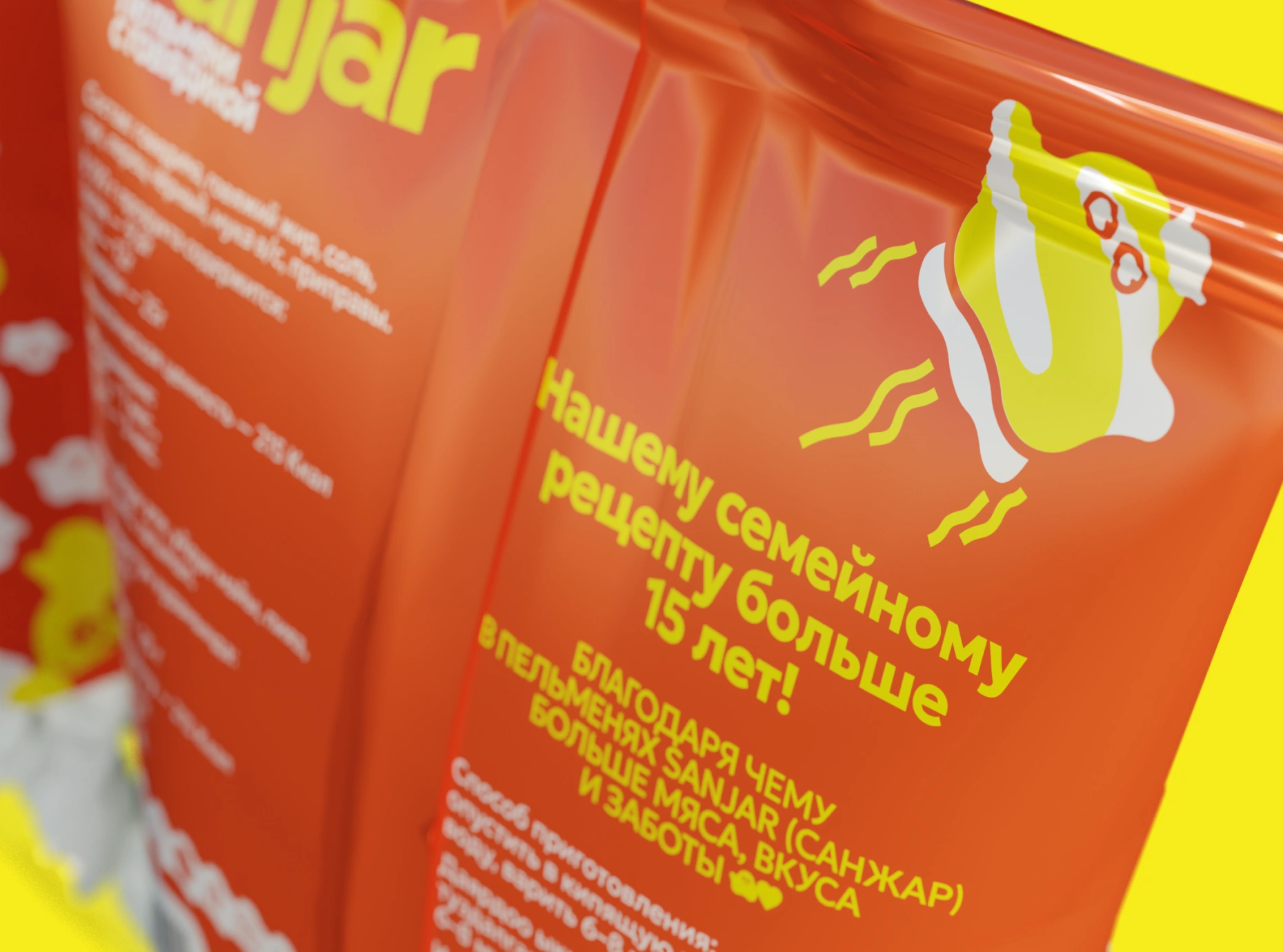
Front and reverse packaging mockups bring the identity onto the product.
Geologica provides the supporting typography for headings, product details, and longer information. Its range of styles and language coverage suit the client’s regional plans and provide a consistent counterpart to the wordmark.
For the dumpling packaging, I brought the elements together around a clear hierarchy: the Sanjar name, product description, and pack weight. A repeating field of characters gives the printed area its personality, while a transparent lower section keeps the product visible.
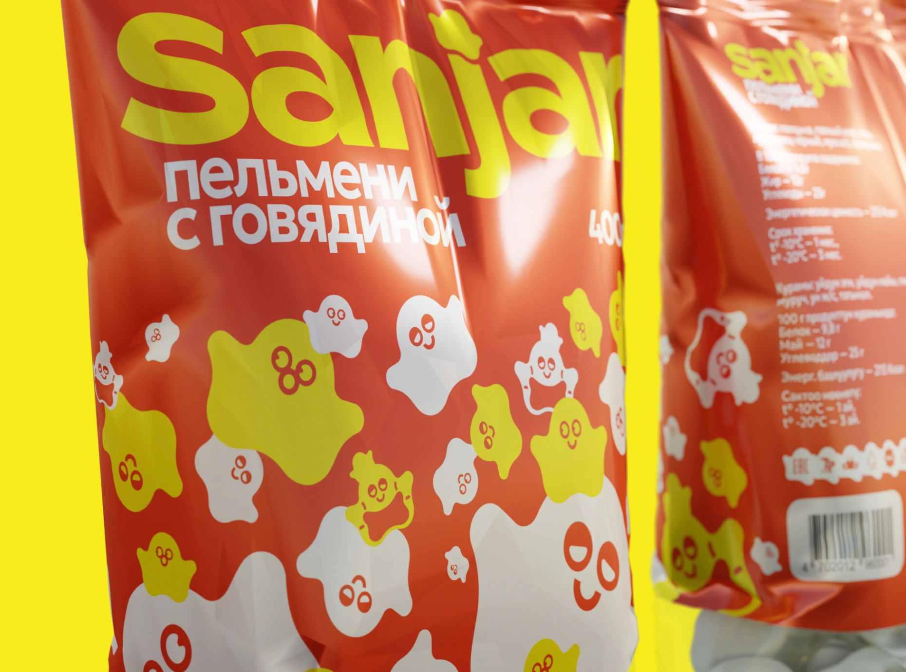
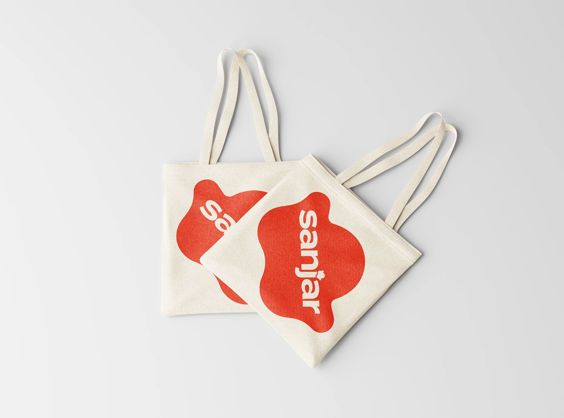
The character moves from a packaging pattern to an enlarged graphic on tote bags.
The reverse brings together preparation instructions, ingredients, storage information, and other product details within the same visual language.
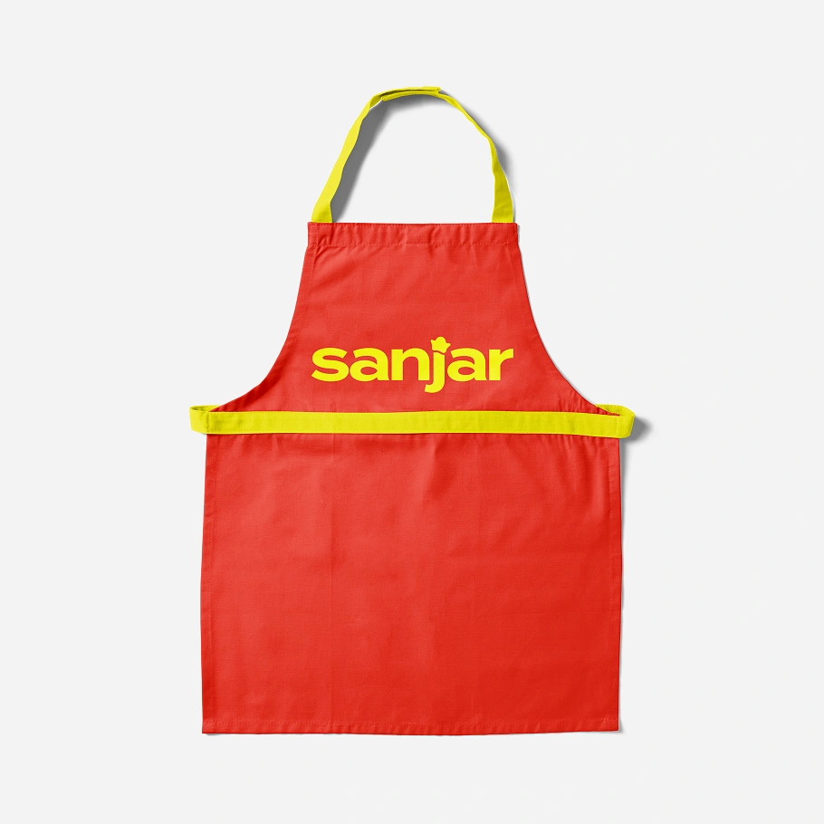
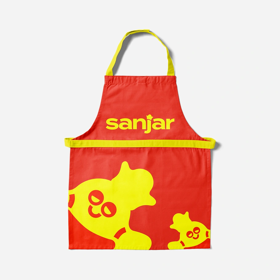
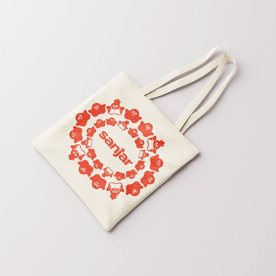
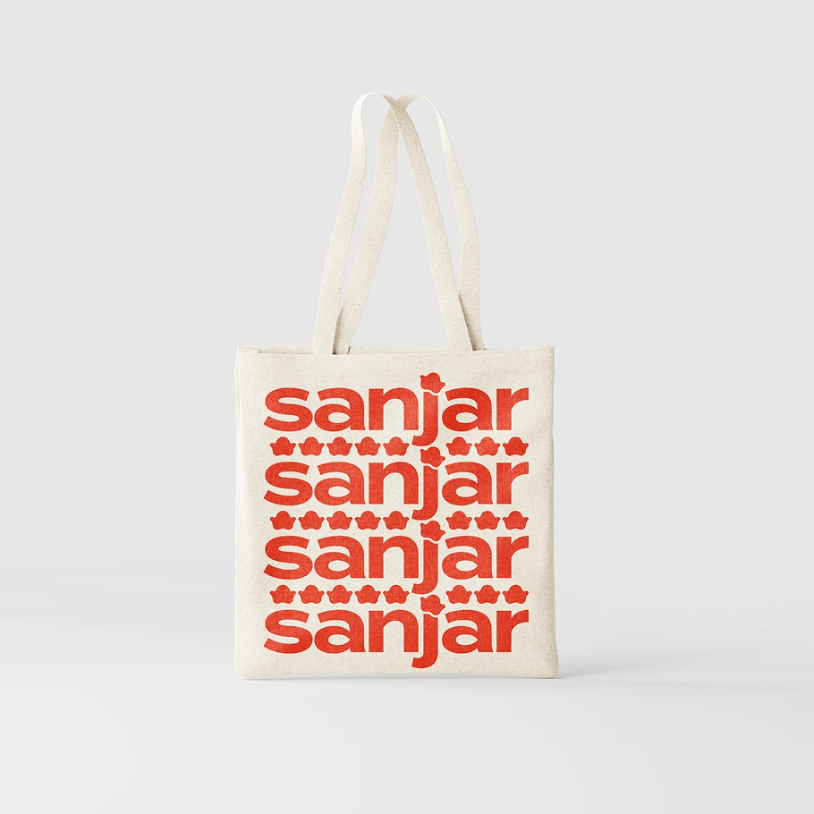
Application studies explore different balances of wordmark, character, and pattern.
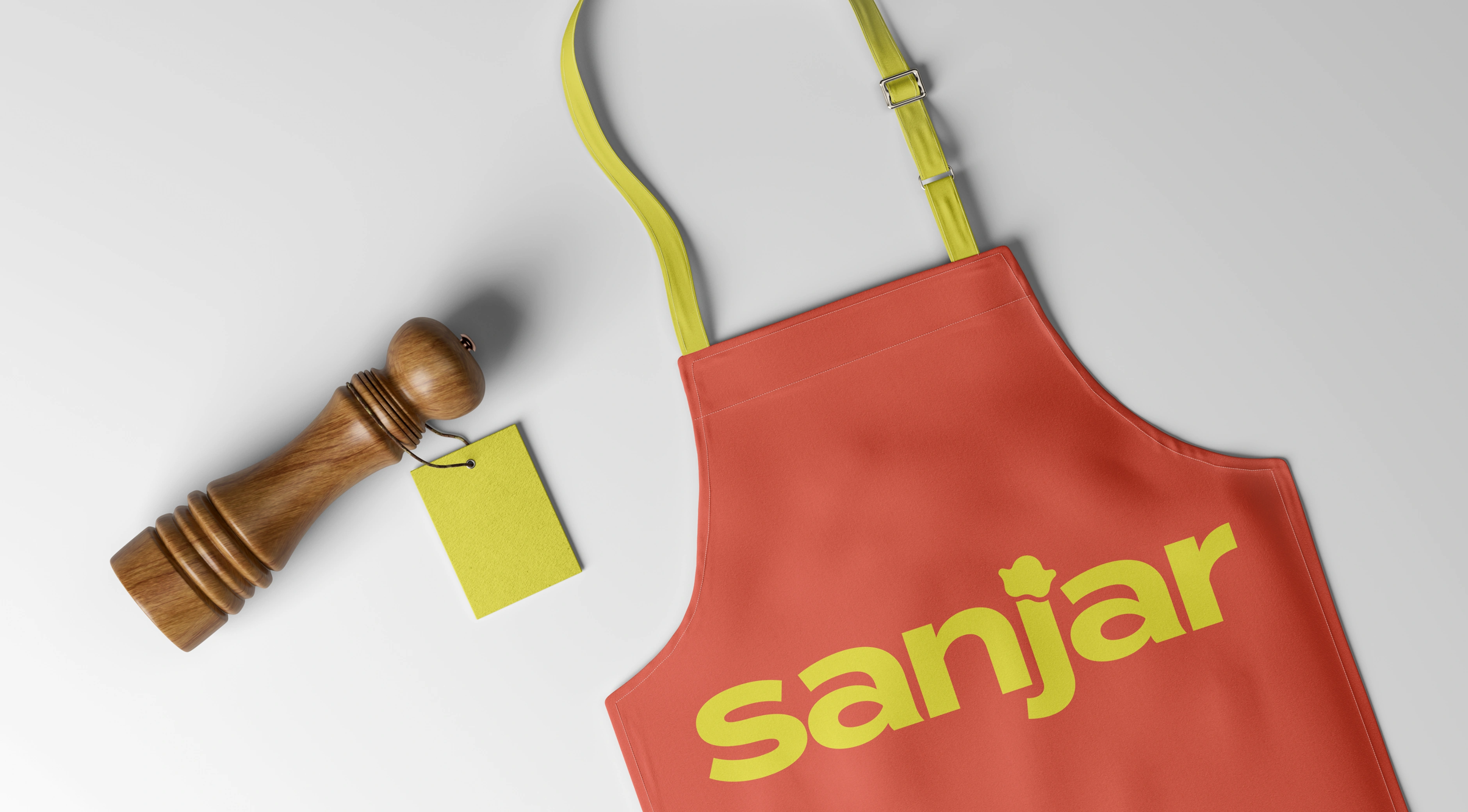
Application studies across tote bags, an apron, and communication graphics demonstrate how the identity can extend beyond the pack. The balance shifts between a prominent wordmark, a single character, and a fuller pattern according to the format.
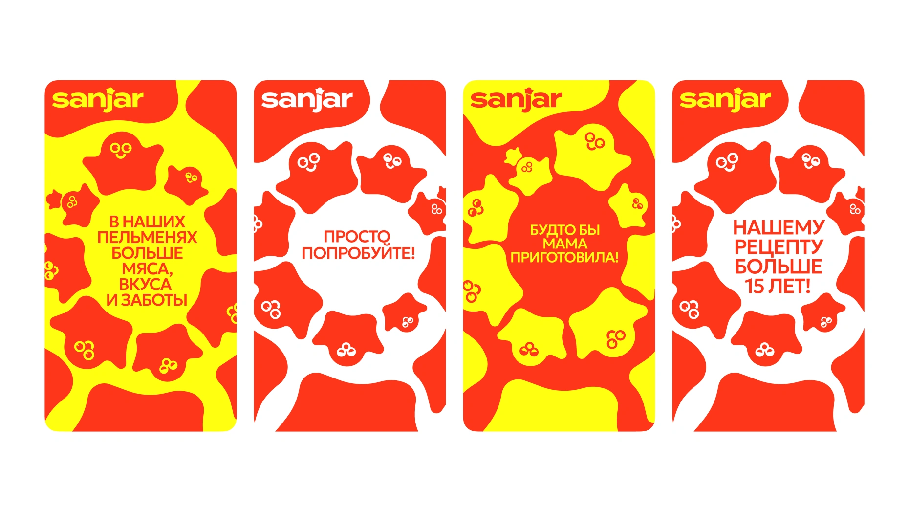
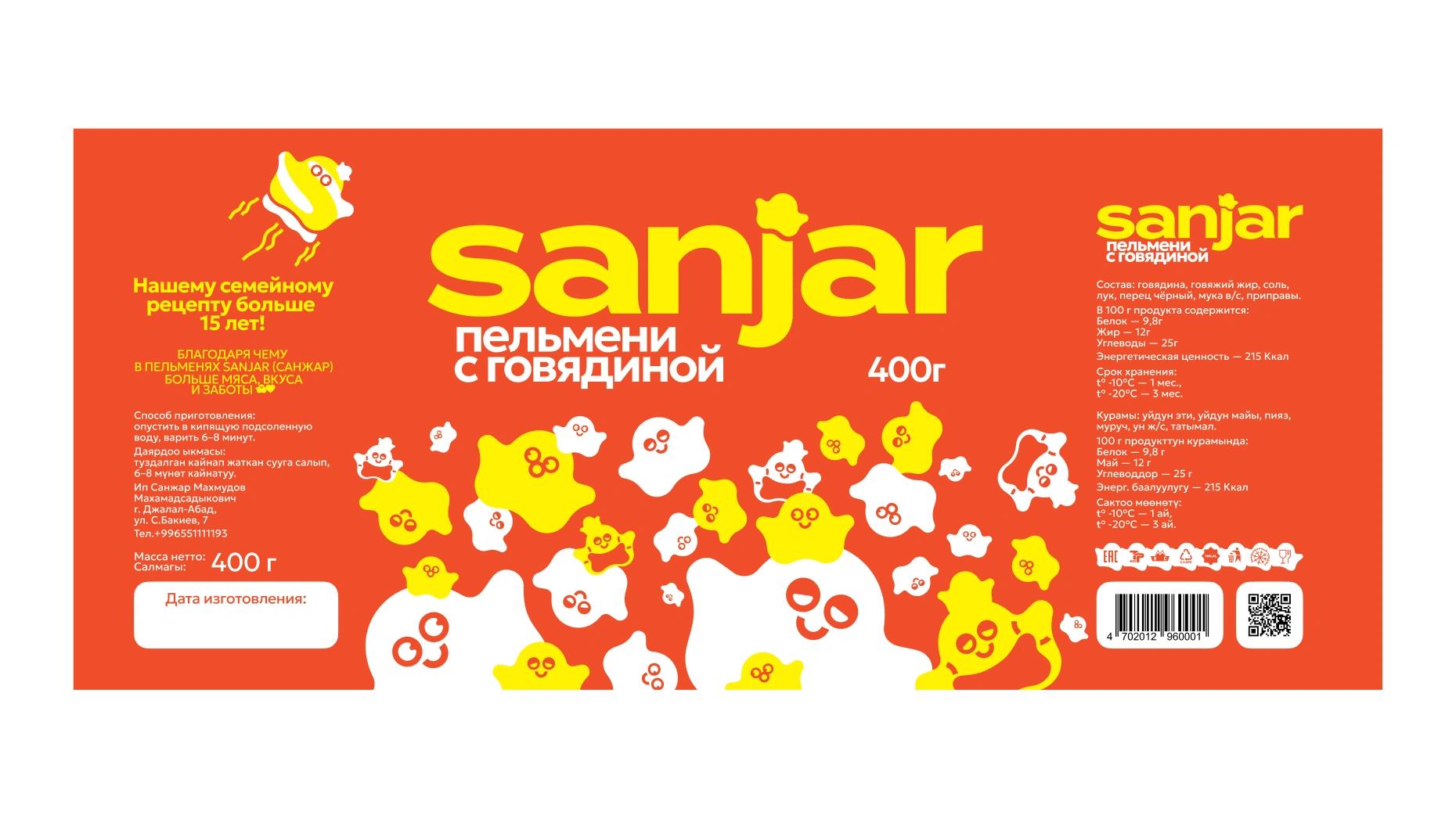
The identity extends into communication graphics and a complete packaging layout.
Result
A shared character for the product and the brand around it.
Sanjar gained a logo, symbol, basic palette, supporting typography, and a dumpling packaging design built from the same recognizable elements.
The identity gives the client a consistent starting point for presenting its current product and developing future materials. Its flexible character provides opportunities for both simple identification and more expressive communication.
The result is a warm, distinctive food identity that brings recognition, playfulness, and everyday care together.