

Context
Books, people, and the stories that connect them.
Н* is an independent publishing project founded by writer and editor Nes Goldstein. It helps authors turn ideas and manuscripts into books, with a particular focus on preserving personal stories and family histories.
Alongside publishing, the project supports tree planting—a connection between the paper used to make books and the natural world it comes from.
The existing logo had become outdated. The publisher needed a simpler mark that could represent its work across different formats while retaining a connection to its earlier identity.
The Challenge
Simplify the mark without losing its connection to the publisher.
The Cyrillic letter Н was an important part of the previous logo and needed to remain recognizable in the new design.
The challenge was to give that familiar element a clearer, more distinctive form. The logo needed to work alongside very different book designs, appear comfortably at smaller sizes, and extend to other printed and digital materials.
The challenge: create a simple, adaptable logo that preserved the publisher’s initial and expressed its connection to nature.
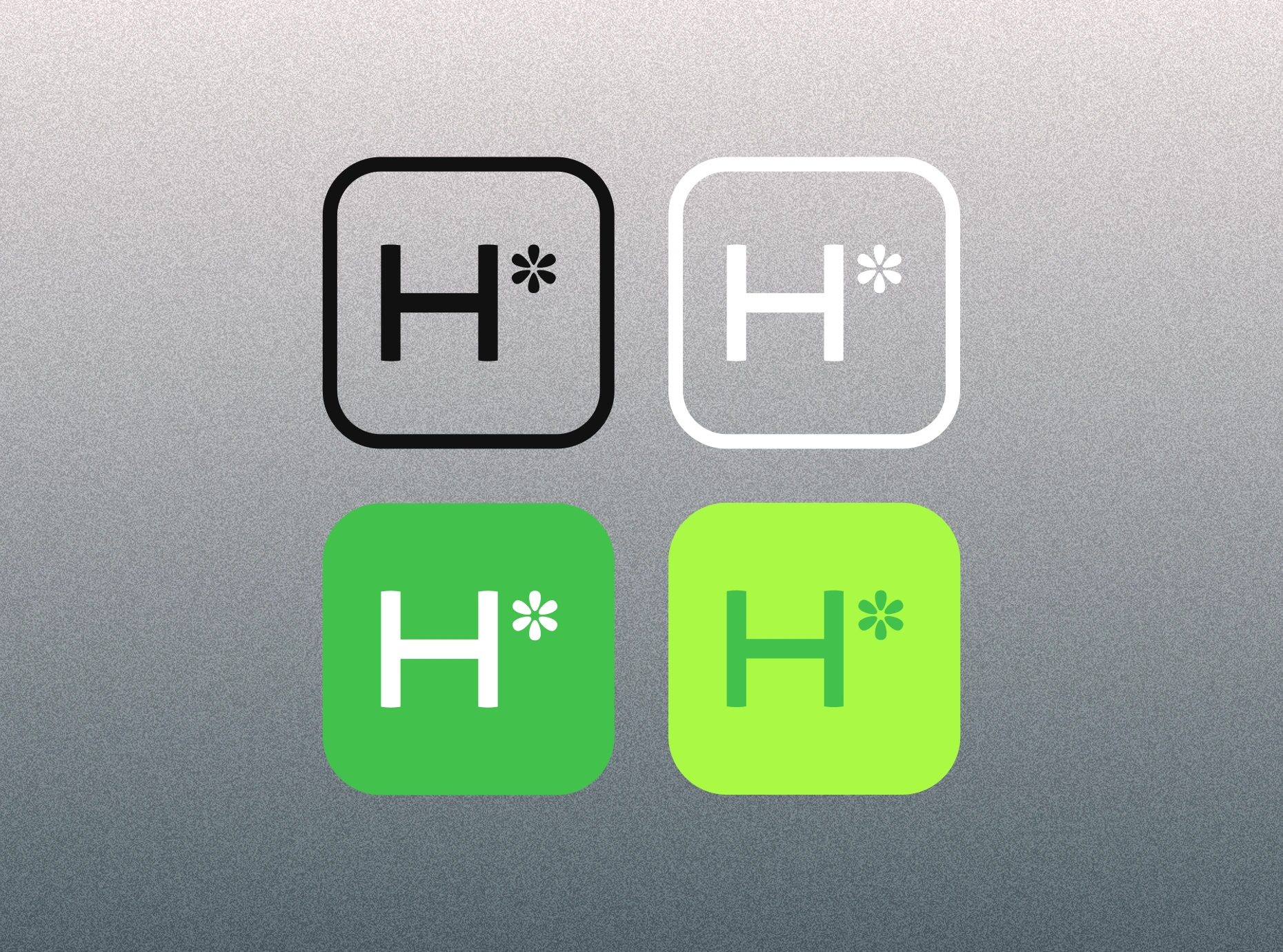
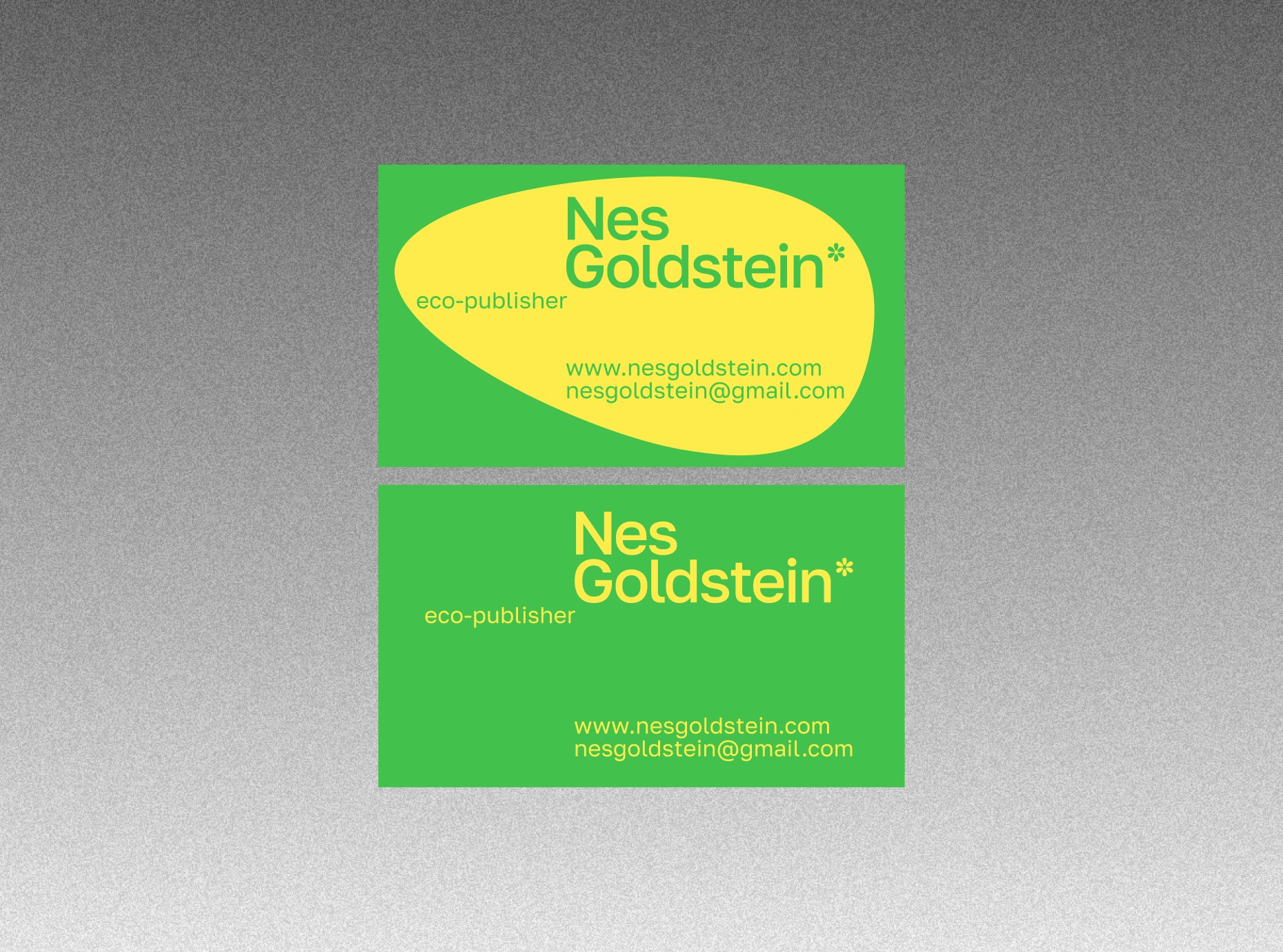
A compact signature in monochrome and green, alongside business-card application examples.
Approach
Find a clear idea within what was already there.
I reviewed the publisher’s work, its niche, and competing identities to understand what the new mark needed to communicate. The direction grew from the relationship between its personal character, its publishing practice, and its environmental initiative.
The name Н* provided the starting point: a letter and an asterisk that could become a compact, recognizable composition.
Three principles guided the work:
— Preserve a familiar anchor
Keep the Н as the central element, maintaining a connection to the earlier logo and the person behind the project.
— Give the asterisk a purpose
Use its form to introduce a botanical association that belongs to the publisher’s story.
— Keep application straightforward
Build a compact mark with a small palette and clear options for light, dark, and colored backgrounds.
Solution
A letter and a flower, brought into one compact mark.
The new logo pairs a simple Н with a small, flower-like asterisk. The letter provides a steady geometric structure, while the softer symbol adds character and connects the mark with growth and nature.
A rounded square brings the two elements together. Its proportions, spacing, and corner curves give the composition a consistent shape that can stand independently or sit alongside other content.
The asterisk also works as a separate graphic. Enlarged, repeated, or cropped, its six-petal form creates opportunities for expression beyond the compact logo while preserving a recognizable connection to it.
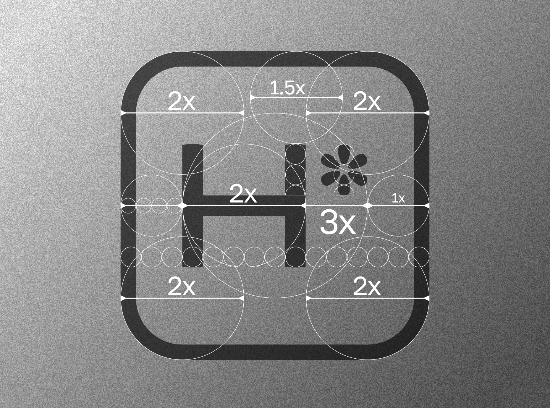

The logo’s proportions and the six-petal asterisk share a considered geometric construction.
The basic palette combines green and bright lime with black and white. Green connects the identity with the publisher’s environmental initiative, while lime introduces a more energetic accent. Monochrome versions provide a quieter option for applications where color would compete with the surrounding design.
Application examples across books, bags, and business cards show how the mark can move between a small identifying detail and a more prominent graphic. The logo stays consistent while its scale, color, and relationship to the surface can change.
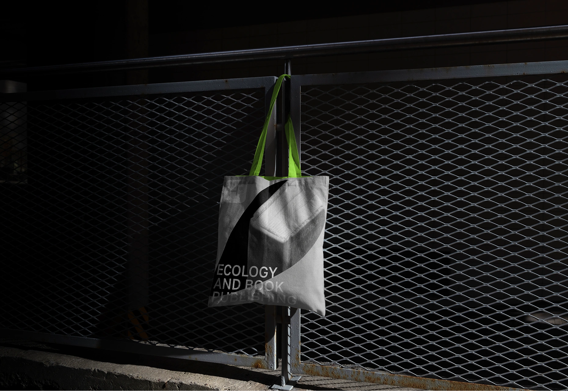
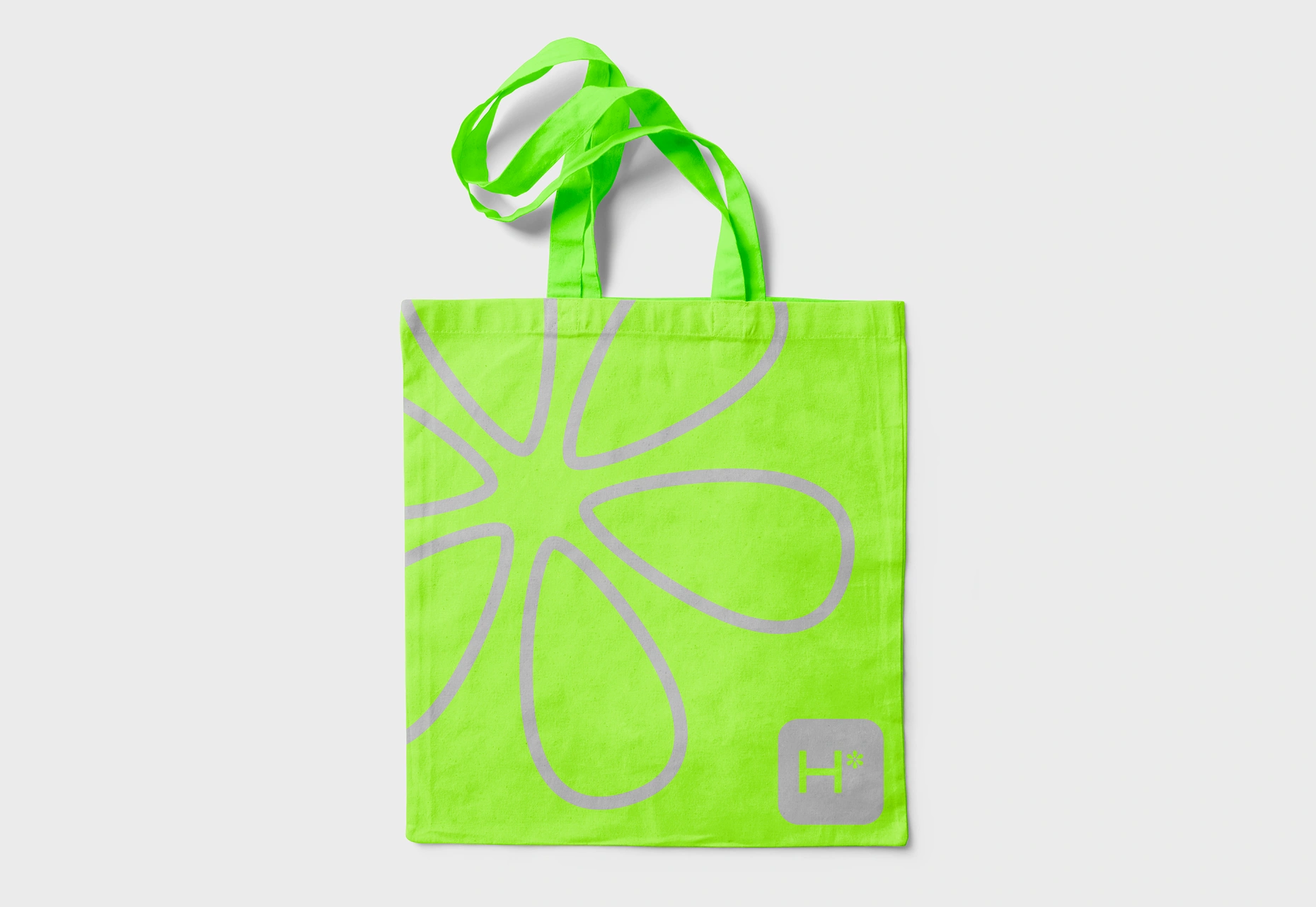
Application examples explore a quieter monochrome treatment and an enlarged botanical symbol in bright lime.
Result
A clearer signature for the publisher’s work.
Н* gained a new logo and basic color palette that retained its familiar initial while introducing a distinctive botanical element.
The compact composition gives the publisher a consistent signature across different materials. The separate flower-like asterisk adds flexibility, allowing the same idea to appear in both restrained and expressive applications.
The result is a simple mark that connects the publisher’s name with the ideas of growth, care, and continuity.