
Context
An established publishing practice needed a home online.
Н* is an independent publishing project founded by writer and editor Nes Goldstein. Its work brings together books, personal stories, family archives, and a tree-planting initiative connected to the publication of printed editions. Personal involvement runs through the practice, from helping authors develop a manuscript to preparing the finished book.
Despite an extensive body of published work, the project had no dedicated online presence or unified catalog. Prospective authors needed somewhere to discover the publisher, explore previous editions, and understand what working together could involve.
The website needed to bring these parts together while preserving the brand’s existing character.
The Challenge
Make a complex, personal service easier to understand.
People approach a publisher at very different stages. Some have a finished manuscript; others have an idea, a collection of documents, or a family story they want to preserve. Their understanding of the process—and the work their book requires—varies just as widely.
The website had to explain the available services, introduce an approach to pricing, and make a diverse publication history accessible. It also needed to communicate the publisher’s values and give family history books enough space as a substantial area of its work.
The challenge: create a coherent introduction to the publisher, with clear routes to exploring its books and starting a new project.
A walkthrough of the publisher’s website, from the opening scene to its books and services.
Approach
Connect the publisher’s story with the visitor’s next step.
I organized the website around the questions a visitor might bring: Who is behind the project? What kinds of books have they published? How does the work happen? What might my book cost?
This led to a structure connecting the main introduction with a publication catalog, a dedicated family history page, and the publisher’s personal story.
Three principles guided the work:
— Make the process approachable
Explain the services and give prospective authors a practical starting point for discussing their book.
— Let the publications demonstrate the experience
Bring the existing work into a searchable catalog, supported by individual book details.
— Extend the existing identity
Develop a visual language from the logo and the publisher’s connection to nature.
Solution
A distinctive visual world with a practical publishing guide.
I designed and built the website on Tilda, bringing the publisher’s introduction, services, catalog, and inquiry routes into one place.
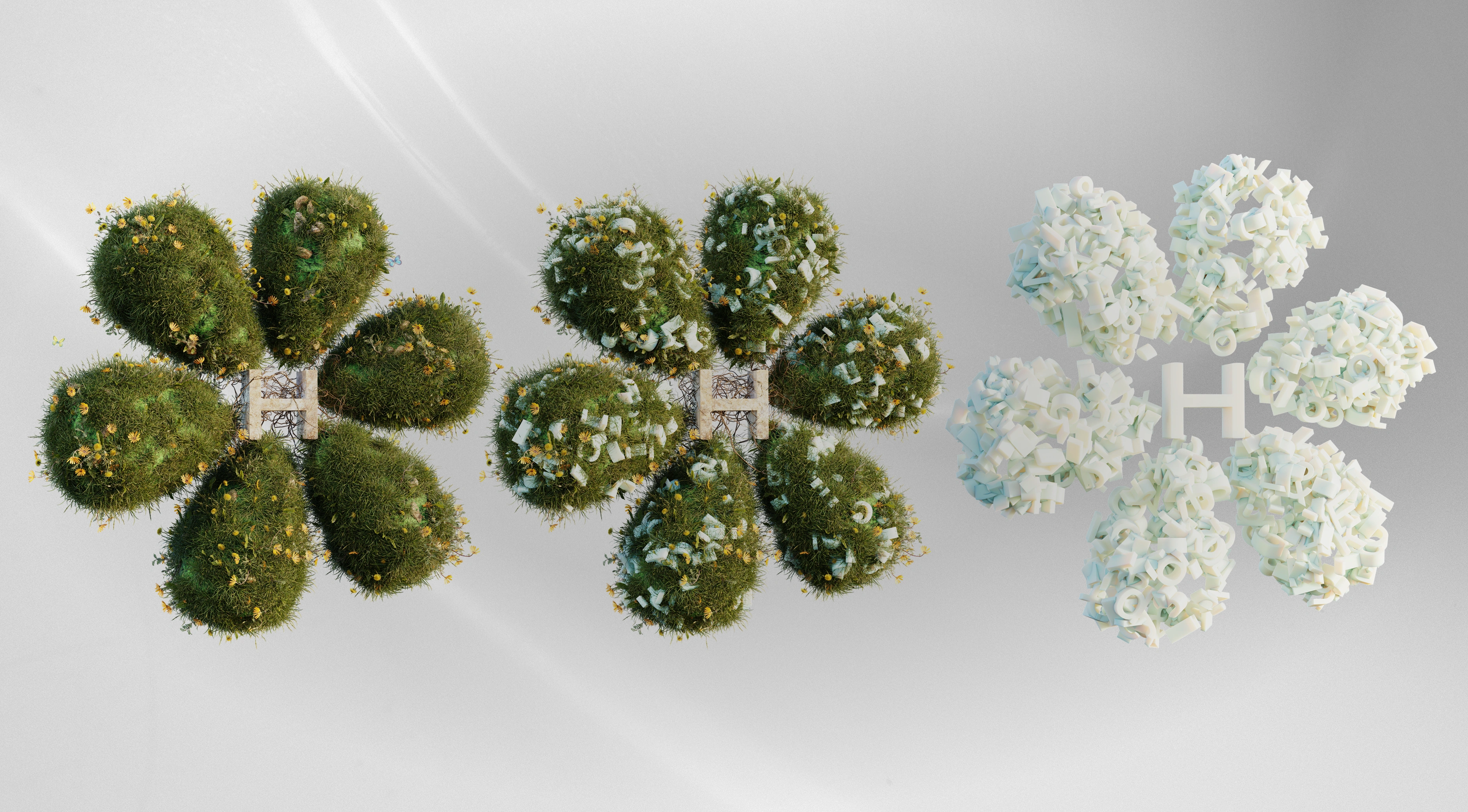
A custom 3D model based on the existing logo became the foundation for the website’s imagery. Across different compositions, the mark appears among vegetation, books, and letterforms. These scenes connect the identity with the subjects at the heart of the project: writing, publishing, and growing trees.
White space, soft neutral tones, and green accents carry this direction into the interface. Large headings introduce each section, while quieter layouts give the books and longer explanations room to be explored.
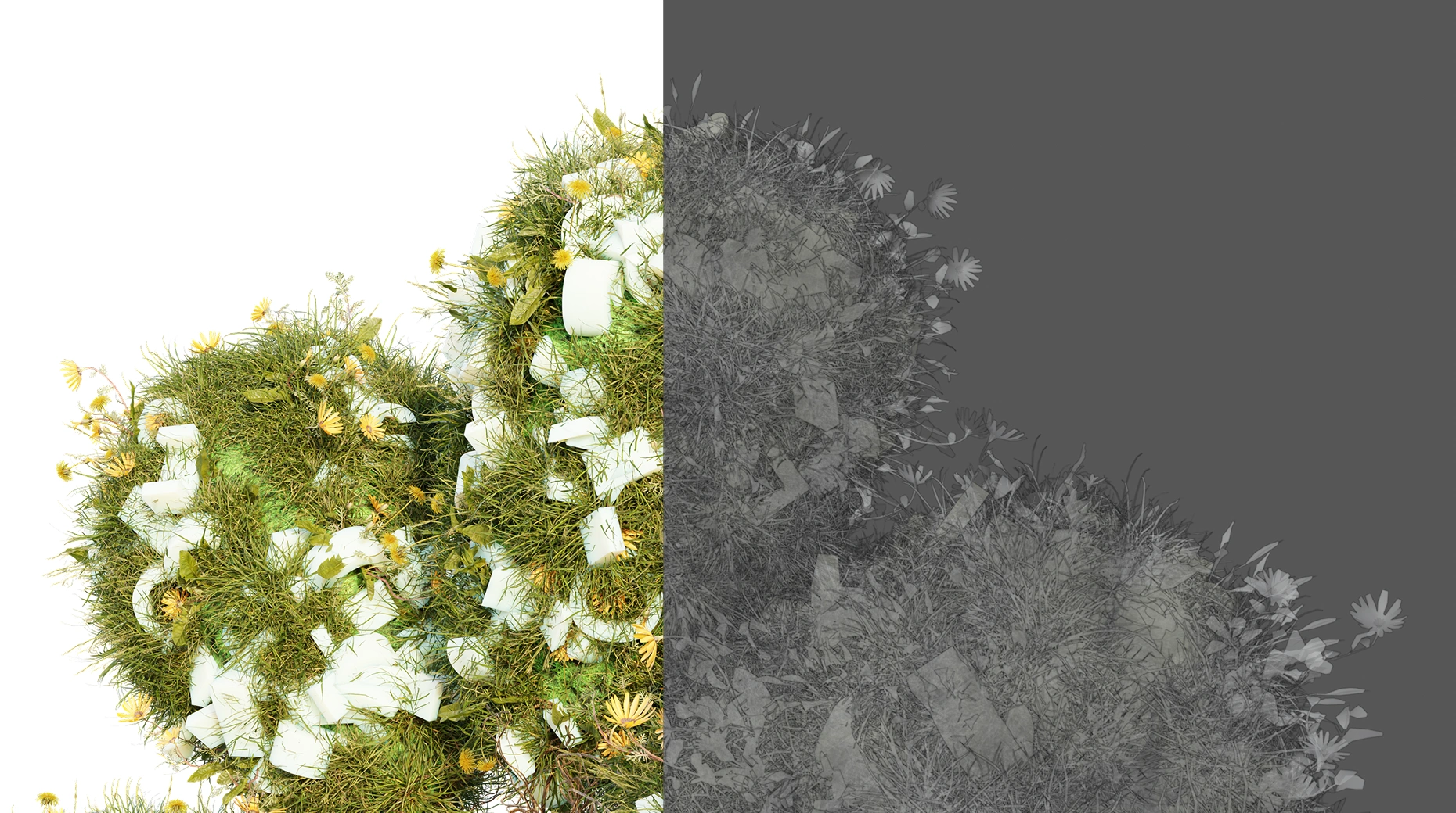
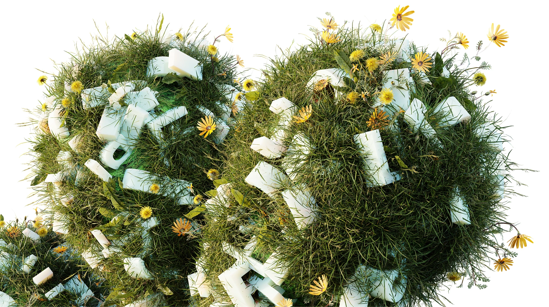
The existing logo becomes a three-dimensional landscape of vegetation, books, and letterforms.
The catalog gathers publications into a consistent browsing experience, with search, sorting, and filters by type, year, and city. Individual entries introduce each edition through its cover, description, and publication details. A separate selection makes the publisher’s own electronic books available to purchase.
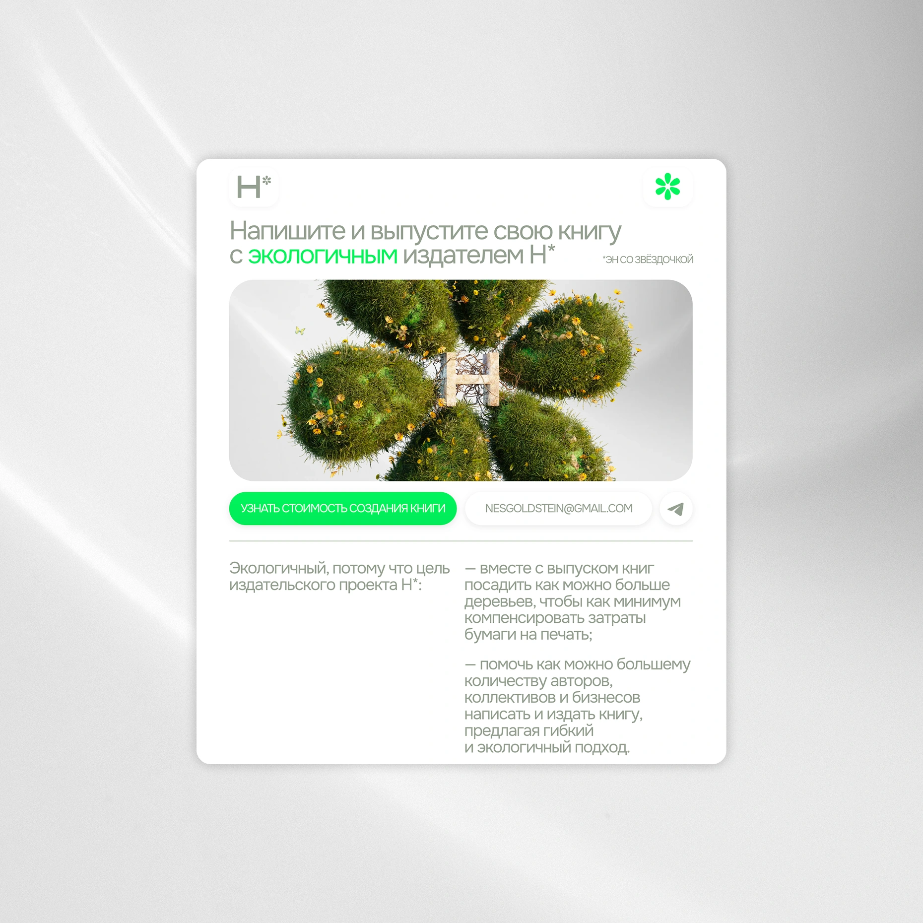
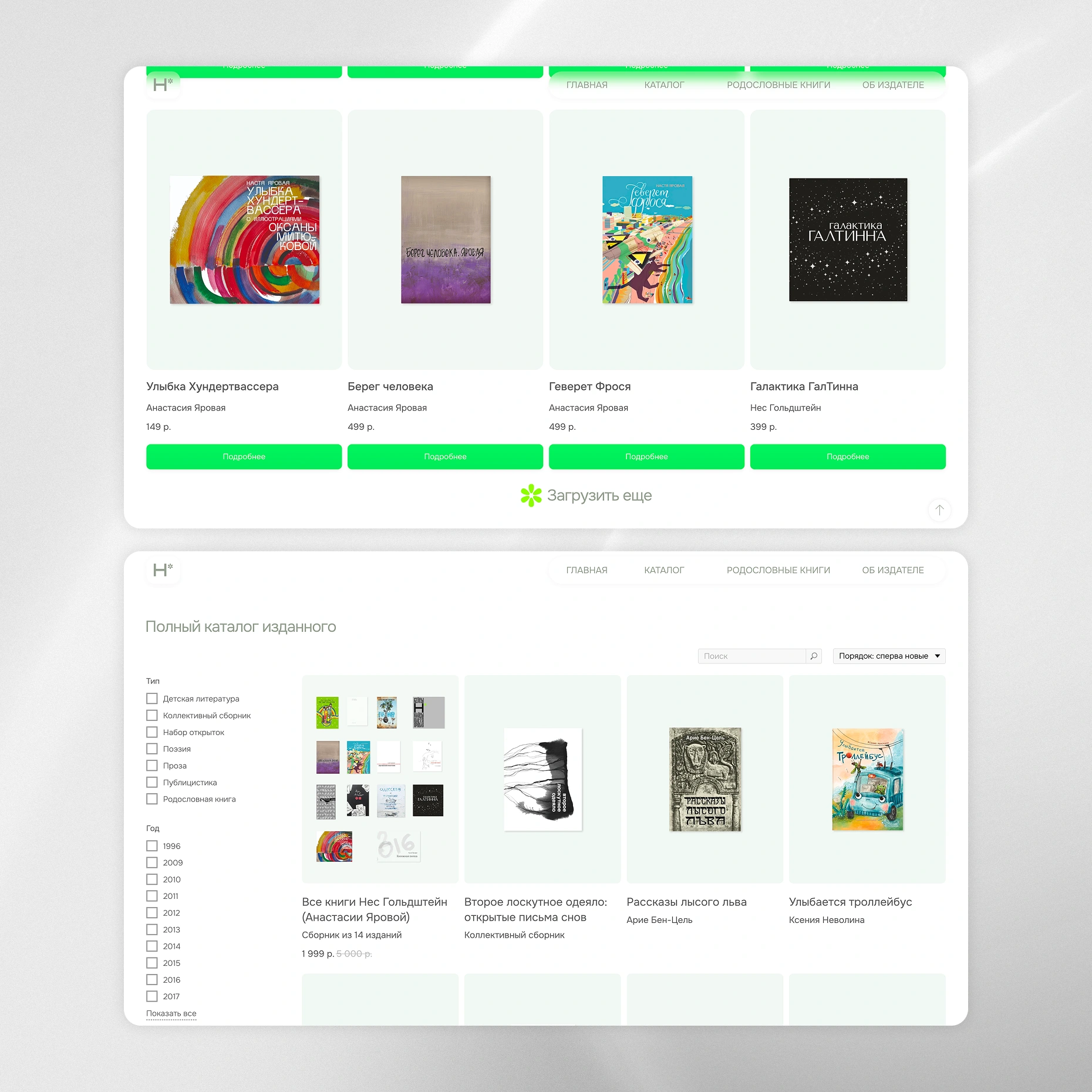
The opening page introduces the publisher, while the catalog brings its publication history into one place.
To help prospective authors understand pricing, I added a short cost-estimation quiz. It asks about the book type, whether a manuscript already exists, its length, and the need for cover design. Visitors receive an indicative starting cost before continuing to an inquiry, with a clear explanation of the included work and the separate cost of printing. Service descriptions and frequently asked questions provide further context for that decision.
Family history books received a dedicated page. It explains how photographs, documents, interviews, and family archives can become a publication, supported by examples and an outline of the process. This gives visitors space to understand both the practical work and the personal significance of creating such a book.
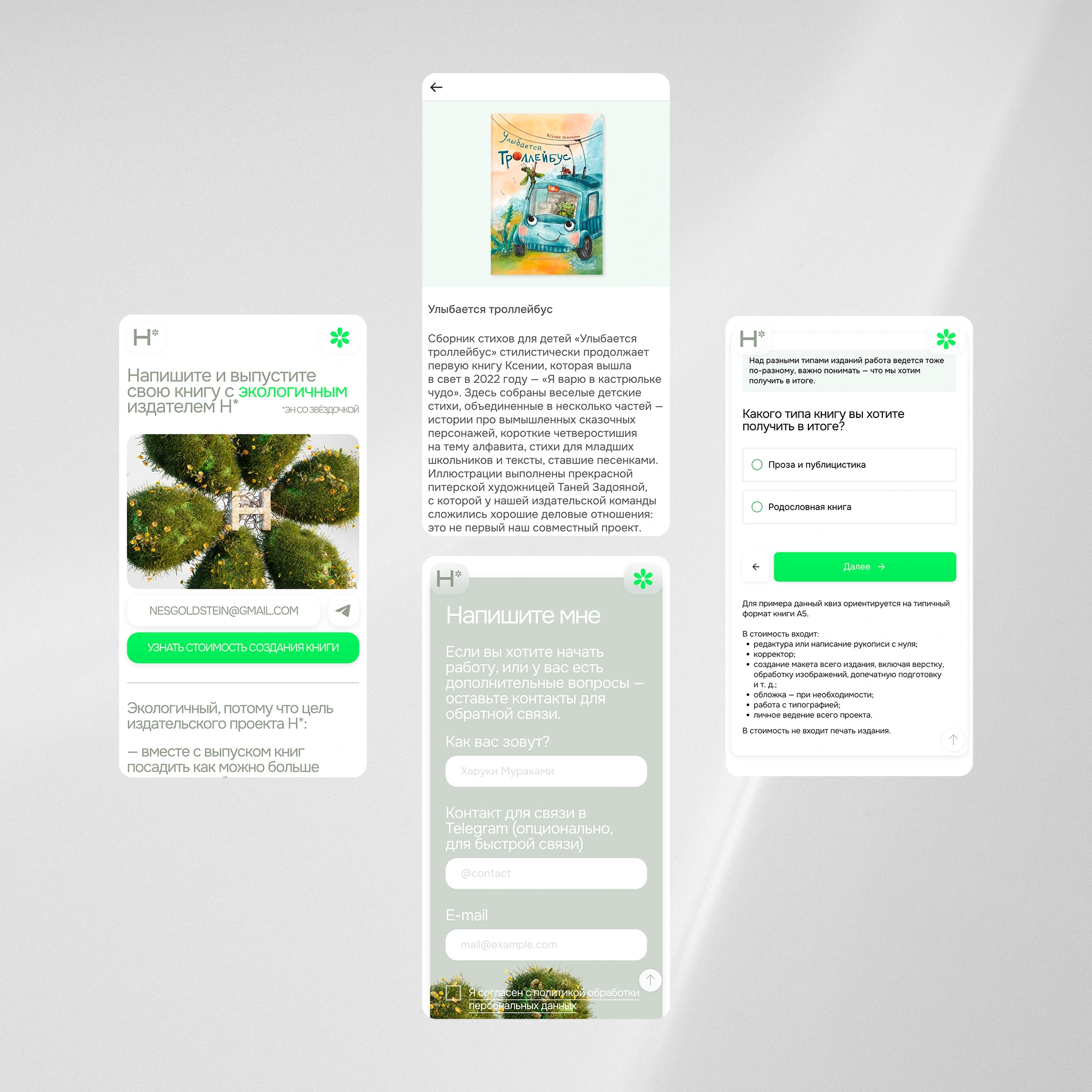
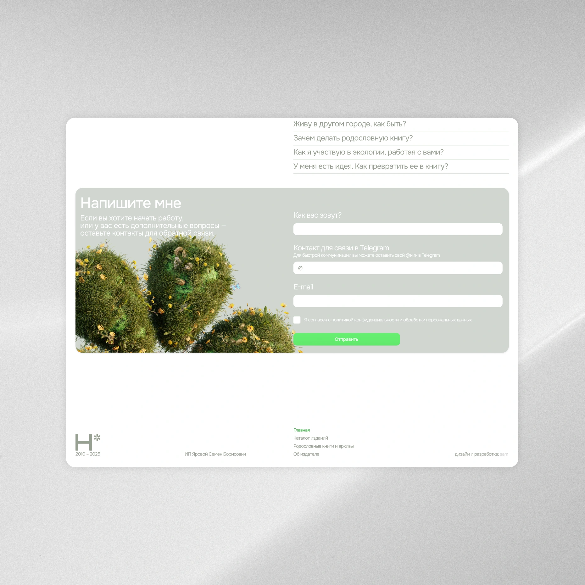
Mobile layouts carry the same visual language through book details, the cost quiz, and direct inquiries.
Result
One place to discover the publisher—and begin a book.
Н* gained a dedicated online presence that brings its identity, publication history, services, and personal approach together.
Visitors can explore completed editions, understand the different ways of working with the publisher, and estimate a starting budget before making contact. The catalog gives the existing body of work a shared home, while the 3D imagery gives the website a recognizable character rooted in the brand.
The result is a website that presents the publisher’s experience and makes the first steps toward creating a book clearer.