
Context
Two directions, connected by the same spirit.
Amato brought together a coffee bar and an intimate jazz club in Irkutsk. Both reflected the same interests: quality, creative independence, and experiences shaped by people who cared about what they were making.
That connection was clear to the founder, but less obvious to newcomers. The businesses were known by overlapping names, and their relationship was not consistently expressed.
Amato had existing logos and a distinctive atmosphere, but lacked a shared strategy and visual language. The project needed to make that character easier to understand and carry across the brand.
The Challenge
Create coherence while leaving room for different experiences.
Buying a coffee and spending an evening listening to jazz are different activities. The identity needed to make each direction immediately understandable while showing that both belonged to Amato.
The club’s positioning added another challenge. It offered a focused musical experience without the formality people might associate with a concert institution. Familiar nightlife expectations did not always fit either: music was central, and the club served no alcohol.
The challenge: clarify what Amato stood for, connect its two directions, and build an identity that could remain consistent across communication, spaces, and everyday materials.
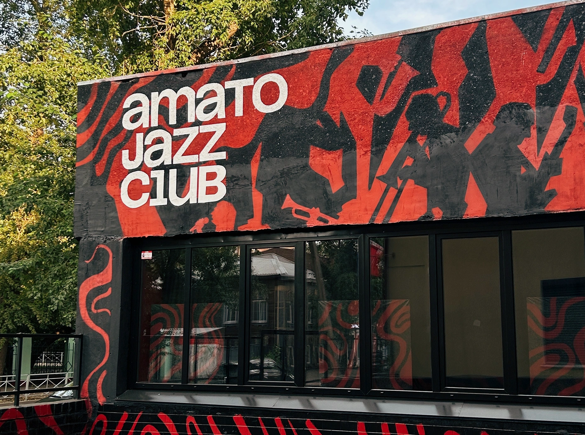
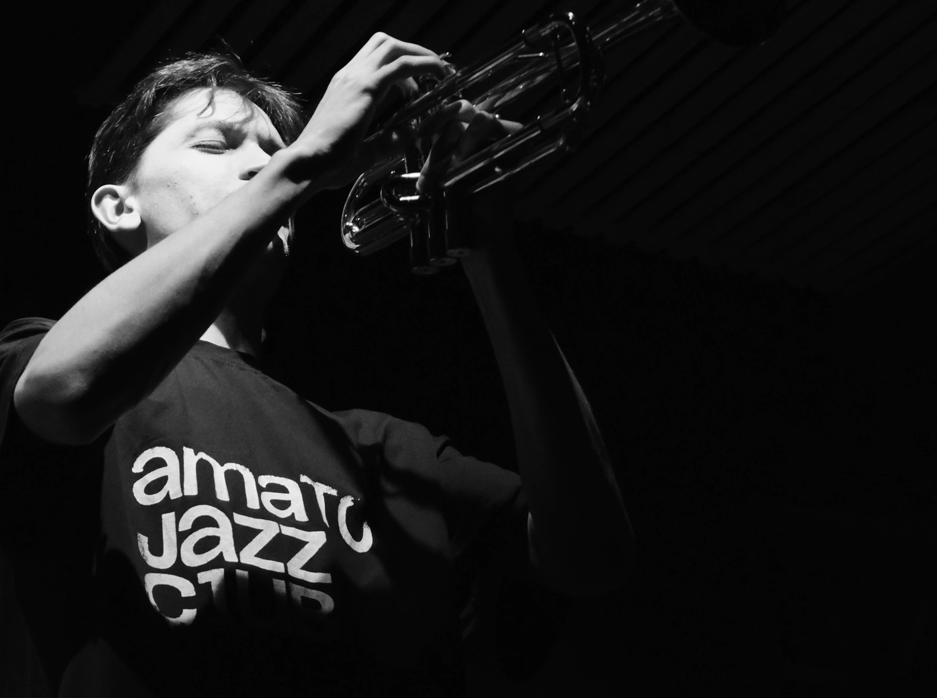
A shared identity for the club’s public presence and the people around its music.
Approach
Understand what people value—and what makes the brand itself.
I conducted a survey with 75 respondents, compared findings with website audience data, and reviewed more than 120 local bars, cafés, coffee shops, and cultural venues.
The research looked beyond direct musical competitors. Responses pointed to several reasons for visiting the club: listening to music, unwinding, meeting friends, and experiencing something new. Amato was competing for people’s time as well as their musical interests.
The audience research focused on the jazz club and informed two personas. Conversations with the founder, the brand’s history, existing communications, and its physical spaces helped establish the broader foundations.
Three principles guided the work:
— Make the relationship clear
Give Amato, the jazz club, and the coffee bar a shared structure, with names and visual elements that explain how they belong together.
— Build from an existing character
Identify the values and attitudes already present in the business, then translate them into clear guidance for language and design.
— Give consistency room to breathe
Define recognizable elements while allowing different levels of expression for a concert poster, coffee menu, piece of merchandise, or formal document.
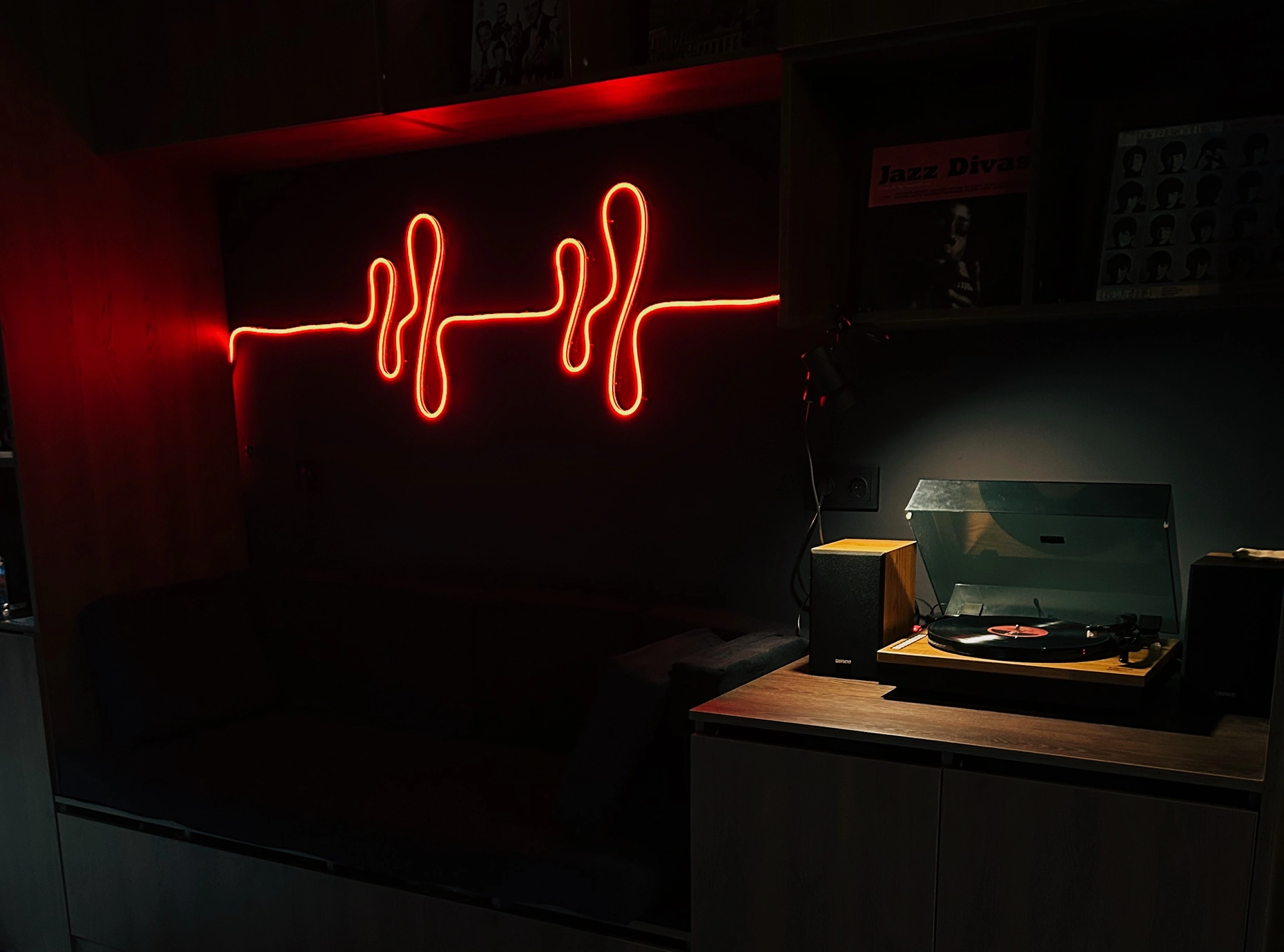
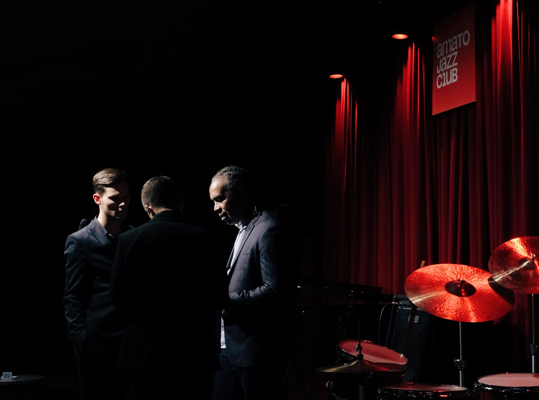
The pulse, lighting, and live music belong to the same atmosphere.
Solution
A common foundation. A language open to improvisation.
The platform defines Amato’s purpose, audience, positioning, and character around four values: creativity, freedom, individuality, and love. These connect its cultural ambitions with the everyday experience of its guests and provide a reference for future decisions.
A family of three related wordmarks makes the brand structure visible: Amato, Amato Jazz Club, and Amato Coffee Bar. Their stacked construction establishes a hierarchy between the overarching brand, its direction, and the venue. Based on Nagel, the lettering combines upper- and lowercase forms, tight spacing, and optical adjustments to give the marks a shared rhythm.
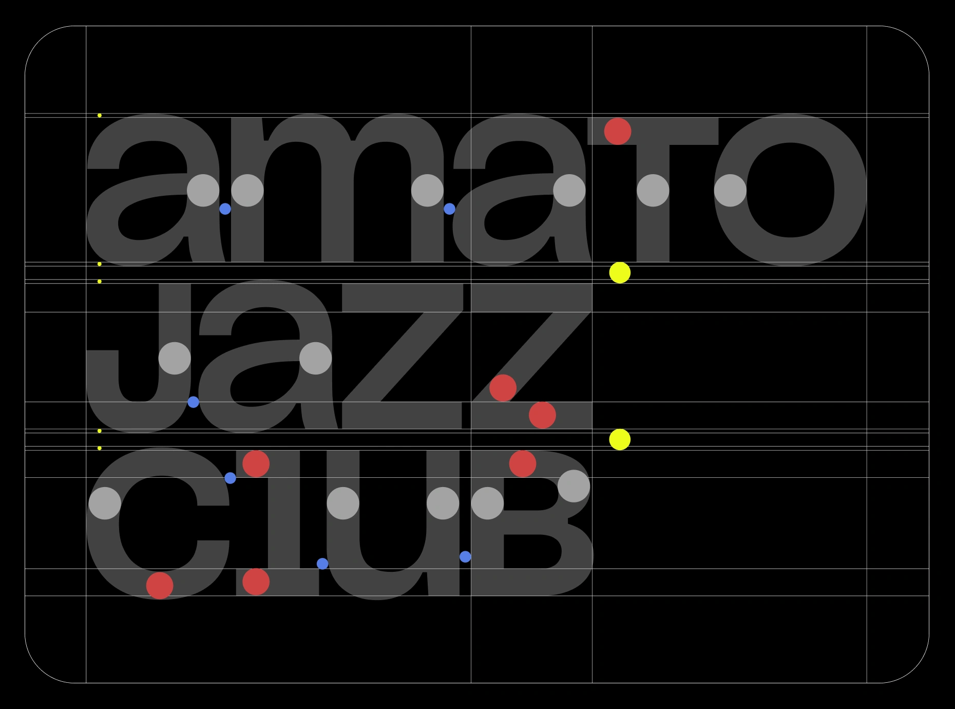
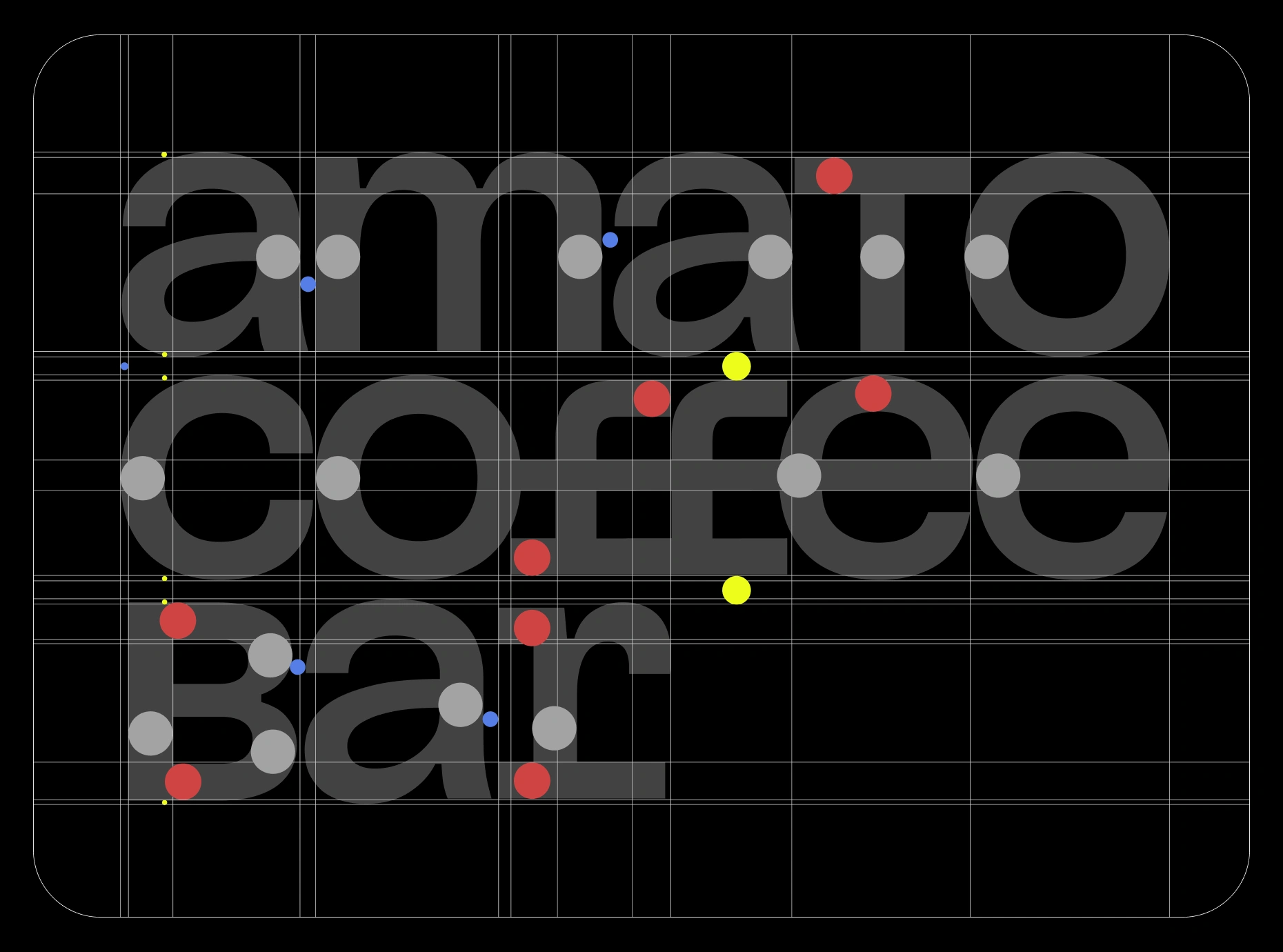
Related letterforms give the jazz club and coffee bar a shared character.
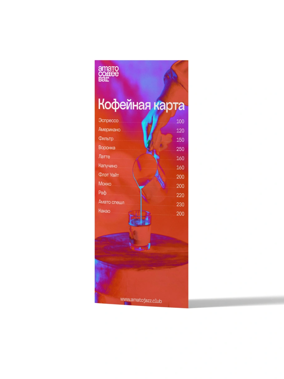
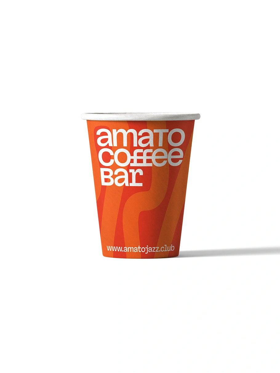
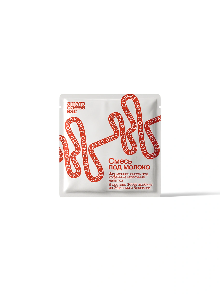
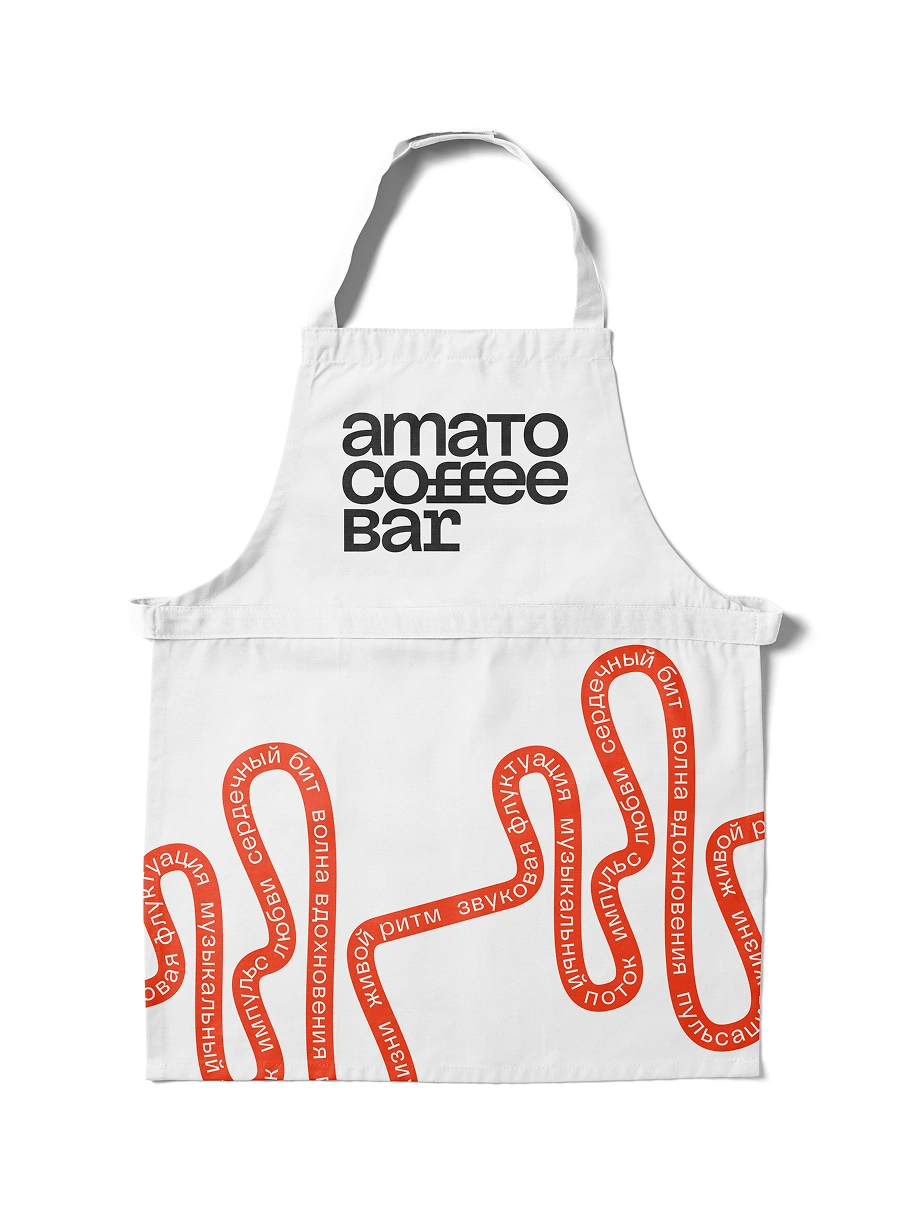
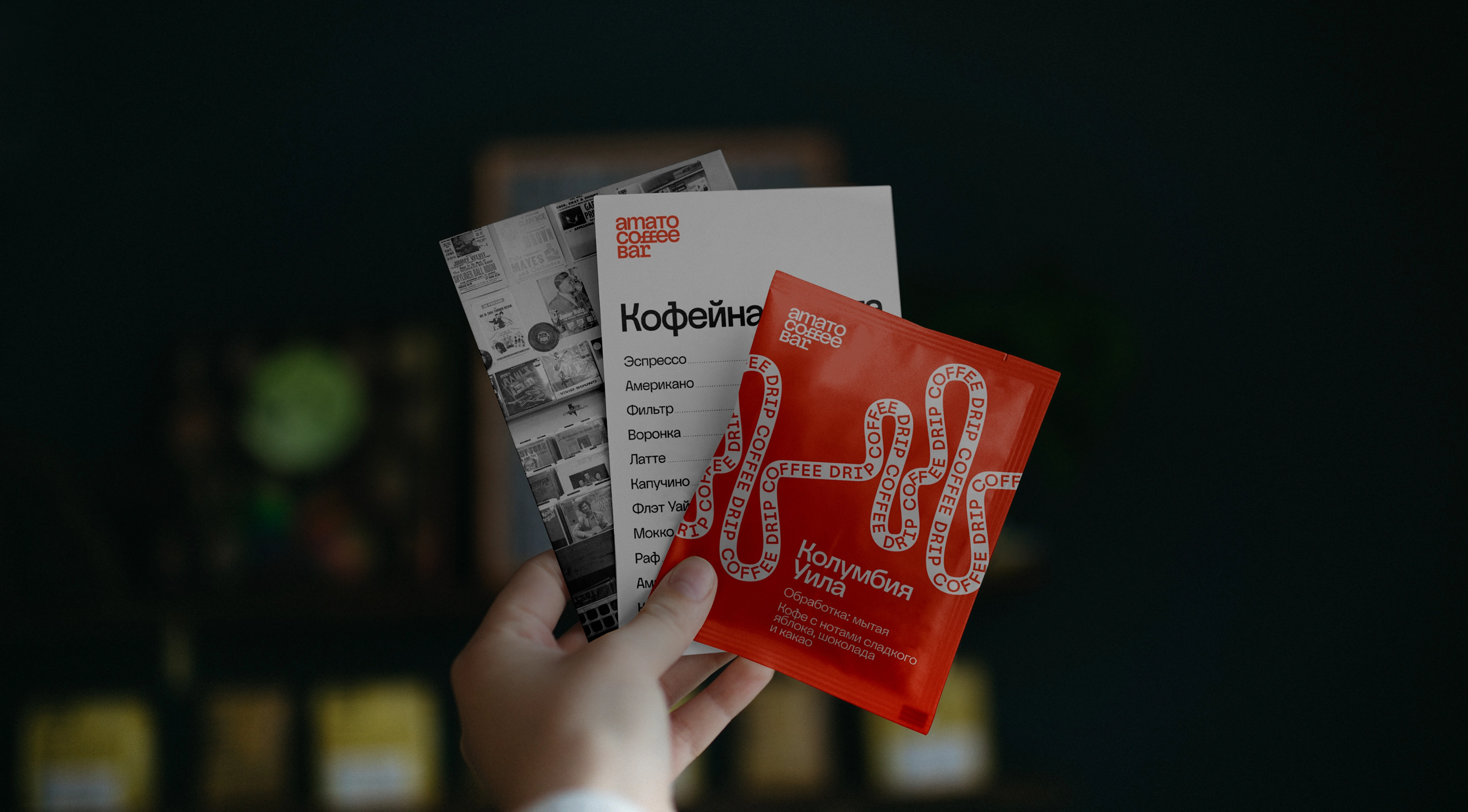
The identity carries across a menu, cup, coffee sachet, and barista apron.
A separate pulse symbol connects the two directions through associations with music, movement, heartbeat, and energy. Its underlying path stays consistent while its treatment can change—from a simple graphic accent to typography following the curve.
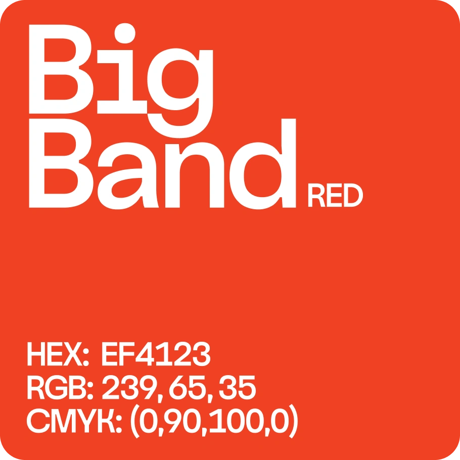
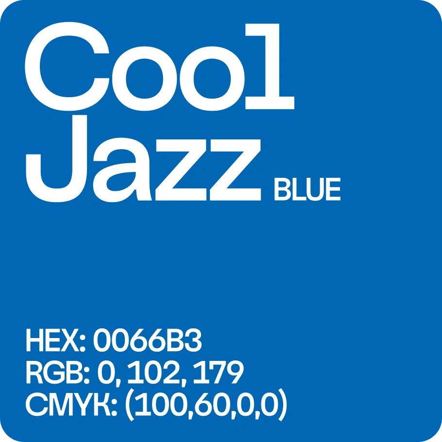
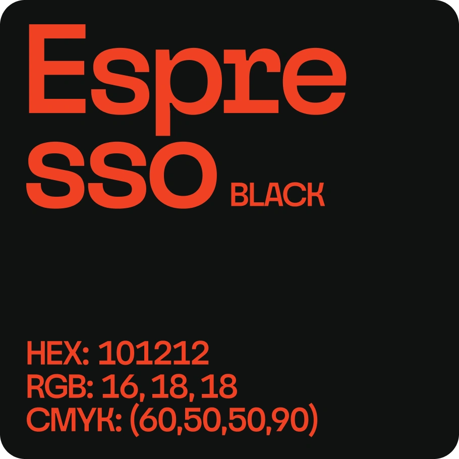
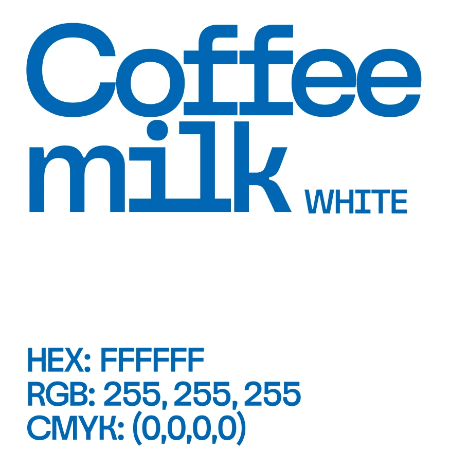
Big Band, Cool Jazz, Espresso, and Coffee milk.
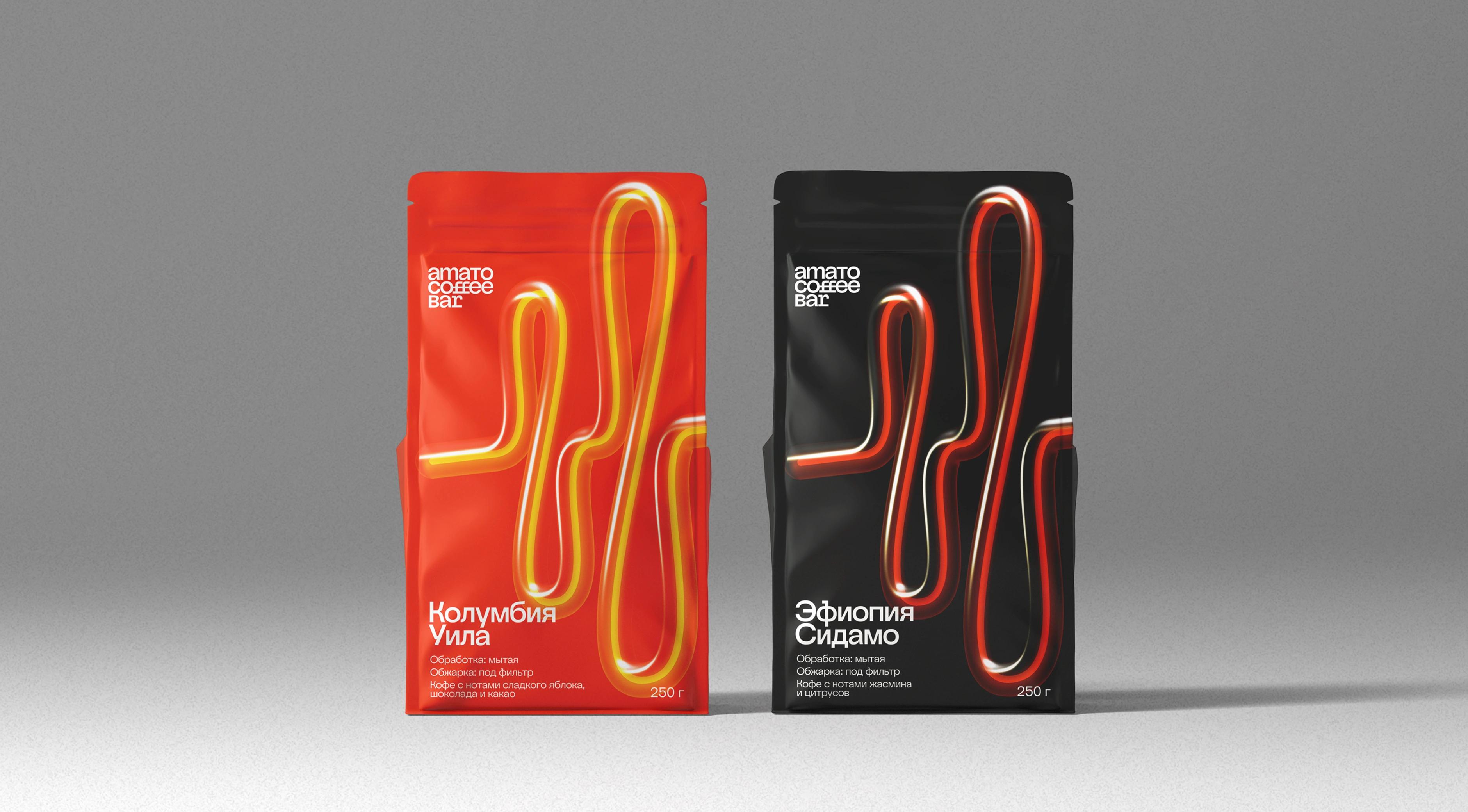
One pulse, interpreted in different materials and treatments.
Red and blue work alongside black and white. Nagel typography and structured grids provide clarity, with space for more experimental compositions when the context allows. The photography direction brings attention to real people, interiors, and details through strong contrast, monochrome images, and selective duotone treatments.
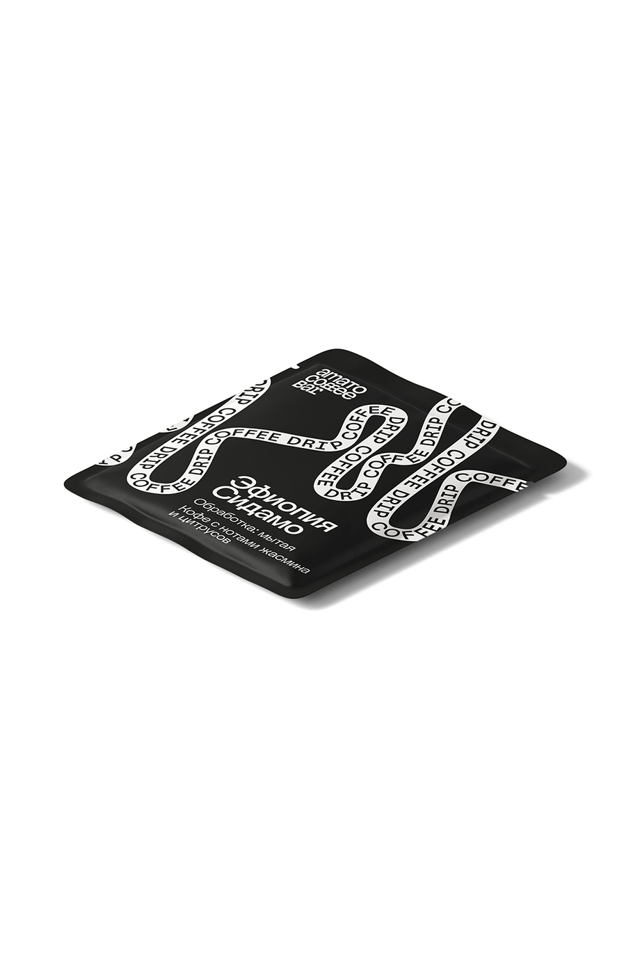
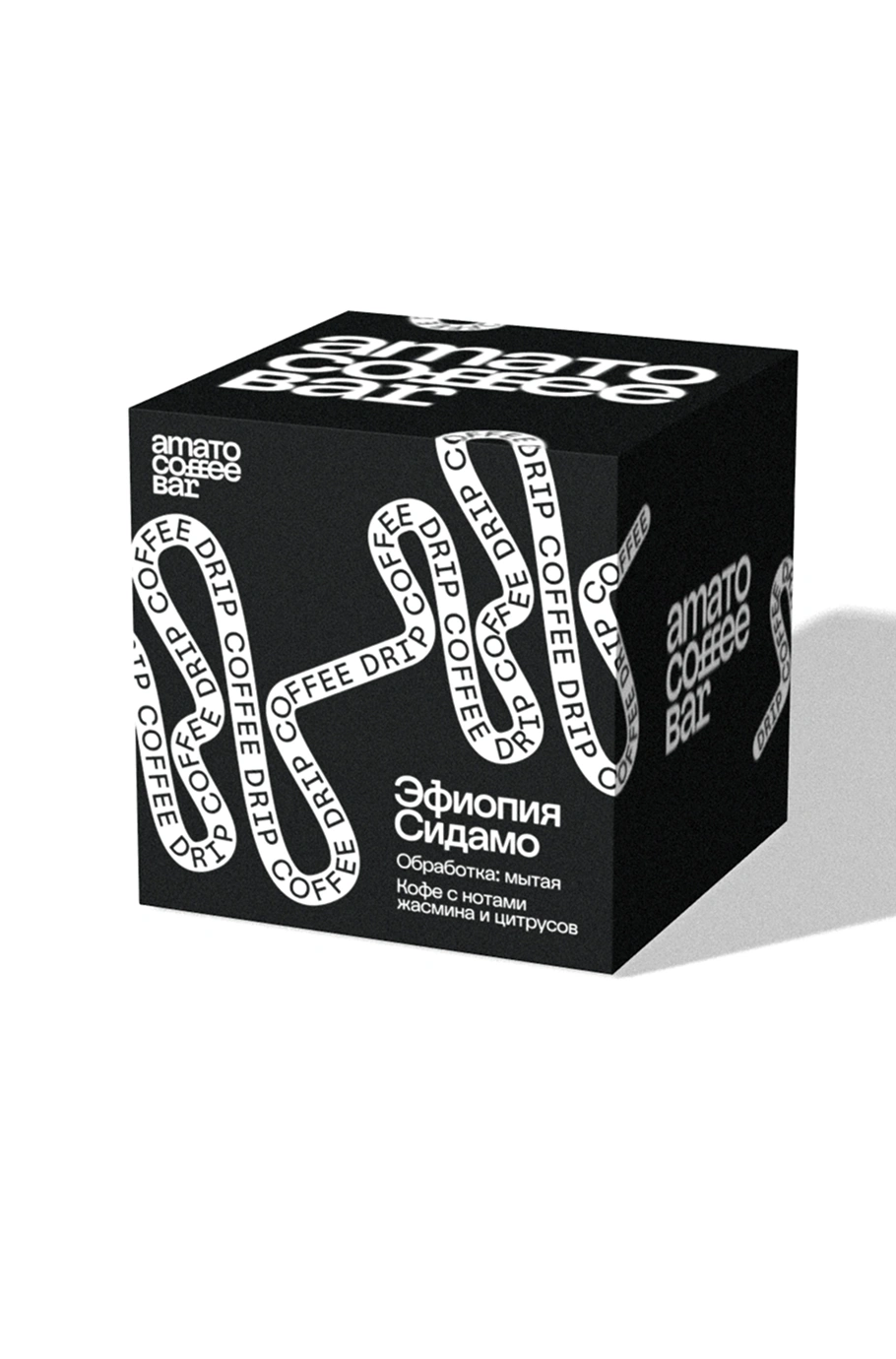
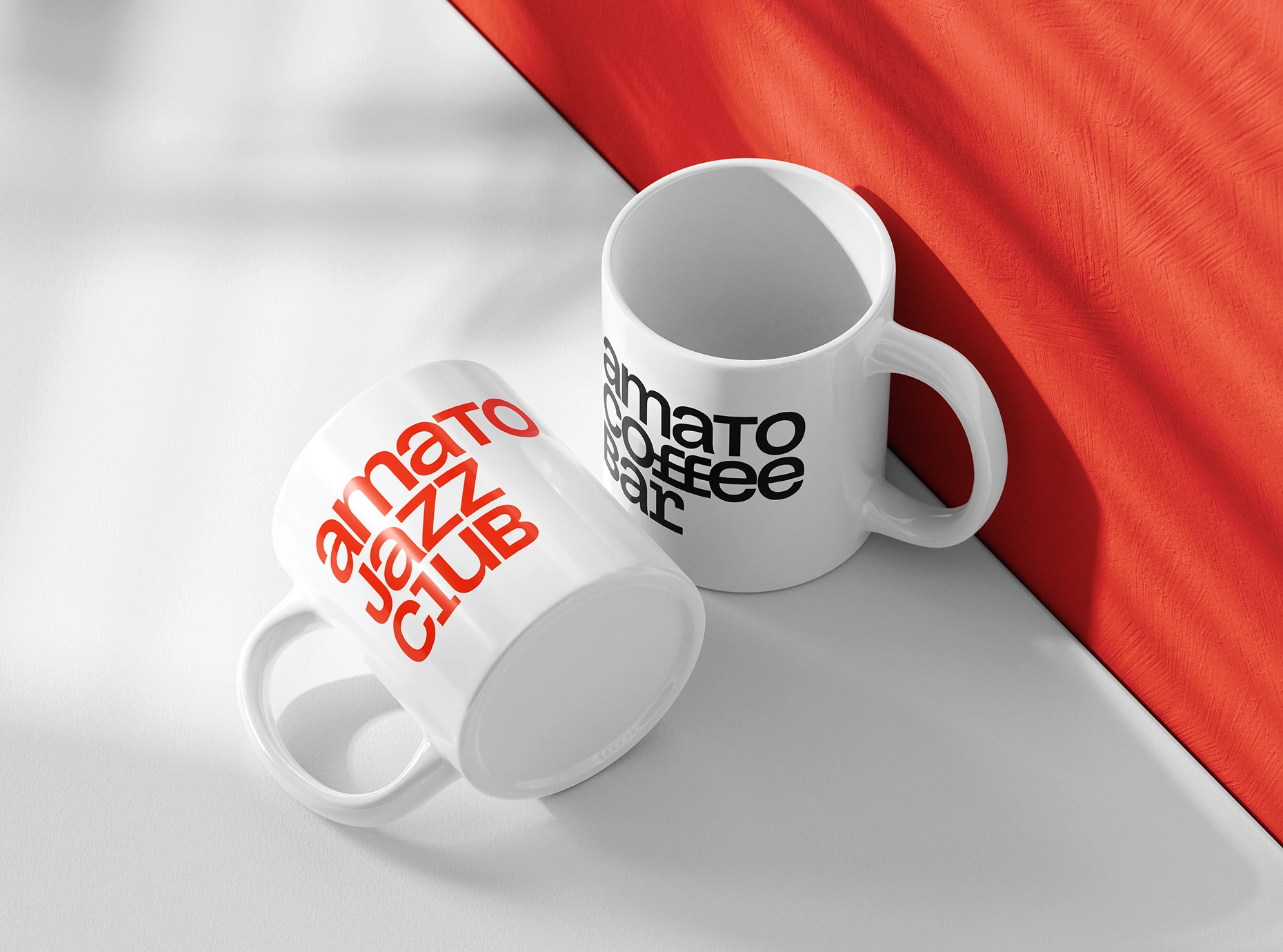
The same visual language moves between packaging and everyday objects.
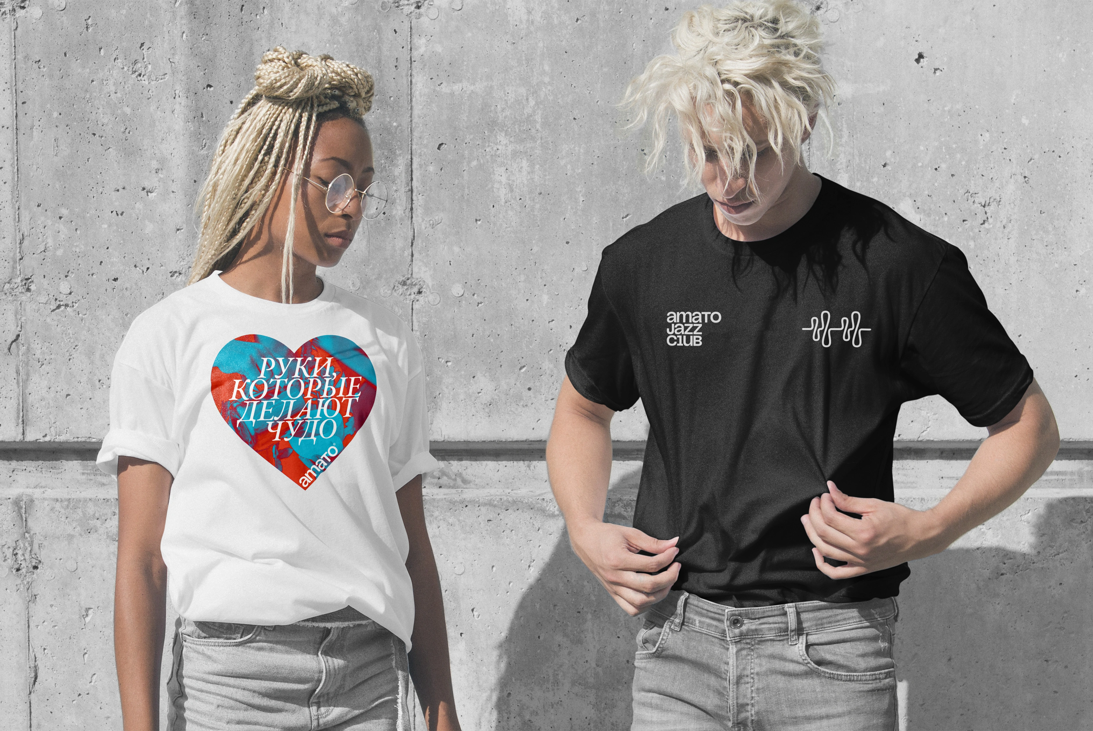
Merchandise brings the identity into the lives of the people around it.
The verbal identity preserves Amato’s conversational character: direct, informal, sometimes ironic, and ready to share knowledge. Guidance covers language, tone, communication principles, and recurring stories, helping different contributors speak with a recognizable voice.
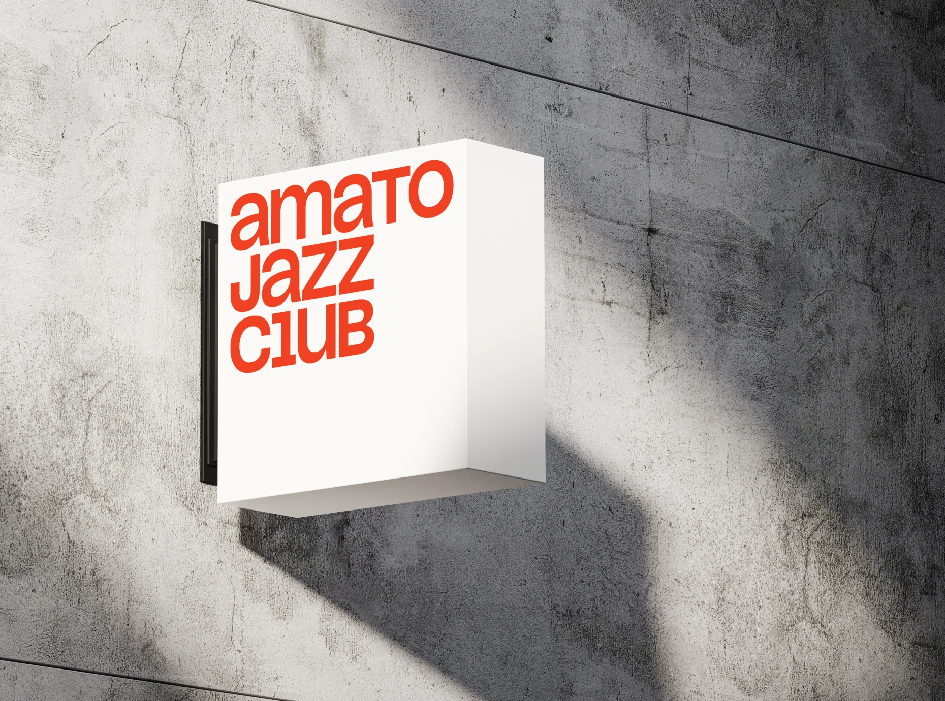
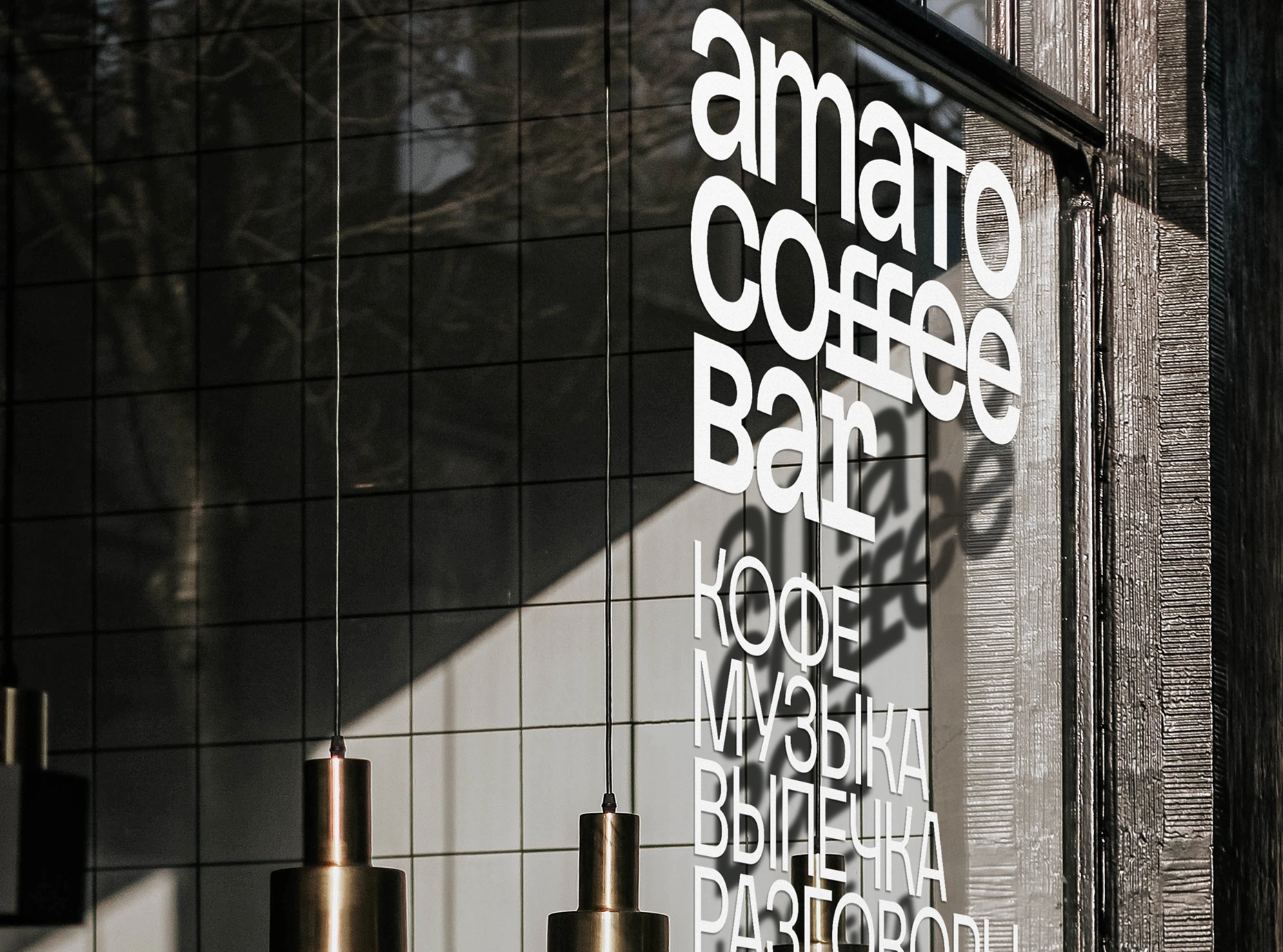
A consistent family of marks across the two directions.
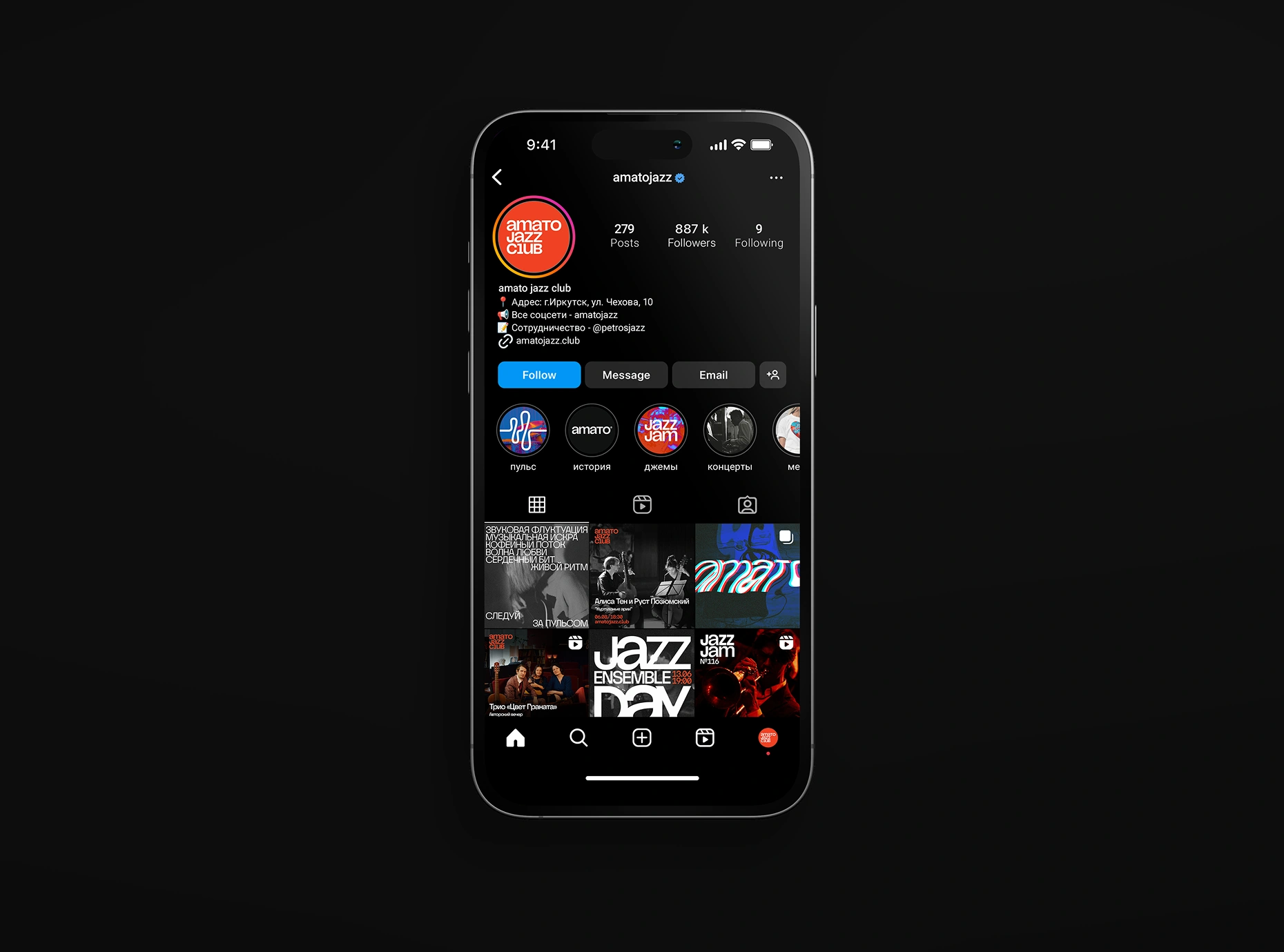
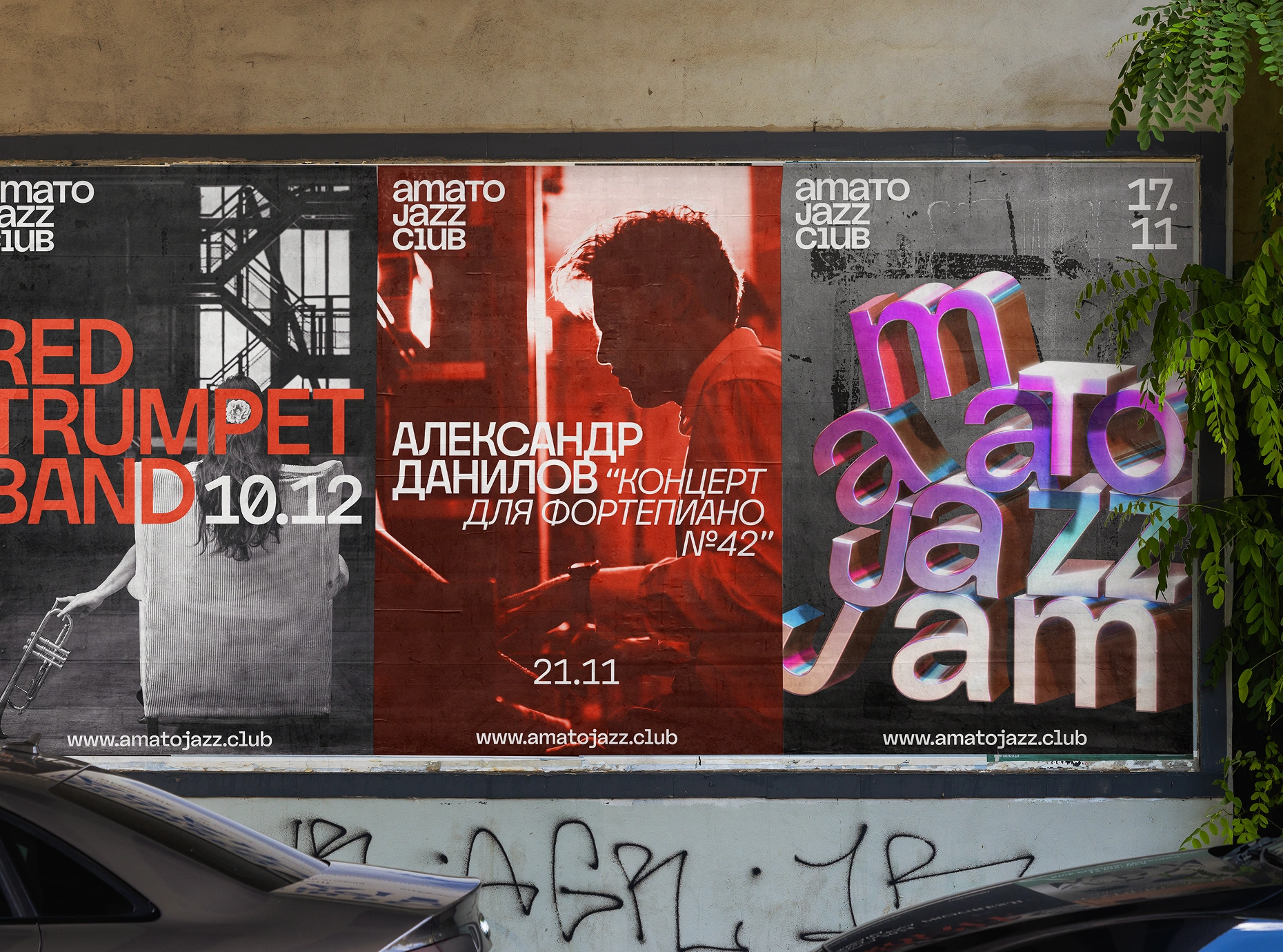
Concert announcements adapt to the artist, event, and channel.
I created a separate brand platform for the client, bringing together the strategy, verbal and visual guidelines, downloadable assets, and a Figma poster builder. It also includes additional materials available only to the client. Examples across menus, coffee packaging, posters, and merchandise demonstrate how the system can adapt to different tasks.
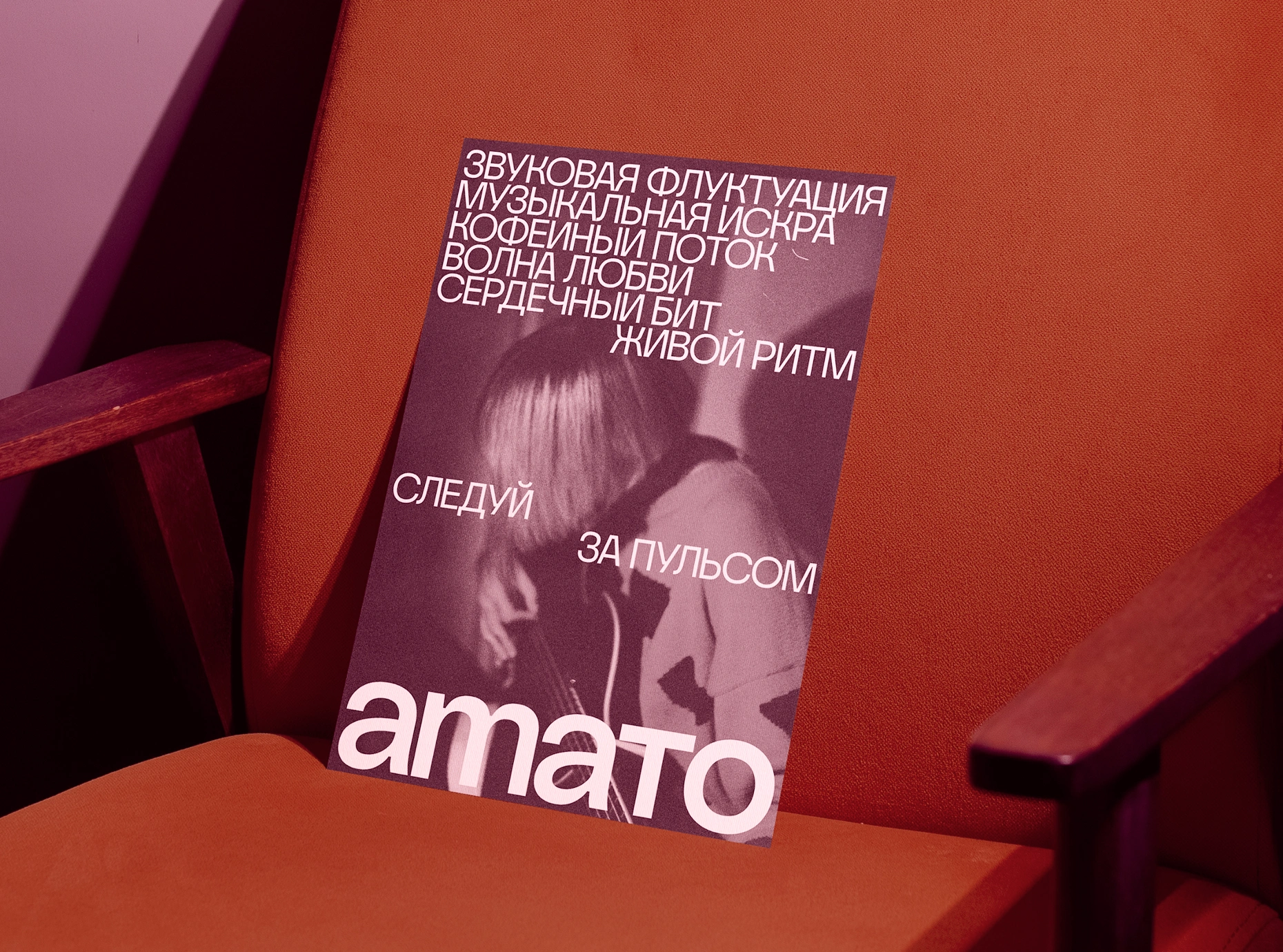
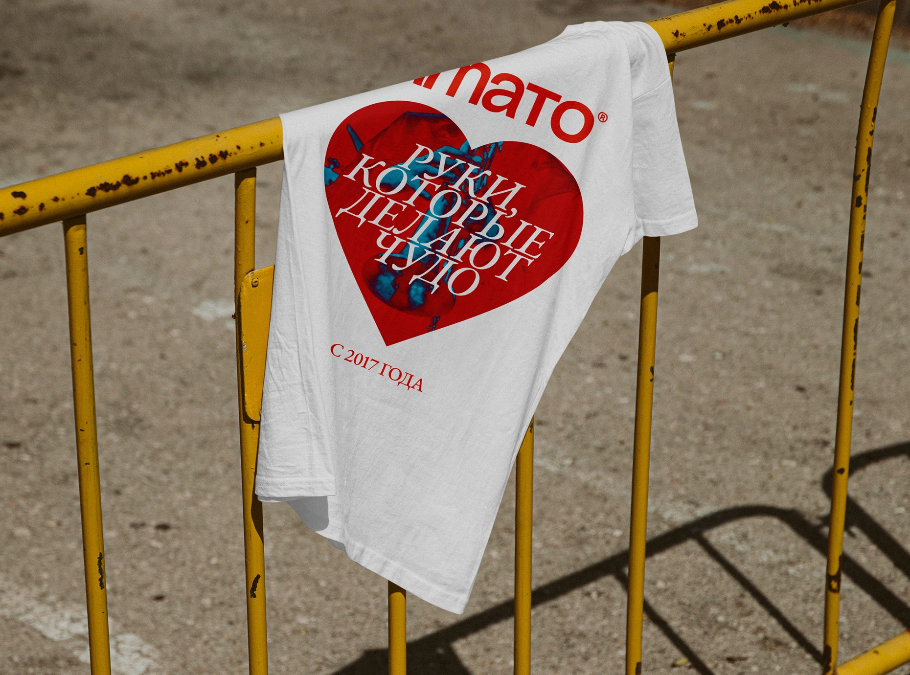
A common foundation allows for different expressions.
Result
From separate expressions to a shared point of reference.
The project brought Amato’s strategy, voice, and visual identity into one shared platform for the client. Its coffee and music directions gained a common structure, with practical guidance for the people creating materials and communicating on the brand’s behalf.
The system establishes what should remain recognizable and where experimentation can happen, giving future work a clear starting point.
Amato gained a foundation for expressing one shared character across two distinct experiences.